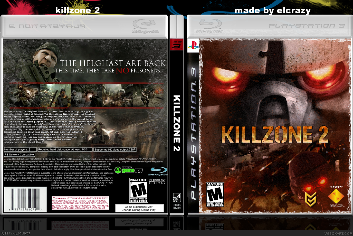
#2, you took the words right off of my mouth. seriously el crazy, I'm lovin' the grunge effects on this. really nice, but take out the white border in the front...I think it would look better :)
I like this. Good to know that you listened to my advice about getting rid of cheesy review quotes. :P IMO, the title text on the back looks terrific.
Some suggestions:
- Back cover synopsis text needs to be smaller. No body is going to read a wall of text. Add some spaces, reduce the amount of text and use a larger font size.
- Listen to Ninjamojo's tip. The guy knows what he is talking about.
- The ESRB rating detail is missing from the back cover. You know the "Blood and Gore, Violence, e.t.c."
 Killzone 2 Box Cover Comments
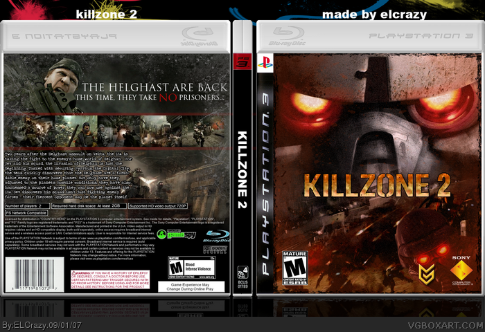
Alright, I'm finally done.
It was hard for me to find the logo, took me half-an-hour.
And the box was really hard to do.
Favs and comments are greatly appreciated! :)
[ Reply ]
#1, It would have been better if the border on the front was blackish. Otherwise awesome.
[ Reply ]
#2, you took the words right off of my mouth. seriously el crazy, I'm lovin' the grunge effects on this. really nice, but take out the white border in the front...I think it would look better :)
[ Reply ]
And the next Hall of Fame box goes to...
Great box, though I agree on the border on the front should be black. Also, the back feels like a WWII box :p Still awesome.
[ Reply ]
very good, I like back cover more
[ Reply ]
#1, can you give me that temp plz?PM it to me?
[ Reply ]
#6, it's twilight's temp....so I'm guessing he would have it also
[ Reply ]
I like this. Good to know that you listened to my advice about getting rid of cheesy review quotes. :P IMO, the title text on the back looks terrific.
Some suggestions:
- Back cover synopsis text needs to be smaller. No body is going to read a wall of text. Add some spaces, reduce the amount of text and use a larger font size.
- Listen to Ninjamojo's tip. The guy knows what he is talking about.
- The ESRB rating detail is missing from the back cover. You know the "Blood and Gore, Violence, e.t.c."
[ Reply ]
Updated!
And thanks #2-8! :)
[ Reply ]
ANYONE?!??!?!
Dammit. I hate it when this happens.
[ Reply ]
Anyone?
!!
[ Reply ]
I would prefer the white frame on front
Edited at 1 decade ago
[ Reply ]
Well, IMO, I took Ninjamojo's tip, and it actually looks better.
[ Reply ]
wow this kiks but 5/5 +fav
[ Reply ]
motion blur the red stripes on the back.
[ Reply ]
UPDATED!
[ Reply ]