-The logo should be larger and easier to see
-The Screens on the back need some sort of border or something.
-The description font on the back doesn't fit the theme.
Alright so I took both of your suggestions and fixed my box. I found a bigger logo from a wallpaper, added a nice Medieval framing to the screens, and downloaded some new fonts for the back. Thanks to both your suggestions I think it looks a lot better so yea thanks. Any other comments or critiques would be greatly appreciated.
 MediEval 2 Total War Box Cover Comments
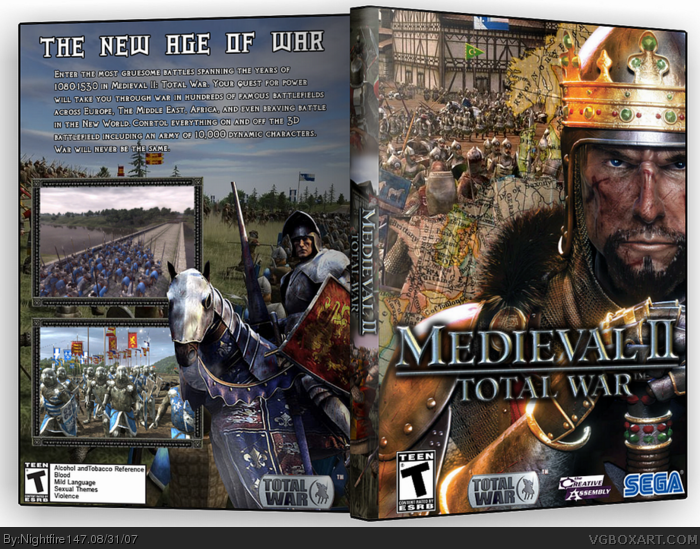
So yea 1st PC box worked really hard on it and really liked how it tuned out. Personally I think its a personal best.
[ Reply ]
Really cool but the logo dshould be bigger on front. And maybe the text too.
[ Reply ]
Pretty good, however:
-The logo should be larger and easier to see
-The Screens on the back need some sort of border or something.
-The description font on the back doesn't fit the theme.
Still, 4/5. Fix those things and it will be 4.5/5
[ Reply ]
Alright so I took both of your suggestions and fixed my box. I found a bigger logo from a wallpaper, added a nice Medieval framing to the screens, and downloaded some new fonts for the back. Thanks to both your suggestions I think it looks a lot better so yea thanks. Any other comments or critiques would be greatly appreciated.
Edited at 1 decade ago
[ Reply ]
this is great! nice job.
Edited at 1 decade ago
[ Reply ]