
[ Box updated on September 7th, 2007 ] [ original ]
 Shadow the Hedgehog: Hero or Menace Box Cover Comments
Comment on hunter1993's Shadow the Hedgehog: Hero or Menace Box Art / Cover.
[ Box updated on September 7th, 2007 ] [ original ]
Comment on hunter1993's Shadow the Hedgehog: Hero or Menace Box Art / Cover.
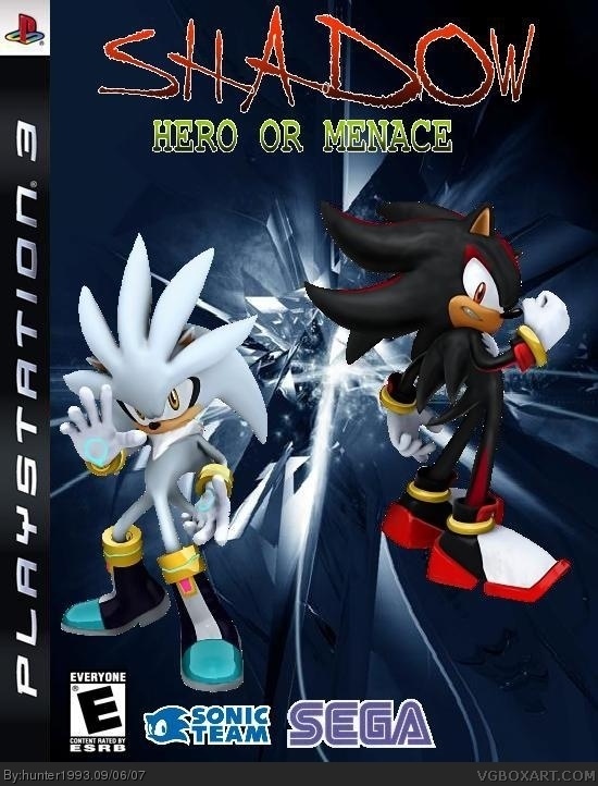
my 2nd box i bet it's better from the first
[ Reply ]
Well in some ways yes and no. The logo is bad. Not liking the text of shadow and the colors from red to green doesn't go too well. The characters look less noisy then last time but I still see white points around. And sega logo needs to be on the right and sonic team more in the center. The background is ok but I would have prefer it in red.
[ Reply ]
updated the box i replaced the shadow logo and the background and please tell me if sonic and silver are better with transparent
[ Reply ]
#3, i think you should put the attention on the characters instead f=if tge background, and move the logo's away from the edge a bit[ 2-5 pixels ]
[ Reply ]
WOW!!!!!!!!!! I like the red stuff!
[ Reply ]
its ok
[ Reply ]
I like it
[ Reply ]