P.s.
don't come saying"the front is only wallpaper", look close. this box took alot of effort, front, back and cartridge.i've used wallpapers, but edited them alot.
Thanks.
-Ayron
5/5 Great job once again! I do wish that you could have kept Marche's original color though because everything else looks very colorful in the box, and he's not so he kinda sticks out. But yeah...nice.
Oh I see now. It makes a lot more sense now...that way the unicorn won't stick out with a solid color all by itself. That being said my opinion's changed. This totally deserves a fav. So here's one from me.
UPDATE! added my signature, and as a 'special surprise', i added a special edition Stylus pack!
i'd appreciate it if this doesn't get left out in the rain..x]
#25, I didn't change my opinion based on comments. You clarified to me why Marche was a solid color and after that clarification I saw the box clearer and realized the artistic style and effort put into it.
i think the box kicks ass, however I really don't like the background at all. the box is great, but the light purple canvas just ruins it. A better text arrangement in the back would also make it even better. still VERY well made. great effort and great box. worth a fav ;) one more buddy...
#41, you surely haven't seen the wallpaper-editing an rendering/effects i've used for the back.
The styluses are just an extra, did you post this criticism on Blinkofeye's box with the console and remote?
Thanks #43.
 Final Fantasy Tactics DS Box Cover Comments
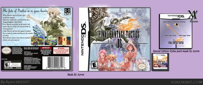
My final fantasy tactics DS box+cartridge.
I thought this would be thé game to port to DS, since it was a great game on Advance, and Squeenix is already porting some games..
Hope you like it.
Credits do CruSaDer[right?] for template and Blinkofeye for cartridge temp.
P.s.
don't come saying"the front is only wallpaper", look close. this box took alot of effort, front, back and cartridge.i've used wallpapers, but edited them alot.
Thanks.
-Ayron
Edited at 1 decade ago
[ Reply ]
dude... its beautiful, makes me want to cry. 5/5+fav
[ Reply ]
#2, Thank you =D!
that means alot to me. =]
[ Reply ]
its beautiful.
5/5 +fav
[ Reply ]
#4, thanks ^.^
[ Reply ]
Really nice. BTW, Ayron, I updated my Hellgate box.
[ Reply ]
I love the front great job on that. only thing I see wrong is on the back there is a space missing between magical and kingdom. hehe, still +fav.
[ Reply ]
-darb awesine,
E: I mean darn it's awesome :D
Edited at 1 decade ago
[ Reply ]
This is so beautiful. :) +fav
NF
[ Reply ]
#7, lol yeah,ty.
ty ervo,nice typo
thanks a bunch WD!
For the logo, does anyone need it? it's custom made.. x].
This took me alot of work,making logo, rendering the coloured part of logo, making the effects etc. so i hope you enjoy ^^
Edited at 1 decade ago
[ Reply ]
This is gorgeous. I love it. Faved.
[ Reply ]
#11, Thanks adfd..
wow, 6 favs already o.o'
[ Reply ]
5/5 fav teach me plx mens plx
[ Reply ]
#13, Rofl. there is nothing to teach you haji.
If you put 1 day in your work, you'll pwn me.
[ Reply ]
5/5 Great job once again! I do wish that you could have kept Marche's original color though because everything else looks very colorful in the box, and he's not so he kinda sticks out. But yeah...nice.
[ Reply ]
#15, i tried to make him match with the unicorn on the front.
thanks alot though!
[ Reply ]
Oh I see now. It makes a lot more sense now...that way the unicorn won't stick out with a solid color all by itself. That being said my opinion's changed. This totally deserves a fav. So here's one from me.
[ Reply ]
#17, thanks =D
I'm surprised by how many people like it.
[ Reply ]
Your best box yet.
[ Reply ]
Awesome job, seriously
[ Reply ]
Thanks #19-20. i appreciate it ^^
[ Reply ]
Great job! :)
[ Reply ]
#22, Thanks elcrazy!
Wow, 16 Favs o.o'!,
Thanks people!.
Keep the comments coming, i'd like to improve further.
-Ayron
Edited at 1 decade ago
[ Reply ]
What do you guys think about the cartridge btw, i haven't got a single comment in it..?
[ Reply ]
Sorry to bump, but #17, don't change your opinion based on comments please..
Thanks in progress,
-Ayron
[ Reply ]
UPDATE! added my signature, and as a 'special surprise', i added a special edition Stylus pack!
i'd appreciate it if this doesn't get left out in the rain..x]
Thanks in progress.!
[ Reply ]
this is nice
keep up the good work
5/5
and a fav
[ Reply ]
#27, Thanks alot Yummy.
the stylus pack took alot of effort btw, so yeah, thank you.
[ Reply ]
#25, I didn't change my opinion based on comments. You clarified to me why Marche was a solid color and after that clarification I saw the box clearer and realized the artistic style and effort put into it.
[ Reply ]
Niceeeee.
[ Reply ]
#29, ahh ok. thanks for clearing it up.
thanks robo=D
[ Reply ]
i think the box kicks ass, however I really don't like the background at all. the box is great, but the light purple canvas just ruins it. A better text arrangement in the back would also make it even better. still VERY well made. great effort and great box. worth a fav ;) one more buddy...
Edited at 1 decade ago
[ Reply ]
#32, ghehe 1 more..*drools*.
i'll try and fix some flaws tomorrow.
thanks alot LK.
[ Reply ]
Congrats.
[ Reply ]
Nice job dude 5/5.
[ Reply ]
congrats ayron.....if this was the official......it would be so awesome
[ Reply ]
Greatttttt job. Looks beautiful.
[ Reply ]
W00t h0f! thanks for +favs and comments people.
[ Reply ]
Those Stylus' are of the hook. Great job. Congrats for he HoF!
[ Reply ]
#39, Thanks ervo, i thought the stylus' were a good idea.
[ Reply ]
Its a pretty good box but I'm not really feeling the back its just boring and nothing really amazing on it just black text and a BG.
P.S. Both Styluses are completely unnecessary and take away from the box
[ Reply ]
#41, All of the Final Fantasy boxarts are like that.
[ Reply ]
congratulations :)
[ Reply ]
#41, you surely haven't seen the wallpaper-editing an rendering/effects i've used for the back.
The styluses are just an extra, did you post this criticism on Blinkofeye's box with the console and remote?
Thanks #43.
[ Reply ]
Nice job bro. 5/5
[ Reply ]
#44, yeah. I'm pretty sure he did.
[ Reply ]
lol you improved incredibly since your first box
[ Reply ]
#47, thanky.
thanks as well #45
[ Reply ]
Really nice! I like the front! 5/5
[ Reply ]
thanks for comments and +favs everyone.
[ Reply ]