i cannot wait for this game! if it came out and i didn't have a ds i would buy one just for this game. anyways... the background seems a bit squished but all in all its very good. 4.7/5
You guys cmon, this box does NOT deserve a 4/5, it deserves a 2/5 at the most. I mean, the art is stretched beyond belief and is just a wallpaper I bet. And I mean look at the logo, its blurry, choppy, too small and looks like a piece of crap. So next time put more time into your boxes then just rush through to be the first one done.
#17, how about you shut the Hell up and not act like a freaking smart ass? This box didn't require much effort anyway. It's just a wallpaper with a logo and a few dev logos, along with a rating. Its nothing special. But use of unmodified wallpapers are fine. If the logo was cut out better, then maybe. Just maybe I would like it. Its too choppy. 3/5 Keep trying Blaker. I know you can do better than this.

 Kingdom Hearts 358/2 Days Box Cover Comments
I hope you like it. :)
[ Reply ]
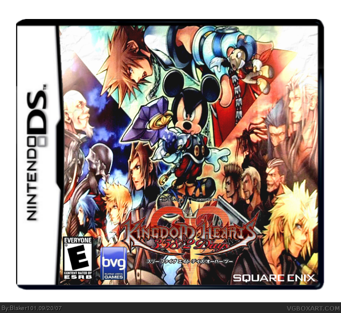
I love the art but the logo needs a bit more work.
4/5
[ Reply ]
updated.
Edited at 1 decade ago
[ Reply ]
i cannot wait for this game! if it came out and i didn't have a ds i would buy one just for this game. anyways... the background seems a bit squished but all in all its very good. 4.7/5
[ Reply ]
You´ve mixed the art of three games. (Up Coded (mobile), Left Birth By Sleep (PSP) and Right 358/2 Days (DS)).
[ Reply ]
Hum, i can´t edit X_x. Anyway, the compsition of the image its pretty cool.
[ Reply ]
pretty nice 4/5 i like the logo, looks nice too
[ Reply ]
Thanks for the comments. :)
[ Reply ]
You guys cmon, this box does NOT deserve a 4/5, it deserves a 2/5 at the most. I mean, the art is stretched beyond belief and is just a wallpaper I bet. And I mean look at the logo, its blurry, choppy, too small and looks like a piece of crap. So next time put more time into your boxes then just rush through to be the first one done.
[ Reply ]
#9, It's a picture of a wallpaper actually. The wallpaper/image hasn't even been released yet.
Edited at 1 decade ago
[ Reply ]
#10, Wow thats sad...
[ Reply ]
Sorry everyone, but it's not a wallpaper as of yet. It's just game art, so calm down.
Also, ninja, there really any great quality images of the new logo's yet. What you see is what you get, learn to deal, kthxbai.
Blaker, the box looks good. We should both update when better logo's are out ^^b
[ Reply ]
#12, Then why make a box with a shitty logo if there is none? Hmmm?
[ Reply ]
#13 stfu this is a really good box so f**k off!
[ Reply ]
#14, Please read the rules. link
[ Reply ]
Well it hard to make a box with no artwork or any info. So it not that bad 3.5/5.
[ Reply ]
#15 im saying this is good gay boy
[ Reply ]
ITs squashed
[ Reply ]
roxas & ven are switched, they do look alike but you should still switch them
[ Reply ]
#17, how about you shut the Hell up and not act like a freaking smart ass? This box didn't require much effort anyway. It's just a wallpaper with a logo and a few dev logos, along with a rating. Its nothing special. But use of unmodified wallpapers are fine. If the logo was cut out better, then maybe. Just maybe I would like it. Its too choppy. 3/5 Keep trying Blaker. I know you can do better than this.
Edited at 1 decade ago
[ Reply ]