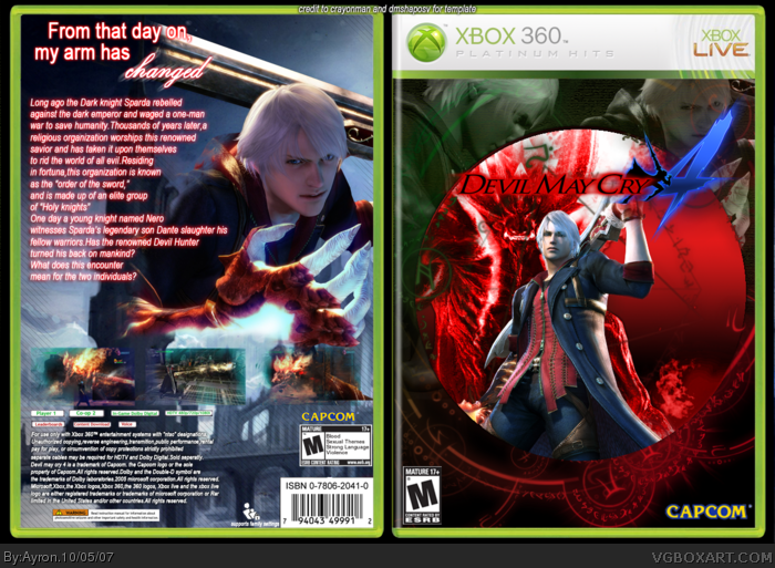
Mý Dmc4 Box.
i know it can't really compete with Vengeance and Elcrazy's box, but i did my best.
thanks to Roboross for helping me.
Cred to crayonman for template, and dmshaposv for editing the template into "platinum hits".
Front is nice but the back could use some work, that from that day on etc text looks badly placed. And the other text on the back is little bad. If you work on the back more i might fave it ;)
#3, that red text. Put it like the white text down below ( i dunno if you understand me again :D) and the text on the top would look better if it was from left to right. Sorry, i suck at telling people how to improve the box :I
I like the originality, but I dislike the intense red glow on the text and how you formatted it. Paragraphing would be nice. Also the screenshots don't blend in as well as you might hope.
#12, you can, but Nero is the main character. Dante will serve as playable character. Remember how could play as Vergil in the special edition version of Devil May Cry 3? Well its sorta like that.
It just looks a lot like Dante on the front. I guess Capcom doesn't have a whole lot of creativity when it comes to appendage-weapon wielding hack n' slash heroes.
The back template rights side needs to not have casing. Real boxes don't have the plastic all the way around and its a full cover wrap and you don't see green if that makes sense.
 Devil May Cry 4 Box Cover Comments
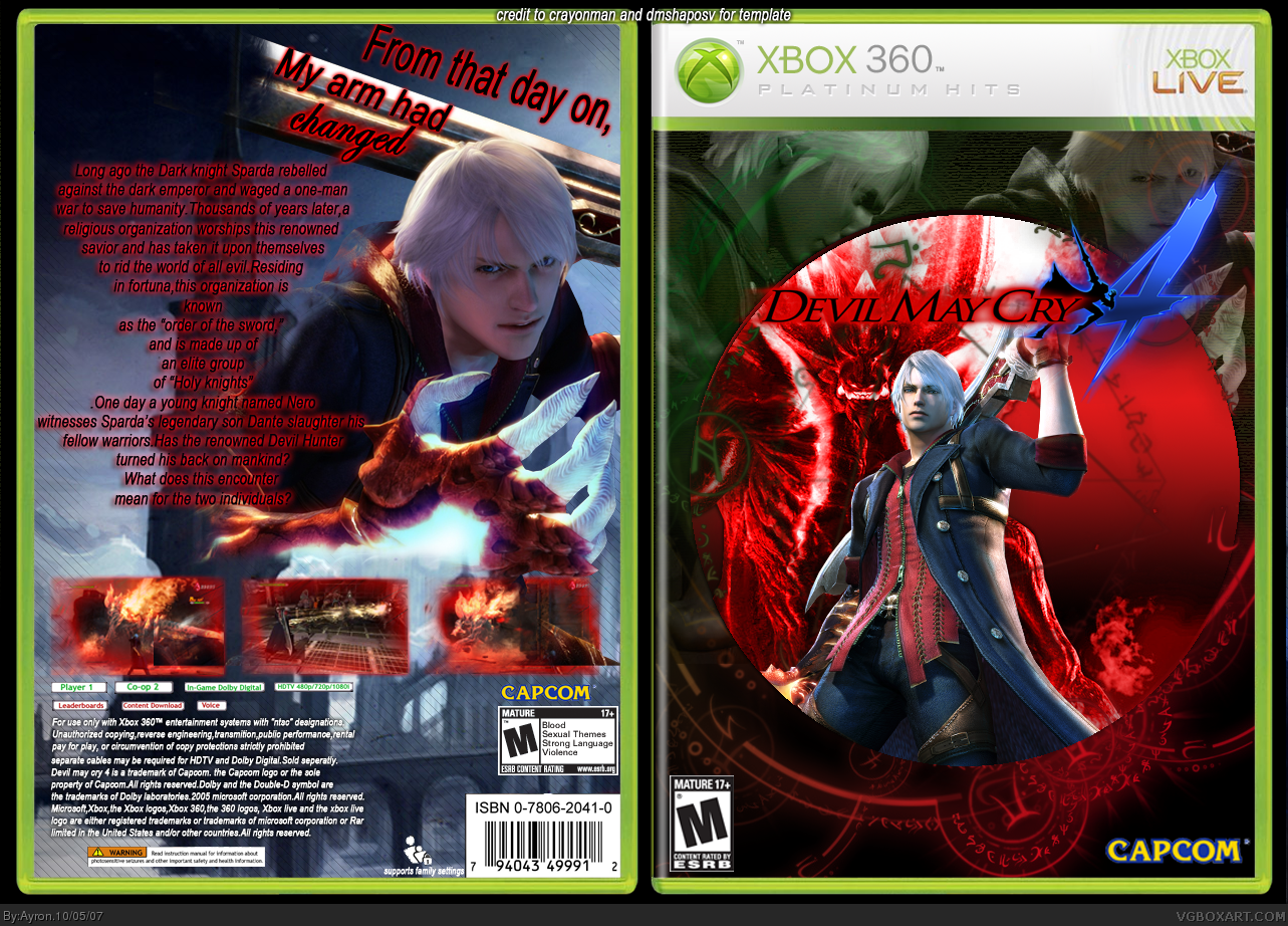
Mý Dmc4 Box.
i know it can't really compete with Vengeance and Elcrazy's box, but i did my best.
thanks to Roboross for helping me.
Cred to crayonman for template, and dmshaposv for editing the template into "platinum hits".
Comments are appreciated,
-Ayron
[ Reply ]
Front is nice but the back could use some work, that from that day on etc text looks badly placed. And the other text on the back is little bad. If you work on the back more i might fave it ;)
[ Reply ]
#2, well, tell me what to do with it..
as i said before. i suck at backs.
Edited at 1 decade ago
[ Reply ]
#3, that red text. Put it like the white text down below ( i dunno if you understand me again :D) and the text on the top would look better if it was from left to right. Sorry, i suck at telling people how to improve the box :I
[ Reply ]
#4, you want me to change the text to look like the copyright info and put the catch-phrase horizontally?
i'll try that ervo,ty.
[ Reply ]
I like the originality, but I dislike the intense red glow on the text and how you formatted it. Paragraphing would be nice. Also the screenshots don't blend in as well as you might hope.
[ Reply ]
update! hope you like it, thanks for the help everyone.
Edited at 1 decade ago
[ Reply ]
I love the way you did the front. Looks like a 007 opening sequence.
Overall, well done! :)
[ Reply ]
I love the front, but the back text doesn't fit very well Ayron. I would change the font into Times New Roman, or someting like that.
[ Reply ]
#5, that's what i meant, looks much better now!
[ Reply ]
thanks everyone
[ Reply ]
Yeah, kind of a stupid question, but... You don't play as Dante in this one, right?
[ Reply ]
#12, you can, but Nero is the main character. Dante will serve as playable character. Remember how could play as Vergil in the special edition version of Devil May Cry 3? Well its sorta like that.
Edited at 1 decade ago
[ Reply ]
Gotcha.
It just looks a lot like Dante on the front. I guess Capcom doesn't have a whole lot of creativity when it comes to appendage-weapon wielding hack n' slash heroes.
[ Reply ]
The back template rights side needs to not have casing. Real boxes don't have the plastic all the way around and its a full cover wrap and you don't see green if that makes sense.
[ Reply ]