Yes i know this looks exactly like Koopa's Tempest King box, i liked the style so much i hope you don't mind that i borrowed the format of it koopa, credit to Blairy Boy for the logo
I'm going to give you a fave on this one, Brett, because this is what I was hoping my Tempest King box would look like, but I could never pull it off. Great job!
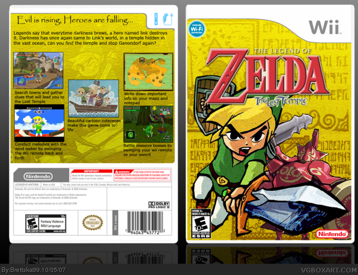
 The Legend of Zelda: The Lost Temple Box Cover Comments
Yes i know this looks exactly like Koopa's Tempest King box, i liked the style so much i hope you don't mind that i borrowed the format of it koopa, credit to Blairy Boy for the logo
[ Reply ]
i like it...alot! its awesome great placement of everything. 5/5+fav
[ Reply ]
#2, Thanks
[ Reply ]
REALLY nice. It's pretty much your best so far :)
[ Reply ]
#4, i agree :)
[ Reply ]
it looks good, great job.
[ Reply ]
Sweet
[ Reply ]
Thanks
[ Reply ]
can somebody give me more comments?
Edited at 1 decade ago
[ Reply ]
The logo does have white spaces into it. I think you should cut that away....furthermore I think this box is brilliant.
[ Reply ]
#10, that white space is suppose to be there, thats new offcial logo thing
[ Reply ]
#11, seriously. I hate that. I got PH and saw the logo and went "O my gosh that's gonna bug the crud outta me!" But yeah, SWEET box.
[ Reply ]
I'm going to give you a fave on this one, Brett, because this is what I was hoping my Tempest King box would look like, but I could never pull it off. Great job!
[ Reply ]
#13, woah, koopadasher actually faved my one of my boxes, i should feel honored
[ Reply ]
wow youve improved.
and i remember the first box of yours that i saw...
and i critiqued you and you called me a man...
[ Reply ]
Your back screen shots are so plain no fancy border or anything. Try getting creative.
[ Reply ]
On the back, There are buttons for the gamecube.
[ Reply ]