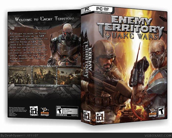
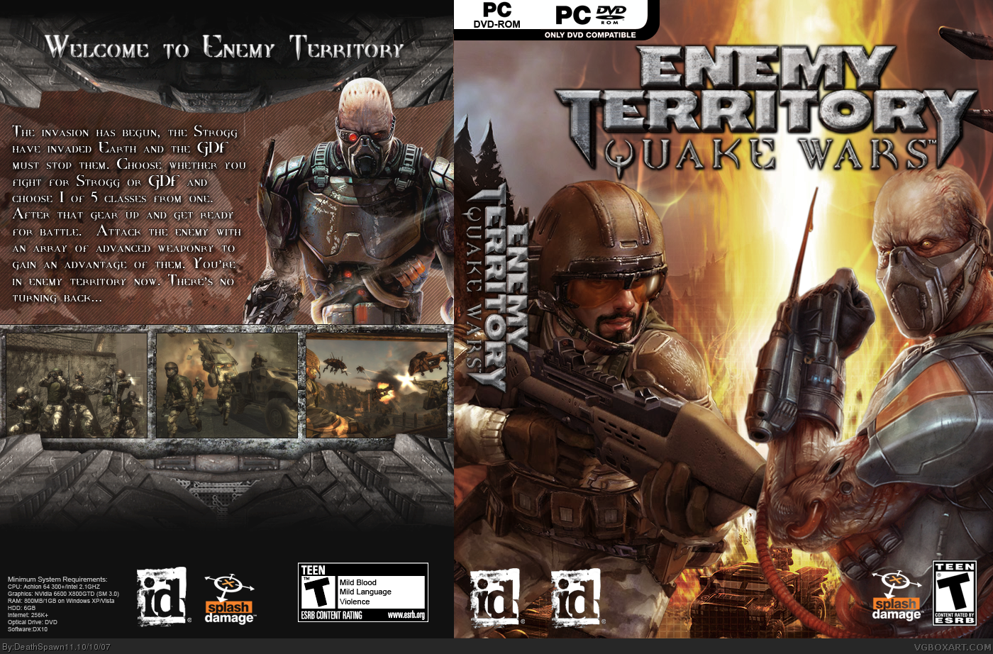
this was originally supposed to be a challenge box against Jason (ninjamojo) but he submitted his box without me knowing. so here it is. I'll post 3-D later
It's good but I don't like the way the spine is, you should do something to make it look like a spine because it looks like there are two id, PC and ETQW logos. I love the back however. 4.5/5
#6....sigh....I know what it is alright. So let me elaborate if you didn't catch what I was saying. Your "constructive" criticism is going to make the box less official without the official id and pc/dvd logos. Trust me, if this was on 3D you'd know what I mean...but atleast try to imagine it in 3D, now do you see it. That's the best and most appropriate spine for the game, to do away with the official logos would make it less official, thus I questioned your "constructive" criticism :)
Steven, just wondering, why did you put the ESRB rating on the other side? That is the ONLY thing that rubs me the wrong way. Every other aspect of the box is awesome, and very official looking. Just that ESRB placement is weird to me.
 Enemy Territory: Quake Wars Box Cover Comments
this was originally supposed to be a challenge box against Jason (ninjamojo) but he submitted his box without me knowing. so here it is. I'll post 3-D later
[ Reply ]
It's good but I don't like the way the spine is, you should do something to make it look like a spine because it looks like there are two id, PC and ETQW logos. I love the back however. 4.5/5
Edited at 1 decade ago
[ Reply ]
#2...so? the whole box is great overall. nice job :)
[ Reply ]
looks great, ive never seen any of those images before either nice job!
[ Reply ]
Very nice
[ Reply ]
#3, It's constructive critism.
[ Reply ]
Really nice.
[ Reply ]
Why did you have to go and own ninja like that. Lol great job.
[ Reply ]
#6....sigh....I know what it is alright. So let me elaborate if you didn't catch what I was saying. Your "constructive" criticism is going to make the box less official without the official id and pc/dvd logos. Trust me, if this was on 3D you'd know what I mean...but atleast try to imagine it in 3D, now do you see it. That's the best and most appropriate spine for the game, to do away with the official logos would make it less official, thus I questioned your "constructive" criticism :)
[ Reply ]
I agree with Tikicobra. I like it, though. Nice job.
[ Reply ]
updated to 3D, so stop your complaining about the ID logo looking wierd.
[ Reply ]
Steven, just wondering, why did you put the ESRB rating on the other side? That is the ONLY thing that rubs me the wrong way. Every other aspect of the box is awesome, and very official looking. Just that ESRB placement is weird to me.
[ Reply ]
huh its awesome
[ Reply ]
#12, well I noticed that like all the games made by ID have the ESRB on the other side so......self-explanitory.
#13, thx dude.
[ Reply ]
#1,did you get my message
[ Reply ]