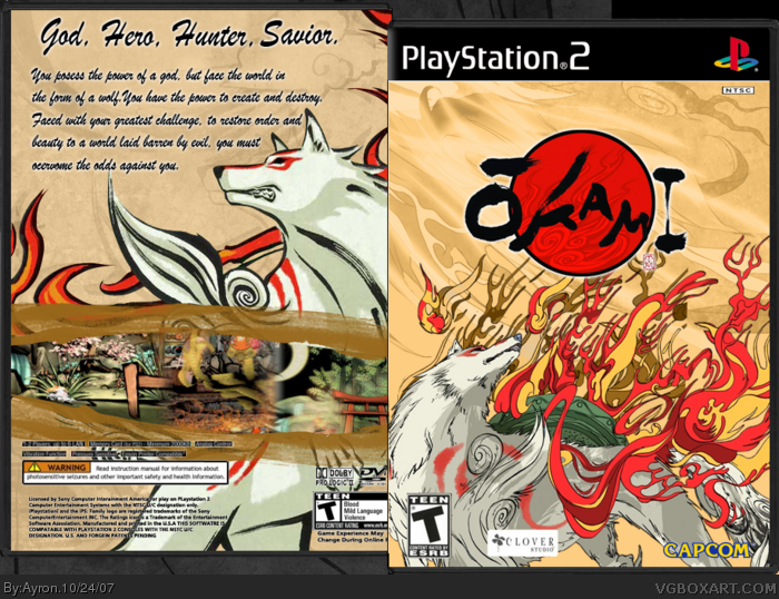
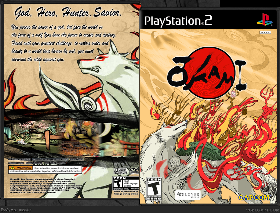
[ Buy Okami at Amazon ] By Ayron 47 on October 23rd, 2007 No Printable Available [ Box updated on October 24th, 2007 ] [ original ] Okami Box Cover Comments Comment on Ayron's Okami Box Art / Cover. Cancel Reply Ayron 47 [ 1 decade ago ] My latest box, hope you like it. [ Reply ] xstormthegatesofhellx 7 [ 1 decade ago ] It's good, but there have been wayyyy too many Okami boxes lately. Oh, and the Teen logo on the back is kinda stretched. [ Reply ] Ayron 47 [ 1 decade ago ] #2, i know X'D,just couldn't resist. [ Reply ] yummybrains 30 [ 1 decade ago ] The Front is Amazing! The Back Could use a Little work, though. I would suggest using a different text on the back, i cant read it. [ Reply ] Ayron 47 [ 1 decade ago ] #4, i might update the text,after some more comments.. thank you. [ Reply ] Destined Reality 22 [ 1 decade ago ] Pretty good, but I don't like the black screenshot borders. It is just way too messy and puts a huge stain at the nice color scheme. [ Reply ] Ervo 48 [ 1 decade ago ] Pretty nice ;) I like it. [ Reply ] Ayron 47 [ 1 decade ago ] Update! V2 is with color-edited screen border, V3 is, as you see, with outer glow border. Thanks #6-7 [ Reply ] E_G 39 [ 1 decade ago ] Great job, I'd prefer it if the Okami logo was bigger though. [ Reply ] Ayron 47 [ 1 decade ago ] #9, Thanks E_G, but if the logo was bigger, it'd take away the attention of the wolf itself. [ Reply ] ELCrazy 50 [ 1 decade ago ] Beautiful. [ Reply ]
 Okami Box Cover Comments
My latest box, hope you like it.
[ Reply ]
It's good, but there have been wayyyy too many Okami boxes lately.
Oh, and the Teen logo on the back is kinda stretched.
[ Reply ]
#2, i know X'D,just couldn't resist.
[ Reply ]
The Front is Amazing!
The Back Could use a Little work, though.
I would suggest using a different text on the back, i cant read it.
[ Reply ]
#4, i might update the text,after some more comments..
thank you.
[ Reply ]
Pretty good, but I don't like the black screenshot borders. It is just way too messy and puts a huge stain at the nice color scheme.
[ Reply ]
Pretty nice ;) I like it.
[ Reply ]
Update!
V2 is with color-edited screen border,
V3 is, as you see, with outer glow border.
Thanks #6-7
[ Reply ]
Great job, I'd prefer it if the Okami logo was bigger though.
[ Reply ]
#9, Thanks E_G, but if the logo was bigger, it'd take away the attention of the wolf itself.
[ Reply ]
Beautiful.
[ Reply ]