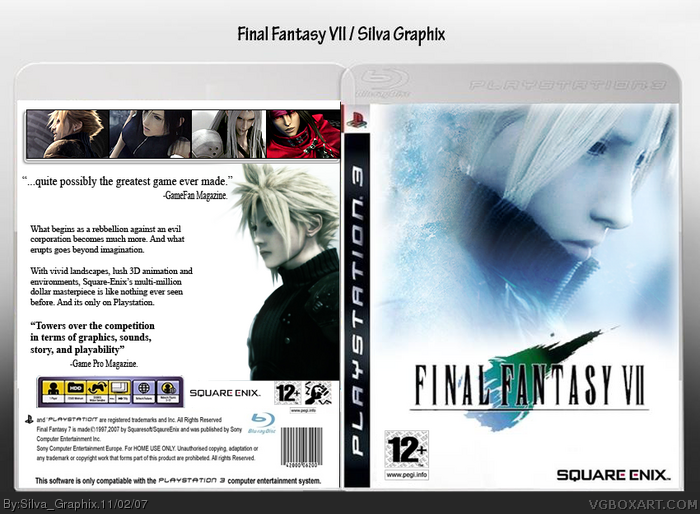
#1, hey thanks elcrazy, yea i was thinking about that, i think text is the hardest thing about box art, ill see if ppl think i should get ride of the shadow.=]
#6, you're the master of the box, not the box you nor other artists in the site. It's your decision. overall it's pretty nice. some pointers: front pic seems blurry, some temp cutting problems, squeanix logo seems squished and reflection of squeanix is unnecessary. Back is nice, but feels a lil' empty. you're getting better, keep it up ;)
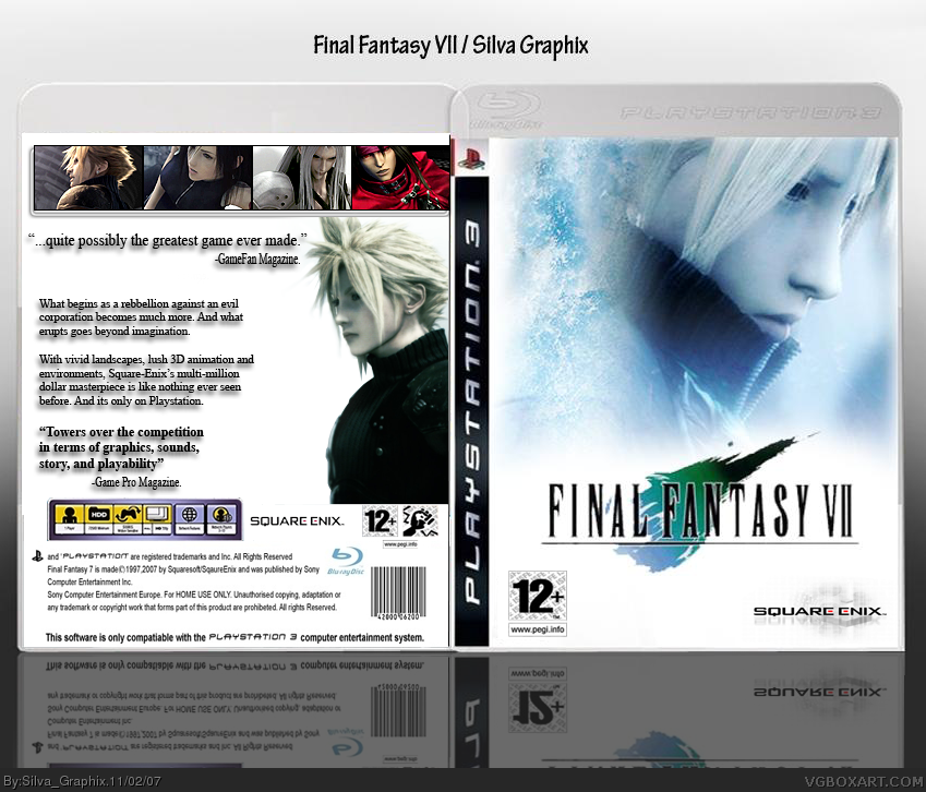
a small update. couldnt really do anything about the pic being blury thats how it was .lol. the temp is fixed, and the logo, got ride of the reflection.
and i tried to keep it simple because most final fantasy game covers are like that =]
Don't let official-ity keep you from making the box as best as you can make it. Sure, official ff boxarts are simple, but that shouldn't prevent you from making it your own. keep the reflection of the box itself, I was talking about the previous reflection on the squeanix logo. Nonetheless, it looks better. +fav for that and being open minded about criticisms, which really isn't common in the site :(
Thanks ladykiller =] well the reflection is on my original on my computer, im tryin to get a art book for this stuff, so i want to make sure its at least decent, and its ok if i need some criticisms,lol it was makes me better and pushes me to do my best, thanks for the support!
 Final Fantasy VII Box Cover Comments
The front is amazing. But the back....if you lose the shadow for the text, I'll give it a fav :).
[ Reply ]
#1, hey thanks elcrazy, yea i was thinking about that, i think text is the hardest thing about box art, ill see if ppl think i should get ride of the shadow.=]
[ Reply ]
Looks pretty good, but why the front and screens are from Advent Children chothes?
[ Reply ]
#3, What?
[ Reply ]
#3, its hard to find pictures of a updated cloud and stuff so i used the material that i can find since final fantasy vII for the ps3 is not out.
[ Reply ]
Hey if you guys can help me out, i want to know how many people think i should get ride of the shadow from the text. Its been a hard choice. thanks :P
[ Reply ]
#6, you're the master of the box, not the box you nor other artists in the site. It's your decision. overall it's pretty nice. some pointers: front pic seems blurry, some temp cutting problems, squeanix logo seems squished and reflection of squeanix is unnecessary. Back is nice, but feels a lil' empty. you're getting better, keep it up ;)
[ Reply ]
a small update. couldnt really do anything about the pic being blury thats how it was .lol. the temp is fixed, and the logo, got ride of the reflection.
and i tried to keep it simple because most final fantasy game covers are like that =]
[ Reply ]
Don't let official-ity keep you from making the box as best as you can make it. Sure, official ff boxarts are simple, but that shouldn't prevent you from making it your own. keep the reflection of the box itself, I was talking about the previous reflection on the squeanix logo. Nonetheless, it looks better. +fav for that and being open minded about criticisms, which really isn't common in the site :(
[ Reply ]
looks great, nice job!
[ Reply ]
Thanks ladykiller =] well the reflection is on my original on my computer, im tryin to get a art book for this stuff, so i want to make sure its at least decent, and its ok if i need some criticisms,lol it was makes me better and pushes me to do my best, thanks for the support!
[ Reply ]
#10, hey thanks shady :P
[ Reply ]
A little to much white on the back. Maybe you should have out a image with a low trasparentcy(spelled wrong) on it.
Edited at 1 decade ago
[ Reply ]
That text is on another box too...
Wait! It's the official text right?
Anyway, I can see this being a real box.
5/5
[ Reply ]