The front looks great, i really like how you distorted the colors in the logo. The back of the box however, doesn't look as good. There should be a boarder around the screenshots so i could easily see them. Also, you forgot to fix the esrb rating system in the back.
My other suggestion is to desaturate the background in the back, so i can read the text. Desaturate means to take all of the colors away if you didn't know.
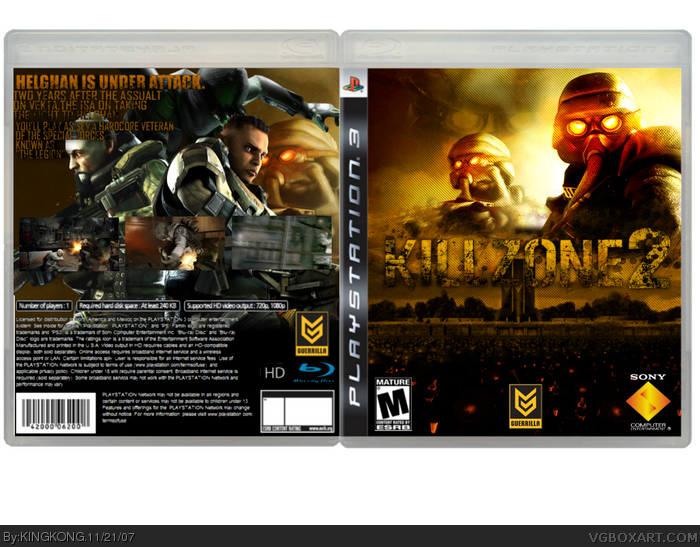
 Killzone 2 Box Cover Comments
no comments?
[ Reply ]
The front looks great, i really like how you distorted the colors in the logo. The back of the box however, doesn't look as good. There should be a boarder around the screenshots so i could easily see them. Also, you forgot to fix the esrb rating system in the back.
My other suggestion is to desaturate the background in the back, so i can read the text. Desaturate means to take all of the colors away if you didn't know.
Overall: 8/10
Good job.
Edited at 1 decade ago
[ Reply ]
Love the front, good job.
Agreed with NS for the back.
[ Reply ]
the fronts great yo, but i think the back is a little confusing to me :D
[ Reply ]
The Front is great. Loves the color on the logo especially. And its really great.
The back is not as good as the front. A line around the screens would have made them more visible. And i can hardly see them.
If your using Gimp i can give you a tip:
Use the turn tool and turn both pictures around so they stand on their "heads". Then low the opacity. Now it looks like a mirror!
Great picture. You get a heart from me.
[ Reply ]
the back is a mess, and the front is to plan, and do u have a spliter cell guy on there. There is no M logo on the back, and the images r hard to see
Edited at 1 decade ago
[ Reply ]
#6 That's the same thing I was thinking. I almost sworn that there was a Splinter Cell picture in there.
[ Reply ]