its still bad. this is my third art and i plan to grow as an artist. so please comment and be as nice as possible! oh and i know that i should get rid of the star on the bowser.
Did you honestly even try?
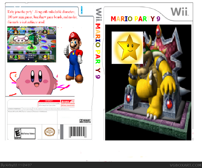
This is really bad.
The front is just bowser in a chair with a star covering his face.
The spine is made from the pencil tool in paint.
The back is just... really bad, and it's all together too WHITE!
And it only being your third box is a horrible excuse, link
that was my third box and it had a lot more effort than this.
#14 This is not bumping. I repeat, Im not trying to get attention. I just want to get this out of my mouth for everyone to hear already. Cant you see this was my second box?? My second. Please, stop already. Cant you see how much i've improved?
im not begging for comments but how the heck is this box getting more comments than the mine??? perhaps REMOVE THE STAR FROM BOWSER FACE!!! out a background, cut bowser black background, KIRBY?? cmon something like sonic or link but KIRBY???
Why even post this??? One word.... Horrible. Please get GIMP, Paint.NET or Photoshop! Sure there are some good tricks for paint and some people have some good boxes from paint but obviously not you!
 Mario Party 9 Box Cover Comments
its still bad. this is my third art and i plan to grow as an artist. so please comment and be as nice as possible! oh and i know that i should get rid of the star on the bowser.
Edited at 1 decade ago
[ Reply ]
Did you honestly even try?
This is really bad.
The front is just bowser in a chair with a star covering his face.
The spine is made from the pencil tool in paint.
The back is just... really bad, and it's all together too WHITE!
And it only being your third box is a horrible excuse, link
that was my third box and it had a lot more effort than this.
Edited at 1 decade ago
[ Reply ]
sorry. my next box will take longer, and i will put all my effort into it!
[ Reply ]
this is really worse. sorry to say, but the picture's are bad quallity and that star...
please try front only first
[ Reply ]
No dev logos on front or esrb, too white, just horrible.
Front: .5/5
Back: 1/5
[ Reply ]
#5, this..... is your box...
[ Reply ]
*bursts out laughing*
[ Reply ]
#6, hes trying to bump, and he put that hoping that reed wont notice
[ Reply ]
huh? what do you mean by bump? what does that mean? i was telling myself the mistakes i made, #6
[ Reply ]
#9, if you give yourself those ratings then why post it on the site?
[ Reply ]
#10 cause im getting better now, and i cant delete this so, im rating how bad it was.
[ Reply ]
make it 3d!
[ Reply ]
It might be better if you cut out the star
[ Reply ]
dude come on did you try im being series take that star off bowsers face then ill be 5/10
Edited at 1 decade ago
[ Reply ]
#14 This is not bumping. I repeat, Im not trying to get attention. I just want to get this out of my mouth for everyone to hear already. Cant you see this was my second box?? My second. Please, stop already. Cant you see how much i've improved?
[ Reply ]
#15, I can.
[ Reply ]
#14, come on, why do you have to bump an old piece of crap like this? No offense, kirby22. :p
[ Reply ]
im not begging for comments but how the heck is this box getting more comments than the mine??? perhaps REMOVE THE STAR FROM BOWSER FACE!!! out a background, cut bowser black background, KIRBY?? cmon something like sonic or link but KIRBY???
[ Reply ]
a kindergardener could to better
[ Reply ]
#19, This was made last year, you moron.
[ Reply ]
Why even post this??? One word.... Horrible. Please get GIMP, Paint.NET or Photoshop! Sure there are some good tricks for paint and some people have some good boxes from paint but obviously not you!
[ Reply ]
#21, That's kinda harsh, isn't it?
[ Reply ]
#21, you know hes good now?
He got a Hof and all.
He's better than you are
[ Reply ]
I see your new here so just to be nice as a gift ill fav
[ Reply ]
#7, *starts giggling* BWAHAHAHAH! Good one Star89er!
[ Reply ]
i think it good for third my first one people r mad at me for it
[ Reply ]
i dont see the point of putting a star on bowser's face...
[ Reply ]