looks very nice, quality and all but one thing i don't like is the text... it may be the font or the stroke... i dunno but it bugs me...
still, good work as always.
amazing work coming from you as always. My only gripe is that the logo is cut in the front. I know lowering it might compromise the design a bit, but nonetheless I think you should have included the whole thing. still amazing though :)
Thank you for the crits/comments. I had the hardest time with picking a suitable font for the text. Mainly because i did this on my new laptop and all of my downloaded fonts are still on a USB stick somewhere. >_>
The back was a pain in the ass as 1/4 of it is taken up by that legal junk and the overall smaller canvas space. I must say i have a respect for those that put together exceptional DS box arts. *looks in ffseer's direction*
#10 - I cut the logo myself. I also added a gradation to "Final Fantasy XII" and removed the Japanese text. Had i known there was one done already i would've saved some time and used yours with permission.
this... is.... amazing!! Gunslinger, your an amazing artist, and a very cool guy. I look up to you man, awsome box, 10/10 (:P the pic on the front was on the cover of nintendo power magezine a couple month ago, so that probably means that that's going to be the acrual cover :D they've done that with a bunch of games :) the logo is awsome thoough, real excelent work)
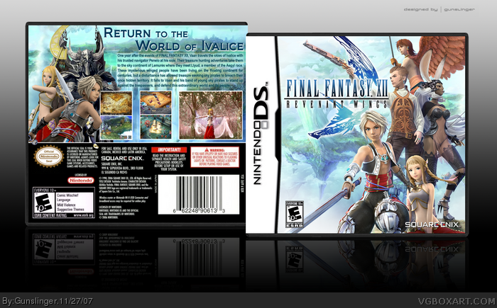
 Final Fantasy XII: Revenant Wings Box Cover Comments
My first DS box so be gentle. ^_^
As always your crits and comments are welcomed. Enjoy.
[ Reply ]
......not fair.......let say........it's sleek, crisp, clean and just perfect. fav+
[ Reply ]
looks very nice, quality and all but one thing i don't like is the text... it may be the font or the stroke... i dunno but it bugs me...
still, good work as always.
[ Reply ]
amazing work coming from you as always. My only gripe is that the logo is cut in the front. I know lowering it might compromise the design a bit, but nonetheless I think you should have included the whole thing. still amazing though :)
[ Reply ]
It's a splendid box art.
[ Reply ]
It's fantastic.
[ Reply ]
Front is....*drool*..
[ Reply ]
This is awesome ! I don't like the way you put the text though...
[ Reply ]
Thank you for the crits/comments. I had the hardest time with picking a suitable font for the text. Mainly because i did this on my new laptop and all of my downloaded fonts are still on a USB stick somewhere. >_>
The back was a pain in the ass as 1/4 of it is taken up by that legal junk and the overall smaller canvas space. I must say i have a respect for those that put together exceptional DS box arts. *looks in ffseer's direction*
[ Reply ]
this is so faved
just a q: is this my logo from simple needs forum, or you cut it yourself
if mine, it's ok to forget to credit, if not im sorry for assuming so
[ Reply ]
What surprises me is why this isn't in the hall yet. This is absolutely amazing! 5/5 +fav
[ Reply ]
#11, Agreed. ^_^
[ Reply ]
#10 - I cut the logo myself. I also added a gradation to "Final Fantasy XII" and removed the Japanese text. Had i known there was one done already i would've saved some time and used yours with permission.
Thanks again to all who faved and commented. ^^d
[ Reply ]
this... is.... amazing!! Gunslinger, your an amazing artist, and a very cool guy. I look up to you man, awsome box, 10/10 (:P the pic on the front was on the cover of nintendo power magezine a couple month ago, so that probably means that that's going to be the acrual cover :D they've done that with a bunch of games :) the logo is awsome thoough, real excelent work)
[ Reply ]
>=Perfection.
[ Reply ]
Srsly, Hall nao.
[ Reply ]
Bump'd 'cause this box isn't in the HoF when it should be.
[ Reply ]
Woah.
I know how it is to make a box for this game, and you did an amazing job :D!
+Fav.
[ Reply ]
This should be in the hall, Its a great box!
[ Reply ]
This ISN'T HoF! I'm shocked. And I'm faving it.
[ Reply ]
Its HoF now!
[ Reply ]
Yes! It got into the HoF! Congrats!
[ Reply ]