Alright... Immense credit to LadyKiller and Ross for being constructive on this WIP and giving me pointers. I couldn't have done it without their encouragement.
Wow, remember your last attempt at an Army of Two box? Heehee, a huge improvement since your last AoT box. You need to move the ESRB down into the corner a little bit more, that's all I can really see right now, nice job. 5/5
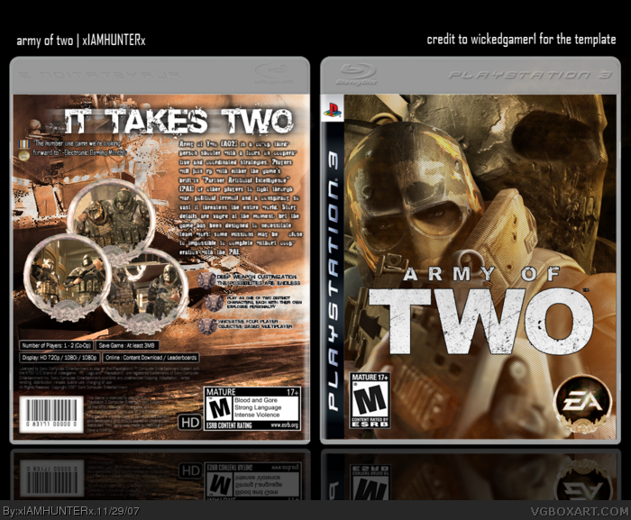
the front is just superb! 2 thumbs up man. Back is very nice as well, but once again, don't settle for anything less than the perfect back text and its positioning. Everything else looks great, it's just the back text that bothered me (as previously with your smg box) master that box element, because as what I've been seeing so far, it's what sets apart the great boxes from the amazing ones. cheers man ;)
anyway, I really would like to see a better font choice/positioning for the back, because that's what I think is what keeping this box from its full potential. I mean seriously, EVERYTHING else looks great.
If you don't have the time to update, I understand. But I trust you will remember in your next box? if so then
 Army Of Two Box Cover Comments
I love it, Fav.
[ Reply ]
#1, Thank you.
Alright... Immense credit to LadyKiller and Ross for being constructive on this WIP and giving me pointers. I couldn't have done it without their encouragement.
[ Reply ]
The template belongs to WickedGamer1, just to let you know. Nice box. It's actually pretty good.
[ Reply ]
"Actually"? That doesn't seem backhanded at all.
[ Reply ]
Wow, remember your last attempt at an Army of Two box? Heehee, a huge improvement since your last AoT box. You need to move the ESRB down into the corner a little bit more, that's all I can really see right now, nice job. 5/5
[ Reply ]
#5, Don't even go there. -.-
[ Reply ]
yeah, its nice
[ Reply ]
Thanks for the faves and comments, everyone.
[ Reply ]
the front is just superb! 2 thumbs up man. Back is very nice as well, but once again, don't settle for anything less than the perfect back text and its positioning. Everything else looks great, it's just the back text that bothered me (as previously with your smg box) master that box element, because as what I've been seeing so far, it's what sets apart the great boxes from the amazing ones. cheers man ;)
[ Reply ]
well, um, this is awesome...
[ Reply ]
Nice work, man. You've become the fastest improving member here =D
[ Reply ]
text on back could have been slightly bigger imo but apart from that m8 , its very very good well done ;)
[ Reply ]
Nice but the back is too plain and the text summary doesn't fit. Also, this last one is a bit hard to read.
[ Reply ]
This is awesome. Imma fav it. But maybe you should move the logo done just so it doesnt cover teh guys face.
[ Reply ]
#14, Thank you, I fixed that. Hope it looks better.
I also moved the text a little bit and made it bigger.
[ Reply ]
I hate it when people tell me I need to fix things, and then when I do, they don't say anything.
[ Reply ]
It looks better now.
*adds to favourites*
[ Reply ]
Thanks, dude. Means a lot coming from you.
[ Reply ]
#16, Well jeez mr. impatient pants, I wasnt home.
It looks |_____<--*Hands*-->_____| that much better
Edited at 1 decade ago
[ Reply ]
XDDD Mr. Impatient pants... Oh, and thanks! ^___^
[ Reply ]
The terrorists win if you don't comment on this box...
[ Reply ]
#21, errmm...that was quite unnecessary.
[ Reply ]
You're unnecessary. :P
[ Reply ]
#23, enough :P
[ Reply ]
You.
[ Reply ]
nice
[ Reply ]
#25, brilliant...lol
anyway, I really would like to see a better font choice/positioning for the back, because that's what I think is what keeping this box from its full potential. I mean seriously, EVERYTHING else looks great.
If you don't have the time to update, I understand. But I trust you will remember in your next box? if so then
+fav ;)
[ Reply ]
GAH *dies*
So what would you suggest?
[ Reply ]
Not to sound whiny or anything, but I really thought this box might have a shot...
[ Reply ]
Edited at 1 decade ago
[ Reply ]
this rocks really awesome 5/5
[ Reply ]
You could fave it.
[ Reply ]