i want to make better boxes, but i dont know what to do! i use paint. ok. i know, that's horrible. ive heard of paint.net and gimp, but i dont know how to use it. and you know what? i'll just view other boxes from now on and if i come across some idea, i probably wont, then i'll do it.
#8, ROFL! No offence to you Kirby 22, but seriously Harmeet! Three things:
Atleast check your post before you post it.
Don't give advice because everyone hates you.
And you see this box that is (No offence Kirby22) really awful all around, and all you say is "The Sonic Team logo DOEN'T look good" What is WRONG WITH YOU?! For the third time, no offence Kirby22.
guys, besides infamous stick you are really being mean..... have you seen kribys other boxes?!?! kirby has improved since the first box. it looks like he has put the most effort of all into this box
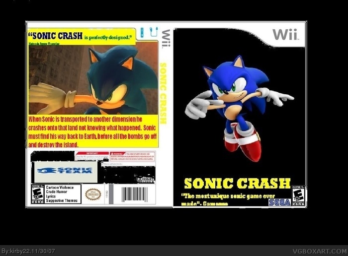
*sigh* where do i start with this.....
The front cover is just plain awful!!! Its just a black background with a picture of sonic on it... WOW! I bet it must of taken you hours to think of that design!! The SEGA logo should be cut out, the age rating logo should be on the left side and the font used is bad and just hard to read.
The back of the box says "Sonic Crash is perfectly designed"
Shame the box AINT!!!!! 1.5/5
woah! whats with all the comments!? okay i'll take a guide or tour or something. i know i screw all my boxes up, im just a B.A.I.T. LOL i just noticed bait, it stands for box artist in training.
 Sonic Crash Box Cover Comments
WTF?
[ Reply ]
dude, stop. youre submitting boxes to a point to where its spam. put more effort into your boxes. not just for you but for the sake of this site
Edited at 1 decade ago
[ Reply ]
ehh... you need to
. cut the template
. get better fonts
. and completly redo the back
1/5... I know you can do better...
[ Reply ]
...wow no or little effort 1/5 great idea but poorly done
Edited at 1 decade ago
[ Reply ]
i want to make better boxes, but i dont know what to do! i use paint. ok. i know, that's horrible. ive heard of paint.net and gimp, but i dont know how to use it. and you know what? i'll just view other boxes from now on and if i come across some idea, i probably wont, then i'll do it.
Edited at 1 decade ago
[ Reply ]
I have a suggestion,
get tutorials on gimp or paint.net
don't just look at it and go, "I GIVE UP!!!"
don't use paint
[ Reply ]
i attempted paint and it sucked GIMP is so much better if you can but photoshop sadly i can't but still
[ Reply ]
the sonic team logo doen't look good
[ Reply ]
#8, i dont think i should take advice from you.
[ Reply ]
#8, ROFL! No offence to you Kirby 22, but seriously Harmeet! Three things:
Atleast check your post before you post it.
Don't give advice because everyone hates you.
And you see this box that is (No offence Kirby22) really awful all around, and all you say is "The Sonic Team logo DOEN'T look good" What is WRONG WITH YOU?! For the third time, no offence Kirby22.
[ Reply ]
guys, besides infamous stick you are really being mean..... have you seen kribys other boxes?!?! kirby has improved since the first box. it looks like he has put the most effort of all into this box
[ Reply ]
go for u kirby22. Your one of my best friend son my site and i am on ur side!
[ Reply ]
*sigh* where do i start with this.....
The front cover is just plain awful!!! Its just a black background with a picture of sonic on it... WOW! I bet it must of taken you hours to think of that design!! The SEGA logo should be cut out, the age rating logo should be on the left side and the font used is bad and just hard to read.
The back of the box says "Sonic Crash is perfectly designed"
Shame the box AINT!!!!! 1.5/5
[ Reply ]
"Sonic Crash is perfectly designed".
Well, this box certainly isn't...
jk man, but this box isn't very good. You should take a guide or something. I reccomend mine or Youphoria's. You should check them out.
[ Reply ]
woah! whats with all the comments!? okay i'll take a guide or tour or something. i know i screw all my boxes up, im just a B.A.I.T. LOL i just noticed bait, it stands for box artist in training.
[ Reply ]
#14 why you steal my joke?! =[
[ Reply ]
#16, did i...? oh... i didn't see it.
[ Reply ]
Read comment #13
And you could always edit your comment out and remove the joke as i do claim credit for that joke and you did not ask permission to use it =P
[ Reply ]
its nice i can say check out my boxes a little bad but they mite help
[ Reply ]
Sorry but this is bad.0/5
[ Reply ]
#20 sorry but this is old.
[ Reply ]
0/5 Sorry, this is really bad.
[ Reply ]
#22 please dont bump, comment on my fourth box, say it's bad when we all know it was and we have improved, or critisize me.
[ Reply ]
tienes que hacer mucho mejor las boxarts
[ Reply ]