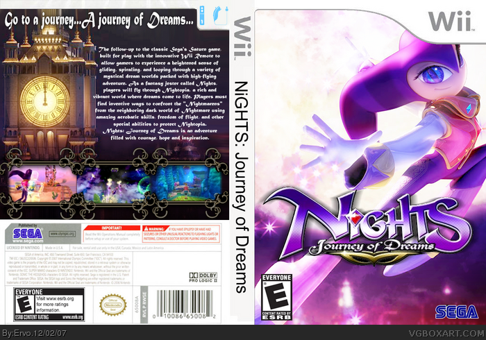
[ Buy Nights: Jour... at Amazon ] By Ervo 48 on December 2nd, 2007 No Printable Available [ Box updated on December 2nd, 2007 ] [ original ] Nights: Journey Of Dreams Box Cover Comments Comment on Ervo's Nights: Journey Of Dreams Box Art / Cover. Cancel Reply DeathSpawn11 47 [ 1 decade ago ] 2 boxes? both without ESRBs!?!?! you horrible person! XD [ Reply ] ELCrazy 50 [ 1 decade ago ] Naughty boy! Two boxes! :0 For shame..... lmao, good job btw. [ Reply ] Ervo 48 [ 1 decade ago ] damn, it uploaded twice :O Please people, comment on this one :) I'll add the ESRB now :D [ Reply ] Sp-6 40 [ 1 decade ago ] double good job:) [ Reply ] Ladykiller 42 [ 1 decade ago ] Very pretty screenshot borders. 2 thumbs up! It would be better though without the spine :) [ Reply ] darkwickus 41 [ 1 decade ago ] #5 is right about the screenshot borders. They are very nice! [ Reply ] frenchboy1 34 [ 1 decade ago ] The back is awesome ! I tihnk if you make a better front, it will be awesome. Now, back : 5/5 front : 3/5 cause it looks plain and simply boring... Come on ! [ Reply ] jimmysnimmy 1 [ 1 decade ago ] hey 5/5 because ive done this box 2 [ Reply ] Deoxys 26 [ 1 decade ago ] The side-text is too big, but I like the presentation of the screenshots. The text on the back could be nicer... The front... hmm... better than mine ;) 4/5 About the clock: You used that startpic of the official site for that game, right? ;) Edited at 1 decade ago [ Reply ] Vivi 1 [ 1 decade ago ] Loooooove this box. It just looks like something that would be published mainstream. Good job. [ Reply ] Mess98 1 [ 1 decade ago ] Spine text is a little icky, but aside from that it's amazing. [ Reply ]
 Nights: Journey Of Dreams Box Cover Comments
2 boxes? both without ESRBs!?!?!
you horrible person!
XD
[ Reply ]
Naughty boy!
Two boxes! :0
For shame.....
lmao, good job btw.
[ Reply ]
damn, it uploaded twice :O Please people, comment on this one :) I'll add the ESRB now :D
[ Reply ]
double good job:)
[ Reply ]
Very pretty screenshot borders. 2 thumbs up! It would be better though without the spine :)
[ Reply ]
#5 is right about the screenshot borders. They are very nice!
[ Reply ]
The back is awesome ! I tihnk if you make a better front, it will be awesome. Now,
back : 5/5
front : 3/5 cause it looks plain and simply boring...
Come on !
[ Reply ]
hey 5/5 because ive done this box 2
[ Reply ]
The side-text is too big, but I like the presentation of the screenshots. The text on the back could be nicer... The front... hmm... better than mine ;) 4/5
About the clock: You used that startpic of the official site for that game, right? ;)
Edited at 1 decade ago
[ Reply ]
Loooooove this box. It just looks like something that would be published mainstream. Good job.
[ Reply ]
Spine text is a little icky, but aside from that it's amazing.
[ Reply ]