[ Buy BioShock at Amazon ] By Joker7 5 on December 9th, 2007 No Printable Available [ Box updated on December 10th, 2007 ] [ original ] BioShock Box Cover Comments Comment on Joker7's BioShock Box Art / Cover. Cancel Reply Joker7 5 [ 1 decade ago ] This game is pretty sweet, so I decided to make a box for it, and I'm dedicating it to my cousin. Anyway, worked really hard on this. Hope you like. Note: M Logo looks kinda small, but look in full view. Xbox Live because of downloadable content. [ Reply ] xIAMHUNTERx 43 [ 1 decade ago ] Aw, nice! I actually just saw this render. You did a good job of placing it. I also like how the BioShock logo is tilted. Only thing I don't like is how the 2K logo is stretched. [ Reply ] Joker7 5 [ 1 decade ago ] Thank you very much! [ Reply ] TrevOwnz 42 [ 1 decade ago ] Well i would like this more if you would have skewed all the water so it was falling down not to the side. Its very easy to fix. [ Reply ] Joker7 5 [ 1 decade ago ] Anyone else? [ Reply ] Ladykiller 42 [ 1 decade ago ] I actually do like it. Esp. the placing of the logo. really nice :) [ Reply ] mooglybear 1 [ 1 decade ago ] the water dripping off the logo is also going sideways lol uh nice box besides that Edited at 1 decade ago [ Reply ] jevangod 50 [ 1 decade ago ] not a bad idea except fix the water falling off of the logo it should be falling to the bottom left. [ Reply ] Joker7 5 [ 1 decade ago ] Yeah, not quite sure how to do that. Any tips? Thanks guys. [ Reply ] mooglybear 1 [ 1 decade ago ] #9, maybe just delete it. [ Reply ] TwistedTinkerToy 43 [ 1 decade ago ] #10, Why would he delete it? It's good. 4/5 [ Reply ] TrevOwnz 42 [ 1 decade ago ] Well to fix the water in photoshop. Take the select took and copy one strand of water and then when its select go to transform - warp, skew or rotate so its falling down not to the side. [ Reply ] Joker7 5 [ 1 decade ago ] Thanks trev. I'll try and post a ver. 2. [ Reply ] Joker7 5 [ 1 decade ago ] VERSION 2!!!! I think this is my best box ever. Credit to dark_raider for the template. Edited at 1 decade ago [ Reply ] Iron Man 14 [ 1 decade ago ] The back is excelent. Although, I think the logo on the front is tilted a little bit too much. Still nice, though. 5/5 +Fav [ Reply ] Joker7 5 [ 1 decade ago ] Thanks. [ Reply ] mooglybear 1 [ 1 decade ago ] #11, i meant delete the water. nice update. where you get template!?!? [ Reply ] Star89er 34 [ 1 decade ago ] #17, It's near the end of the "Templates only" thread. [ Reply ] Kirbylore 35 [ 1 decade ago ] this is very good, probably your best yet. Good job :) [ Reply ] xstormthegatesofhellx 7 [ 1 decade ago ] Where'd 'oo get dat "Welcome to Rapture" thang? [ Reply ] TrevOwnz 42 [ 1 decade ago ] Looks way better great job. [ Reply ] Joker7 5 [ 1 decade ago ] Thanks everyone I reall appreatiate it! xstorm, I found the text on google images, and gave it a kind of, puffy rock effect to it on photoshop. [ Reply ]
 BioShock Box Cover Comments
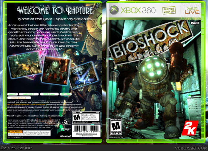
This game is pretty sweet, so I decided to make a box for it, and I'm dedicating it to my cousin. Anyway, worked really hard on this. Hope you like.
Note: M Logo looks kinda small, but look in full view.
Xbox Live because of downloadable content.
[ Reply ]
Aw, nice! I actually just saw this render. You did a good job of placing it. I also like how the BioShock logo is tilted.
Only thing I don't like is how the 2K logo is stretched.
[ Reply ]
Thank you very much!
[ Reply ]
Well i would like this more if you would have skewed all the water so it was falling down not to the side. Its very easy to fix.
[ Reply ]
Anyone else?
[ Reply ]
I actually do like it. Esp. the placing of the logo. really nice :)
[ Reply ]
the water dripping off the logo is also going sideways lol
uh nice box besides that
Edited at 1 decade ago
[ Reply ]
not a bad idea except fix the water falling off of the logo it should be falling to the bottom left.
[ Reply ]
Yeah, not quite sure how to do that. Any tips? Thanks guys.
[ Reply ]
#9, maybe just delete it.
[ Reply ]
#10, Why would he delete it? It's good. 4/5
[ Reply ]
Well to fix the water in photoshop.
Take the select took and copy one strand of water and then when its select go to transform - warp, skew or rotate so its falling down not to the side.
[ Reply ]
Thanks trev. I'll try and post a ver. 2.
[ Reply ]
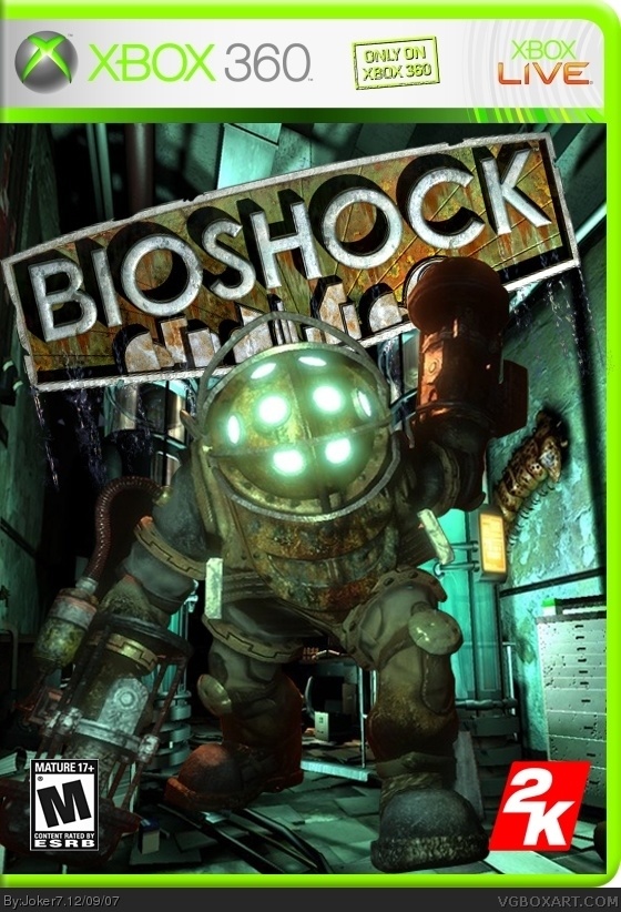
VERSION 2!!!! I think this is my best box ever. Credit to dark_raider for the template.
Edited at 1 decade ago
[ Reply ]
The back is excelent. Although, I think the logo on the front is tilted a little bit too much. Still nice, though. 5/5 +Fav
[ Reply ]
Thanks.
[ Reply ]
#11, i meant delete the water. nice update. where you get template!?!?
[ Reply ]
#17, It's near the end of the "Templates only" thread.
[ Reply ]
this is very good, probably your best yet. Good job :)
[ Reply ]
Where'd 'oo get dat "Welcome to Rapture" thang?
[ Reply ]
Looks way better great job.
[ Reply ]
Thanks everyone I reall appreatiate it! xstorm, I found the text on google images, and gave it a kind of, puffy rock effect to it on photoshop.
[ Reply ]