holy crap, 5/5, fav, thats awsome, and T T toy, some boxes of movies, games, and books have a small pic of da main char, and a larger pic, but the larger pic is ussually the same pic, fadded, joker7, can u try 2 make both pics da same, and the larger version fadded?
Thanks Hunter, Yeah I was going to say about how alot of boxes have a small then large picture. I really wish I knew how to fade, but I'm still getting better at Photoshop with every box. If anyone knows how to fade, please tell me.
#5, use the density tool, that should work, make it darker and fadded out, if dat dose'nt work, u get a free dis on any of my boxes... and if dat dont work, open a new file, paste the sonic, and spray it with white pixles, then paste it 2 ur pic...
Sometimes I feel like my boxes are underapreatiated, because I see crap boxes that are called alright, and then I work hard and make a good looking box, and it gets called alright.
 Sonic and the Secret Rings Box Cover Comments
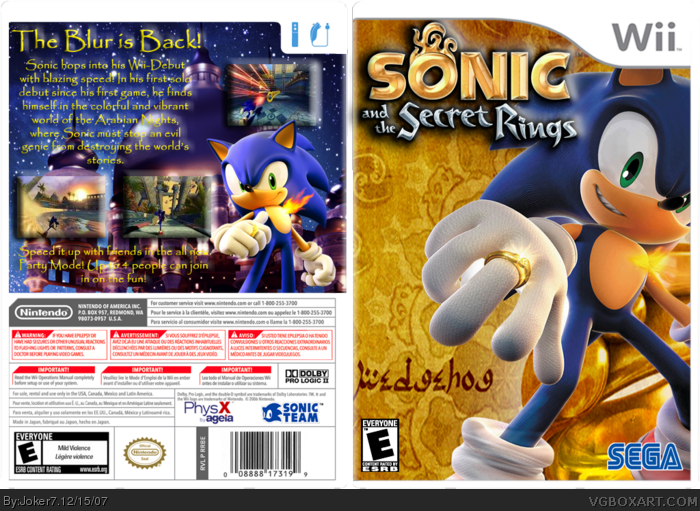
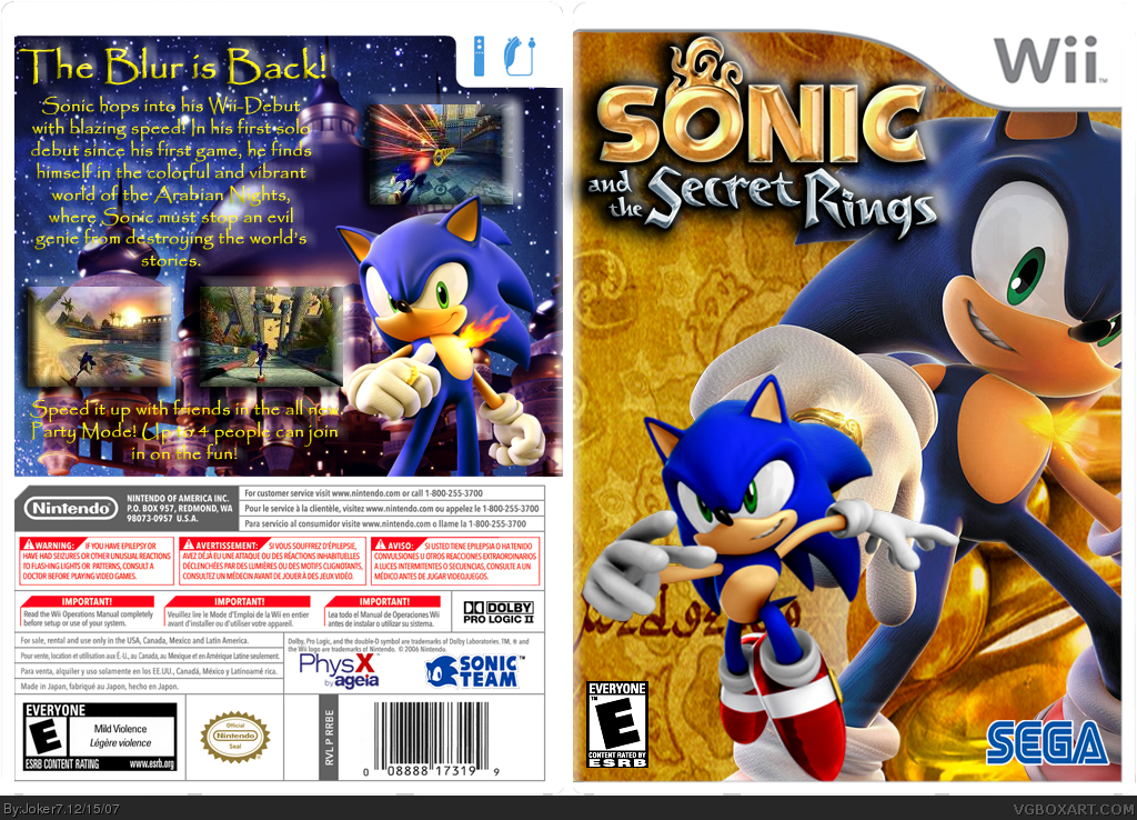
I really love how this one came out! Template credit to KoopaDasher. Hope you guys like it, my first Wii box in a while.
[ Reply ]
It's alright but it would be better if you only had one Sonic on the front.
[ Reply ]
holy crap, 5/5, fav, thats awsome, and T T toy, some boxes of movies, games, and books have a small pic of da main char, and a larger pic, but the larger pic is ussually the same pic, fadded, joker7, can u try 2 make both pics da same, and the larger version fadded?
[ Reply ]
#3, I know that. I just don't think it works so well on this box.
[ Reply ]
Thanks Hunter, Yeah I was going to say about how alot of boxes have a small then large picture. I really wish I knew how to fade, but I'm still getting better at Photoshop with every box. If anyone knows how to fade, please tell me.
[ Reply ]
#5, use the density tool, that should work, make it darker and fadded out, if dat dose'nt work, u get a free dis on any of my boxes... and if dat dont work, open a new file, paste the sonic, and spray it with white pixles, then paste it 2 ur pic...
Edited at 1 decade ago
[ Reply ]
#2, agreed.
[ Reply ]
Sometimes I feel like my boxes are underapreatiated, because I see crap boxes that are called alright, and then I work hard and make a good looking box, and it gets called alright.
[ Reply ]
#8, What are you talking about? We didn't say it was bad. We said you should remove the second Sonic.
[ Reply ]
#9, Ok, I updated. Tell me what you think!
Edited at 1 decade ago
[ Reply ]
its gr8, but u should get evry1s opinion 'bout the small and big faded
[ Reply ]
#11, You're the only one who liked that. It's much better now.
[ Reply ]
nuh uh, i just sugested it, it was a nice idea though, ohhhhhhhhhhhhhhhhhhhhhhhhhhhhhhhhhhhh well...
[ Reply ]
im not so crazy for the front, but the back is phenomenol! 4.5/5
[ Reply ]
I like it but i dislike how everything has a 3D bubble looking effect. Its a cool effect but you used it to much.
[ Reply ]
#15, Yeah, I used it on the text so you could read it better.
[ Reply ]