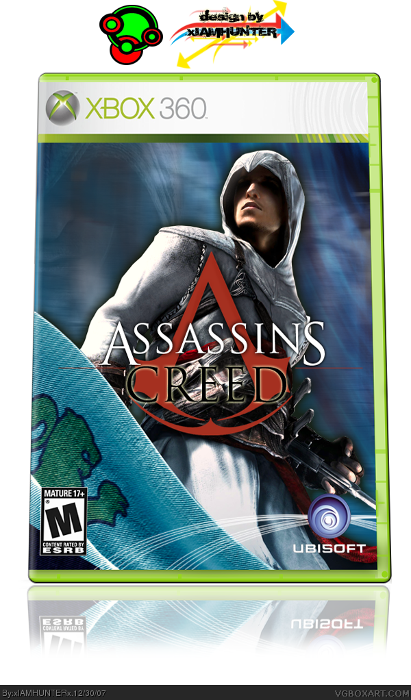
Sweet! Very clean and everything runs smooth. I like the red logo and everthing, but seems alittle "light" for an Assassins Creed game. Still a 5/5 for me
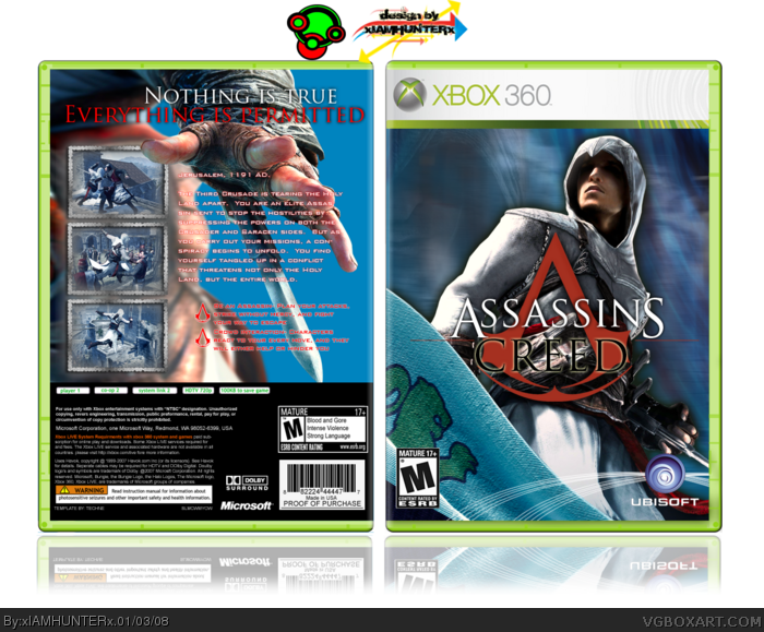
The front is pretty neat and nice but the back seems odd. There is a mix of genre in it. The screens make it looks medieval, but the text make it looks sci-fi. I think you should change the colour of the text and make it bigger.
 Assassin's Creed Box Cover Comments
T-minus 8...
HUGE credit on this box to Youphoria and Ross for the template, and to Youphoria for the Ubisoft lines. Couldn't have done it without you guys.
I think this might be my most intricate box, layer wise. I could be wrong, though.
Comments please!
[ Reply ]
T-minus 8? Uh.. what exactly are you counting down to?
Anyway, the box looks pretty good. 4.5/5.
P.S. At the top it says "designed by xIAMHUNTER". Where's the other "X"?
[ Reply ]
i like the way you did the logo.
[ Reply ]
#2, Oh, bollocks. >__< I'll fix that now.
Thanks, Ross.
[ Reply ]
I love everything EXCEPT the logo. it just looks tacky. what's wrong with using the official?
[ Reply ]
Well... It IS the official. Just red.
[ Reply ]
The logo is nice. 5/5
[ Reply ]
Give or take three weeks of work, countless requests/pleas, complete revamps, and FINALLY the submission... And this all equals out to four comments?
God bless America.
[ Reply ]
I mean, really, though...
[ Reply ]
#9, -.- I'm hamtaro.
[ Reply ]
nicely done man. I love the clean feel to it :)
[ Reply ]
#11, Thanks, dude! I'm always proud to get a fave from you. ^.^
[ Reply ]
d00d im zo orijunol nowon haz dun a aszazsunz cread bockz b4
[ Reply ]
Sweet! Very clean and everything runs smooth. I like the red logo and everthing, but seems alittle "light" for an Assassins Creed game. Still a 5/5 for me
[ Reply ]
Thank you, thank you.
[ Reply ]
I'm gonna update it in a few minutes, as first as someone answers this question-
The game has sci-fi overtones, obviously, but would it ruin the box if I used a futuristic font on the back?
[ Reply ]
Ahhh, screw it. Did the back with Bank Gothic anyway. :D
[ Reply ]
I think the back needs a background. Regardless, it's still great.
Edited at 1 decade ago
[ Reply ]
Man, I REALLY hope this doesn't go unnoticed...
[ Reply ]
eh... i don't like it now. the text is too much for me, and that light blue is too strong for my tastes. It's just not very easy on the eyes. Sorry
[ Reply ]
The text is too much for you? What exactly does that mean?
[ Reply ]
Oh, eff... I did the reflection wrong... XD I'm such a noib.
[ Reply ]
back is very plain :P
[ Reply ]
Because it has no background?
[ Reply ]
E_G's cool.
[ Reply ]
#25, which one of you is xIAMHUNTERx and which one is Techne?
[ Reply ]
We are both the other.
[ Reply ]
#27, oh. Wait... what?
[ Reply ]
I was him and he was me... And yet at the same time, I was myself and he was himself.
[ Reply ]
what did you use for the font on the back ? waht is the name?
[ Reply ]
It's called Pen Island.
[ Reply ]
#31, thanks a billion
[ Reply ]
Sure thing.
[ Reply ]
cant find it anywhere.
[ Reply ]
Did you try Pen Island.com?
[ Reply ]
ahah. i dont get duped. pen island. "penisland?" nice one. now i want the real name of the font please.
[ Reply ]
Haha, sorry. I couldn't help it.
Do you want the one on the back text, or the one on the tagline?
[ Reply ]
The front is pretty neat and nice but the back seems odd. There is a mix of genre in it. The screens make it looks medieval, but the text make it looks sci-fi. I think you should change the colour of the text and make it bigger.
[ Reply ]
Well... I would, but I can't really update it now.
[ Reply ]
even though altair looks like a girl ill still fav
gd box
[ Reply ]