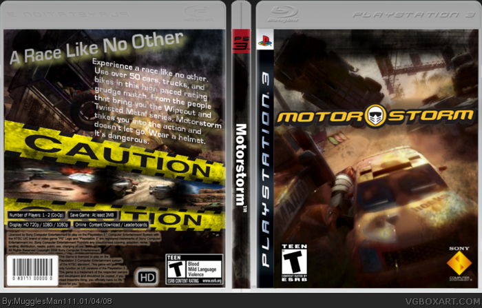
i put alot of thought into this, used alot of brushes, shearing like there was no tomorrow. the text was a little rough to make on the back and the caution tape took a while but i think it turned out alright. hope you guys like. and remember, comments and favs are well appreciated.
the front looks just like a burnout box... the screenshots are really blurry and hard to see. So is the text. That isn't your best work at all... You can do better.
 Motorstorm Box Cover Comments
i like this =D
[ Reply ]
well here is box #49 almost there to the big 5-0
i put alot of thought into this, used alot of brushes, shearing like there was no tomorrow. the text was a little rough to make on the back and the caution tape took a while but i think it turned out alright. hope you guys like. and remember, comments and favs are well appreciated.
#1, wow youre fast. thanks!
[ Reply ]
Probably your best yet. Faved.
[ Reply ]
#1 wow thanks dude
[ Reply ]
#2, i know, i am lightning fast, xD
[ Reply ]
Great, but the back is a bit too full and flashy imo, the slanted screens and text don't really fit too well imo.
[ Reply ]
looks nice
[ Reply ]
the front looks just like a burnout box... the screenshots are really blurry and hard to see. So is the text. That isn't your best work at all... You can do better.
[ Reply ]
Grrr... You gave credit in the forums, but not on the actual box! How dare you forget! I hate you! *runs away crying*
[ Reply ]
jees sorry 89er credit to you, WickedGamer1 and HellKnight for temp. and #6,#8 i respect your cc and ill try to work better. thanks though
[ Reply ]
I think it's your best and this deserves more favorites.
[ Reply ]
#11, agreed :)
[ Reply ]
#12 thanks TTT and LK, it mans alot :)
[ Reply ]
How did I miss this?
[ Reply ]
idk but im glad you found it :)
[ Reply ]
I forgot to say, this pwns. Oh, and I was just kidding about the temp thing, by the way. ;)
[ Reply ]