Heh, I woulda named it "Super Paper Smash" but other than that, good box! XD
I was actually going to make a box like this, but ah well...I've got too many random ideas anyways, so thanks for knocking one off my list for me! =P
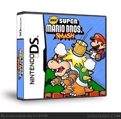
If it weren't for the New Super Mario Bros logo (maybe if you pasted the SMASH over the MARIO instead to make the title fit the original games more?), I'd give this a 5/5
It's decent, but everything is so blurry. Maybe I'm just a little spoiled from your usual high-res, two-sided boxes, but I didn't recognize this as your work at first. The smash text is especially blurry, I would have made that myself instead of cutting it from the old Smash Bros. logo. Also another character or two could possibly make it more dynamic.
If you would try to clear up the image, I'd fav, but right now I rate it 3.5/5.

 Super Mario Bros. SMASH Box Cover Comments
Nice idea. Add a rating and a dev logo.
[ Reply ]
oh right
haha
[ Reply ]
Heh, I woulda named it "Super Paper Smash" but other than that, good box! XD
I was actually going to make a box like this, but ah well...I've got too many random ideas anyways, so thanks for knocking one off my list for me! =P
If it weren't for the New Super Mario Bros logo (maybe if you pasted the SMASH over the MARIO instead to make the title fit the original games more?), I'd give this a 5/5
Either way, I'm debating faving this...
[ Reply ]
the stupid upload thing wanted it bigger...said something about a two-sided box, which it's not.
#3 thanks. i was seriously considering calling it super paper mario but im partial to the way the new super mario bros logo looks.
[ Reply ]
There soething about this i like...
=D
[ Reply ]
i like it, but i dislike the logo. maybe something like new super smash bros?
[ Reply ]
#6, yeah somthing like that this is a fav+
Edited at 1 decade ago
[ Reply ]
yeah, everything is...well, blurry. lol. especially the esrb and nintendo logos. but other that than, i actually kind of laughed.
[ Reply ]
It's decent, but everything is so blurry. Maybe I'm just a little spoiled from your usual high-res, two-sided boxes, but I didn't recognize this as your work at first. The smash text is especially blurry, I would have made that myself instead of cutting it from the old Smash Bros. logo. Also another character or two could possibly make it more dynamic.
If you would try to clear up the image, I'd fav, but right now I rate it 3.5/5.
[ Reply ]
not bad
[ Reply ]