[ Box updated on January 15th, 2008 ] [ original ]
 The Legend of Zelda: Phantom Hourglass Box Cover Comments
Comment on PressCorps's The Legend of Zelda: Phantom Hourglass Box Art / Cover.
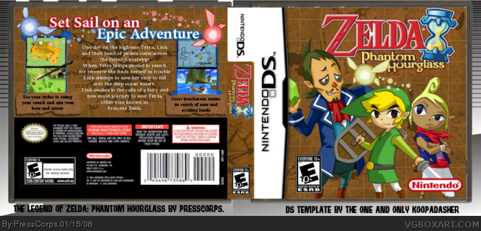
New box by moi. Cut out link myself, which was annoying and to make it worse I somehow didn't save it as .xcf so I had to start from scratch again.
Sorry if the rating is wrong. I'm from Australia so I don't know what it's rated, we just have a big G for our younger kid games.
I got this game 2 days ago, would have finished it yesterday but I got up to the last temple, got the shits and turned itoff without saving. the last place I saved was the Isle of the Dead. x.x So I had to do that temple, now I'm up to Bellum....I should go play it....it's awsome....if you have a DS, get it, forsure.
If you've played PH and gotten a fair way into it you'd know why Ciela is Yellow....
[ Reply ]
The back is really nice. But the front.... Make the front as good as the back and it would be great.
Link, Linebeck and Tetra looks just randomly placed.
[ Reply ]
#2 Umm random? They're in a line...
[ Reply ]
Very nice. There's areas for improvements such as the logo not fitting in, and I think you could've decided upon a more suitable background for putting behind the box.
Edited at 1 decade ago
[ Reply ]
Gosh man this is great i dont know why people are so picky 4/5 from me i might favorite it.
Edited at 1 decade ago
[ Reply ]
#2, How about describing how you think itd look better, and random?
Great box presscorps +fav
[ Reply ]
I like the back but the front is sorta.... er... well not plain but just sorta boring? Nothing just jumps out at me! Its just characters placed on a brown background!! I mean im not saying its a bad box by any means! But just not good enough for a fav, the front lets it down
4/5
[ Reply ]
It looks really good PC
[ Reply ]
#7 You can't really see it, but the background has islands and stuff on it, 'cause it's a map. but yeah.......Thanks for the comments guys.
[ Reply ]
I really think this needs more attention.
This box is really well done! (:
[ Reply ]
#4, agreed. still nicely done overall. keep it up m8
[ Reply ]
#10, I think all my boxes need attention. =P Thanks anyway.
#11 Thanks mate.
[ Reply ]
Get a new template and i will love it.
[ Reply ]
Back is beautifully made.
[ Reply ]
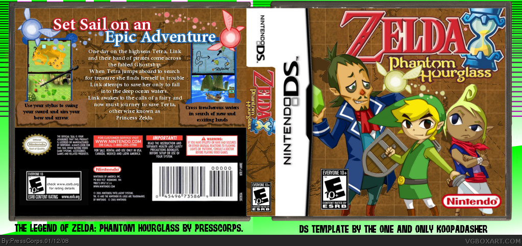
Update(for once). Only 'cause I personally really like this box and I don't know why it hasn't got much attention.
Made both the logos smaller so that they now fit on the box without going under the template. Also desaterated the background 'cause it was a bit too lime green....
EDIT: Whoops, forgot to add, I finished the actual game, man the last boss battle goes for ages. Now I just need to salavage all the treasure and get the Spirit Gems.
Edited at 1 decade ago
[ Reply ]
good
[ Reply ]
great back ok front
[ Reply ]