As soon as I saw the scan for this cover, I wondered how long it would take before somebody pasted it onto a template for a quick boxart.
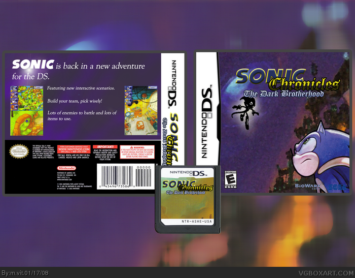
The back of the box is pretty boring and unappealing, generic white text with no special composition. The logo is alright, but I can't really say it fits well with a Sonic game (But then again, this game is hardly like any other.) The title on the spine is a little large, it might be better of stretched and squished, but then again, it might not be readable afterwards. The screenshots on the back don't have any kind of border, which always makes it look nicer. I also feel that the cartridge would be better of with just the title and a blue gradient or pattern of some sort, instead of a concept art scan.
Overall I'd give it a 2/5 (One point for making your own title, one point for actually putting it together.) but I can't really say that it has that many redeeming qualities.
#4, Those are pretty crappy critiques, my man. "Lame art style' is purely opinion. I happen to enjoy the artwork for the new game, use of logos isn't even mandatory, it's 100% optional, I don't understand why everyone turns to the logos when it comes to critiquing boxes. Though I do agree with your final statement, the back IS boring.
Also, I think #2 is referring to the fact that this boxart looks similar to the Grinch boxart, except for the fact that it has it's different. (He's right, if it weren't for the fact that they're different, they'd be exactly the same.)
"
Expect with a Sega and Bioware logo and also Sonic and that evil villain and don't forget the logo."
if you'd like to help me decode this i'd be grateful, right now it's making no sense to me whatsoever.
oh, and btw. the sega logo is supposed to have a white border around it. there's one in the FIRST PAGE of the simple needs forum, so there's no excuse for not having one. And I said the logo doesn't look very good, because, it doesn't.
Fair enough (Though I feel the need to point out that I have seen the Sega logo without the white border before, it's a pretty horrible choice in this context, though.)
Anyway, translation:
"...except with a Sega and Bioware logo..." (As opposed to whatever developer/publisher did The Grinch) "...and also Sonic and that evil villain and don't forget the logo." (Sonic and the villain instead of The Grinch, and the title of the Sonic game, instead of the title of The Grinch game.)
Like I said, if not for their differences, they'd be the same.
 Sonic Chronicles: The Dark Brotherhood Box Cover Comments
Sonic and some artwork copyright SEGA
Logo made by me
Okay, I messed up last time so if someone could delete a title delete the "Dark Chronicles" one. This is my second box, pleace C+C! (-.-U)
[ Reply ]
This boxart reminds me of this game
link
Expect with a Sega and Bioware logo and also Sonic and that evil villain and don't forget the logo.
3.5/5
[ Reply ]
As soon as I saw the scan for this cover, I wondered how long it would take before somebody pasted it onto a template for a quick boxart.
The back of the box is pretty boring and unappealing, generic white text with no special composition. The logo is alright, but I can't really say it fits well with a Sonic game (But then again, this game is hardly like any other.) The title on the spine is a little large, it might be better of stretched and squished, but then again, it might not be readable afterwards. The screenshots on the back don't have any kind of border, which always makes it look nicer. I also feel that the cartridge would be better of with just the title and a blue gradient or pattern of some sort, instead of a concept art scan.
Overall I'd give it a 2/5 (One point for making your own title, one point for actually putting it together.) but I can't really say that it has that many redeeming qualities.
[ Reply ]
i don't like it, the art style is lame, the logo isn't very good, the sega and bioware logos aren't right, and the back is really boring.
#2, what are you talking about? o.O
[ Reply ]
#4, Those are pretty crappy critiques, my man. "Lame art style' is purely opinion. I happen to enjoy the artwork for the new game, use of logos isn't even mandatory, it's 100% optional, I don't understand why everyone turns to the logos when it comes to critiquing boxes. Though I do agree with your final statement, the back IS boring.
Also, I think #2 is referring to the fact that this boxart looks similar to the Grinch boxart, except for the fact that it has it's different. (He's right, if it weren't for the fact that they're different, they'd be exactly the same.)
[ Reply ]
#5,
"
Expect with a Sega and Bioware logo and also Sonic and that evil villain and don't forget the logo."
if you'd like to help me decode this i'd be grateful, right now it's making no sense to me whatsoever.
oh, and btw. the sega logo is supposed to have a white border around it. there's one in the FIRST PAGE of the simple needs forum, so there's no excuse for not having one. And I said the logo doesn't look very good, because, it doesn't.
[ Reply ]
Fair enough (Though I feel the need to point out that I have seen the Sega logo without the white border before, it's a pretty horrible choice in this context, though.)
Anyway, translation:
"...except with a Sega and Bioware logo..." (As opposed to whatever developer/publisher did The Grinch) "...and also Sonic and that evil villain and don't forget the logo." (Sonic and the villain instead of The Grinch, and the title of the Sonic game, instead of the title of The Grinch game.)
Like I said, if not for their differences, they'd be the same.
[ Reply ]
can you send me the logo it cool
[ Reply ]