I'd prefer, that the Halo 3 logo is on the front and not on the back. And I don't like to see "Finish the fight" on the front, even as some kind of subtitle. And please correct the Bungie logo, it needs one color and not two, that looks ugly. I give it a... 3,5/5
Looks ok but i think there needs to be borders or something around the screen shots or maybe a look like the official where there is that weird border. idk you would have to look to see what I'm talking about.
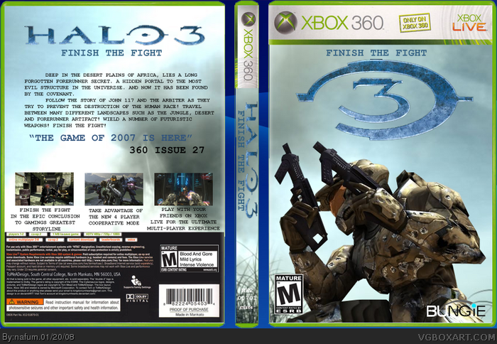
 Halo 3 Box Cover Comments
Credit to:
-Star89er for the great template
-Gutspiller on gamersgallery.com for the master chief and backdrop
-tothegame.com for the screenshots and logo
[ Reply ]
Anyone got any comments?
[ Reply ]
looks good! I suggest some more action on either the front or back though or perhaps a better font for the back?
[ Reply ]
#3, Ok thanks
[ Reply ]
I'd prefer, that the Halo 3 logo is on the front and not on the back. And I don't like to see "Finish the fight" on the front, even as some kind of subtitle. And please correct the Bungie logo, it needs one color and not two, that looks ugly. I give it a... 3,5/5
Edited at 1 decade ago
[ Reply ]
Looks ok but i think there needs to be borders or something around the screen shots or maybe a look like the official where there is that weird border. idk you would have to look to see what I'm talking about.
[ Reply ]