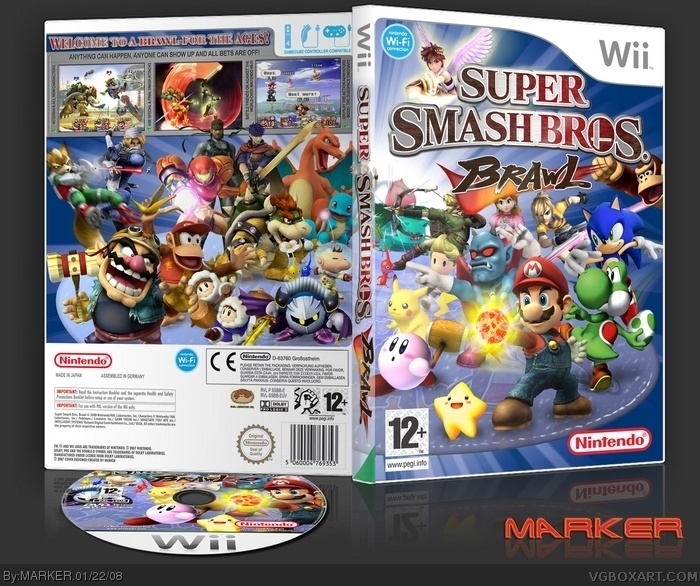
Well... Everyone seem to have done a SSBB cover... so thought I'll do one too :)
Actually, I could have spent a few more days doing this, adding extra effects, but I thought I better stop... anyway... hope you like it... although I guess a few won't as some peeps don't like 'cluttered; boxes --- I say, none of my boxes are cluttered... they are just organised chaos!! LOL
As always, view in Full View... and you can grab the full-size printable version @300dpi at the usual place (when I upload it). ;)
Anywho, On the box, some people's eyes look kinda wierd (Sonic), and I dislike how the "Smash Bros." part of the logo on the spine is curved. Nonetheless, it's great. You should seriously turn this into a wallpaper.
#4, I had to edit the eyes or a few of the characters would be facing wrong direction which would look even more weird IMO. As for the SMASH BROS logo on spine... I used the original which is already curved, so can't be helped without making one from scratch or distorting it.
Do you guys seriously want a wallpaper? If so what resolution you want it? Actually... the wallpaper would look better, as I originally planned Donkey Kong swinging on the edge of the ice disc, but when I stuck him in the bottom corner, you could hardly see him, so removed him and used the Barrel Blast version and put him higher up! ;)
wow really cool. I love the picture you used, just kills it. The screens are well chosen and the whole presentation of it is amazing. WALLPAPER PLEASE! 1024x768 would be nice thanks +fav
Okay... here's the WALLPAPER I've quickly done. Slight cleanup of Masking (Renders)... and as I said earlier, put Donkey Kong hanging from the edge of the ice disc! ;) Plus added a mine (?) since that part was covered up before.
I really don't know why peeps think Sonic looks weird... I bet if I didn't mention that I changed some of the eyes.. none of you would have noticed. On Sonic, I only moved the left eye a few pixels to the left. I bet if the original person that draws Sonic, it would look fairly similar since Sonic has strange eyes. I mean... look at this pic of Sonic... Weird??
That's pretty sick! Only one suggestion. just an additive. Maybe you should put the 7 star spirits on there! just a thought, make it look a little cooler.
#11, LOL --- Looks like I converted you to liking my box considering your remark to it in my WIP thread! ;) Thanks for the FAV too ---- although at last count... there's 21 FAV for this, but NO HOF --- oh well. ;)
#25, Yeah... he couldn't remove the my name's reflection since it will bugger up the image, or my name on the back of the box itself. I see if you click on his name, he's got a number of images from here too (although he hasn't added his name to them).
 Super Smash Bros. Brawl Box Cover Comments
Well... Everyone seem to have done a SSBB cover... so thought I'll do one too :)
Actually, I could have spent a few more days doing this, adding extra effects, but I thought I better stop... anyway... hope you like it... although I guess a few won't as some peeps don't like 'cluttered; boxes --- I say, none of my boxes are cluttered... they are just organised chaos!! LOL
As always, view in Full View... and you can grab the full-size printable version @300dpi at the usual place (when I upload it). ;)
[ Reply ]
Well it's certainly busy but it's very exciting Fav+1.
[ Reply ]
Looks great!
[ Reply ]
#2, Atk + 3, Def + 2, Fav + 1. Fits in perfectly doessn't it?
Anywho, On the box, some people's eyes look kinda wierd (Sonic), and I dislike how the "Smash Bros." part of the logo on the spine is curved. Nonetheless, it's great. You should seriously turn this into a wallpaper.
[ Reply ]
Um..I like it, but it's a little cluttered or my taste, so I'm not gona fav it, no offense. It's Really good, but not my cup o' tea.
[ Reply ]
Thanks all! ;)
#4, I had to edit the eyes or a few of the characters would be facing wrong direction which would look even more weird IMO. As for the SMASH BROS logo on spine... I used the original which is already curved, so can't be helped without making one from scratch or distorting it.
Do you guys seriously want a wallpaper? If so what resolution you want it? Actually... the wallpaper would look better, as I originally planned Donkey Kong swinging on the edge of the ice disc, but when I stuck him in the bottom corner, you could hardly see him, so removed him and used the Barrel Blast version and put him higher up! ;)
[ Reply ]
Dude, I WANT this as wallpaper!! 1024x768 please :D This box WINS.
[ Reply ]
Stafy is on this box, hes my favorite character so +fav rofl
[ Reply ]
I dislike how your templates are always so blurry but i love the boxes so much.
[ Reply ]
wow really cool. I love the picture you used, just kills it. The screens are well chosen and the whole presentation of it is amazing. WALLPAPER PLEASE! 1024x768 would be nice thanks +fav
[ Reply ]
Epic Fav.
[ Reply ]
Okay then, expect a 1024x768 Wallpaper later... I would have choosen higher-res... but above size is easier to do I guess! ;)
[ Reply ]
This is really special!!!
If it weren't for you ruining Sonics face... i prob would of faved it =/
[ Reply ]
awsome! i love how you always make the covers laying on the ground. FAVED.
[ Reply ]
Okay... here's the WALLPAPER I've quickly done. Slight cleanup of Masking (Renders)... and as I said earlier, put Donkey Kong hanging from the edge of the ice disc! ;) Plus added a mine (?) since that part was covered up before.
I really don't know why peeps think Sonic looks weird... I bet if I didn't mention that I changed some of the eyes.. none of you would have noticed. On Sonic, I only moved the left eye a few pixels to the left. I bet if the original person that draws Sonic, it would look fairly similar since Sonic has strange eyes. I mean... look at this pic of Sonic... Weird??
link
Amyway... here's link to WALLPAPER...
link
Edited at 1 decade ago
[ Reply ]
That's pretty sick! Only one suggestion. just an additive. Maybe you should put the 7 star spirits on there! just a thought, make it look a little cooler.
[ Reply ]
#11, LOL --- Looks like I converted you to liking my box considering your remark to it in my WIP thread! ;) Thanks for the FAV too ---- although at last count... there's 21 FAV for this, but NO HOF --- oh well. ;)
[ Reply ]
*craps in pants*
[ Reply ]
What did you do to the characters eyes?!
J/k. Really nice btw. 5/5
[ Reply ]
It's good, a bit cluttered, but good. I would say take Snake and Sonic out, since they're secret characters.
[ Reply ]
No they aren't...
[ Reply ]
Well, they're unlockable, but almost everyone knows they're in it.
[ Reply ]
Your work never ceases to amaze me, marker!
[ Reply ]
Congrats, here's someone who uses it: link
Edited at 1 decade ago
[ Reply ]
#24, Wow, what a lamer that kid is. Erased (and poorly at that) Marker's name and replaced it with his.
Edited at 1 decade ago
[ Reply ]
#25, Yeah... he couldn't remove the my name's reflection since it will bugger up the image, or my name on the back of the box itself. I see if you click on his name, he's got a number of images from here too (although he hasn't added his name to them).
Edited at 1 decade ago
[ Reply ]
So Good
[ Reply ]
I like the back!
[ Reply ]
As usual:AWSOME!!!
[ Reply ]
really nice but could do without the speach bubble over mario and donkey kong in the screen shot
[ Reply ]
#30, Thats part of the screenshot, you can do speech bubbles in the game ;)
[ Reply ]
i dilike sonic eyes, otherwise great, fav and author fav.
[ Reply ]
Ah!!!! Nintendo is exploding all over the box! Jk, nice work.
[ Reply ]
I've gotta say, I love it. I'm not so sure, so 4.5.
Edited at 1 decade ago
[ Reply ]