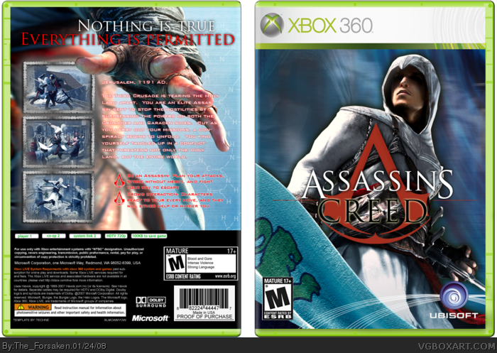
I added a background on the back part and touched it up in places. I changed the text around a little bit and added a few subtle effects to Altair on the front.
interesting and refreshingly different from other assassin's creed boxes. The colors are much brighter as usual and there's not so much stuff going on. I like that.
+fav
 Assassin's Creed Box Cover Comments
You're getting a lot better.
[ Reply ]
<____<
>____>
*runs away*
Creds to Youphoria for the Ubi lines, Ross for the temp, DS for providing the DNA pattern on the back, yada yada yada...
[ Reply ]
yes.
[ Reply ]
#3, XD
[ Reply ]
Why did you resubmit?
[ Reply ]
I was going to update my last one, but do to muh ban I couldn't. So I fixed a few small things and re-submitted.
[ Reply ]
and teh borders :P
[ Reply ]
Oh yeah, credit to muh good friend Al for the screenshot borders.
[ Reply ]
Good work, but I don't like the comic-style front, it doesn't fit with the real game. 4/5
[ Reply ]
link
Why is this exactly the same ? Why did you resubmitted it ?
...
[ Reply ]
...........
Do you bother to read? Like, at all? Look at #6... Sheesh...
[ Reply ]
#11, I read it but I this isn't a reason to resubmitting it.
[ Reply ]
#11, Whats the difference between this and the back one
[ Reply ]
I added a background on the back part and touched it up in places. I changed the text around a little bit and added a few subtle effects to Altair on the front.
[ Reply ]
I like it, it's refreshing, apart from the dark glow around Altair on front and the red stroke on the white text on the back.
[ Reply ]
I don't like it. Front cover is not even close to formal boxart. Text on the bax is too red. It should be white with black stroke.
[ Reply ]
interesting and refreshingly different from other assassin's creed boxes. The colors are much brighter as usual and there's not so much stuff going on. I like that.
+fav
[ Reply ]