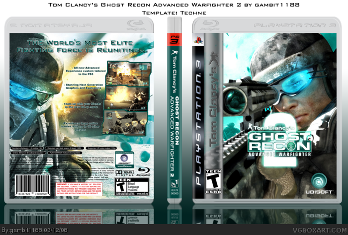
[ Box updated on March 12th, 2008 ] [ original ]
 Tom Clancy's Ghost Recon: Advanced Warfighter 2 Box Cover Comments
Comment on gambit1188's Tom Clancy's Ghost Recon: Advanced Warfighter 2 Box Art / Cover.
My first box in a while. This took me quite a bit of time. Please view in full view. Comments and Crits are alway appreciated.
Major Credit to Techne for his awesome Temp.
[ Reply ]
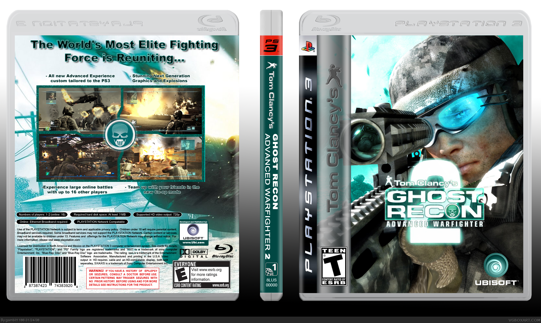
OhmyGAH yes. Although the Clancy bar looks a little too wide, and I would have preferred a GRAW 2 logo WITHOUT the "Tom Clancy's" above it, since you already have his name on the bar. Nice job though.
[ Reply ]
Thanks for the favs. Any other crits?
[ Reply ]
Actually, yeah. There are a few other minuscule things I noticed.
The ESRB on the back should be Teen.
The tagline font doesn't really fit...
That's pretty much it, though.
[ Reply ]
Totally missed the back ESRB. Any suggestions for a better font?
Edit:Updated with new ESRB.
Edited at 1 decade ago
[ Reply ]
very cool (I think the headline is fine :D)
[ Reply ]
Really nice.
If the headline has a font change, I'd definitely fave it.
I suggest Usuzi or Bank Gothic.
[ Reply ]
Updated the headline font. For some reason I didn't have either of those fonts on my computer or I would have probably used them to start with. I also slimed down the TC sidebar a bit.
[ Reply ]
BTW, did you get that art from OXM (on the front)? I was planning on doing the same thing, but I couldn't find that issue. >___<
[ Reply ]
great job
[ Reply ]
I'm not exactly sure where I got that art. I might have found it at gamersgallery or using a google search. I made some modifications to it (like the body in the sight). Keep the Comments, crits and favs coming!
[ Reply ]
Slow on the comments today, I'm trying to think of any ways that I can improve the back. Does anyone have any ideas?
[ Reply ]
Thanks for the fav jevan.
[ Reply ]
not bad.
[ Reply ]
Thanks for the fav techne, worki my way up there!
[ Reply ]
Does anyone have the ubi lines that they can pm me? I really want to try those on this box.
Thank for another fav!
[ Reply ]
Looks better, although the tagline could have lesser space between the lines, oh well, still a great job and a fav from me! ;)
[ Reply ]
#11, Oh damn, I just noticed that. Nice touch. ;)
[ Reply ]
Thanks for pointing that out ELCrazy. Thats just the default for the font. I'll look into a change and update later.
[ Reply ]
i'd make the 4 pictures on the back slightly bigger, but overall nice job gambit.
[ Reply ]
Yet another update. Took out some space in the headline this time. Thanks all! More comments always welcome!
[ Reply ]
I'd also think about thinning the Tom Clancy bar to the width of the ESRB rating.
[ Reply ]
I felt like the back on the previous versions was kind off lacking something so I redid it and this is what I came up with. As always, comment and crits welcome. I do have the previous back still saved on my computer so I can roll it back if you guys like the old back better.
[ Reply ]
Holy boogers.
I love this box, and you should too.
[ Reply ]
Thanks for the additional favs as well as the author favs. I'm trying to get more involved in the sight but college gets most of my time now. Currently working on a rs vegas box. I'll post in a WIP thread later.
[ Reply ]
#25, Can't wait!
[ Reply ]
very nice. :)
[ Reply ]
Thanks. Glad to see the new back getting some attention.
[ Reply ]
I updated this box yet again with a bit better presentation. I'm kinda stalled on my next box so I was just messing around with my presentation so here it is!
[ Reply ]
printable plz? +fav
[ Reply ]