[ Buy Assassin's C... at Amazon ] By DeathSpawn11 47 on January 25th, 2008 No Printable Available Assassin's Creed Box Cover Comments Comment on DeathSpawn11's Assassin's Creed Box Art / Cover. Cancel Reply DeathSpawn11 47 [ 1 decade ago ] cred to Koopa for the temp. this is a quickie for me, but it isn't since it took me a couple hours lol. the screens are odd looking cause I had to kinda warp them to the flag. [ Reply ] jevangod 50 [ 1 decade ago ] Not bad [ Reply ] IceFox 42 [ 1 decade ago ] I continue to be aamazed. I like how you did the back and the screens, it all flows really well. I don't like the template much though (the way the spine is mostly) [ Reply ] The Forsaken 6 [ 1 decade ago ] I love the effect of the screens on the flag. [ Reply ] E_G 39 [ 1 decade ago ] The box is splendid. [ Reply ] DeathSpawn11 47 [ 1 decade ago ] thx for the comments guys ^_^ [ Reply ] VGMaster 42 [ 1 decade ago ] Every once and a while, I see a box and go "Holy crap!" This happened to me twice today! This is amazing! Total fave! [ Reply ] Techne 1 [ 1 decade ago ] Screenshot placement was awesomely done dude. [ Reply ] The Forsaken 6 [ 1 decade ago ] *nods* Only complaint I have is the Ubi lines- perhaps it would be better to just have the regular logo, since it's hard to see the lines? [ Reply ] Ayron 47 [ 1 decade ago ] As i've said before, this is awesome dude. [ Reply ] Vengeance 40 [ 1 decade ago ] i want you dead. [ Reply ] Ladykiller 42 [ 1 decade ago ] you rock P.S. DS, can you tell me the font you used for your sig? tnx [ Reply ] DeathSpawn11 47 [ 1 decade ago ] #12, lol, "P.S. DS" the font is called Bellrose. [ Reply ] frenchboy1 34 [ 1 decade ago ] Awesome :O Did you get the font from dafont.com ? If not, where else ? [ Reply ] DeathSpawn11 47 [ 1 decade ago ] #12&14, sorry my bad, it's called bellerose. I made a typo. linky to it below link [ Reply ] Syrup_hugger 1 [ 1 decade ago ] wow! this is amazing! ur a really good artist :) :) [ Reply ] burgerking13 1 [ 1 decade ago ] its probaly the best assassins creed ds box on this sight [ Reply ]
 Assassin's Creed Box Cover Comments
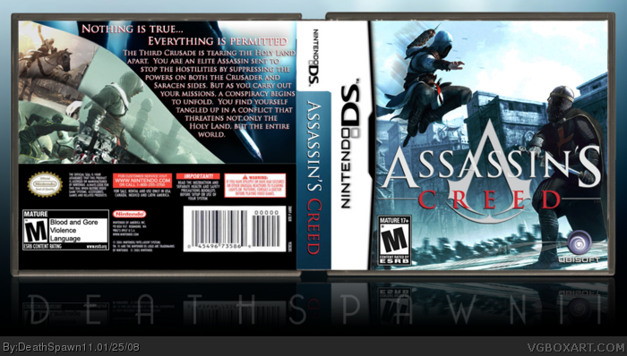
cred to Koopa for the temp. this is a quickie for me, but it isn't since it took me a couple hours lol. the screens are odd looking cause I had to kinda warp them to the flag.
[ Reply ]
Not bad
[ Reply ]
I continue to be aamazed. I like how you did the back and the screens, it all flows really well.
I don't like the template much though (the way the spine is mostly)
[ Reply ]
I love the effect of the screens on the flag.
[ Reply ]
The box is splendid.
[ Reply ]
thx for the comments guys ^_^
[ Reply ]
Every once and a while, I see a box and go "Holy crap!"
This happened to me twice today!
This is amazing!
Total fave!
[ Reply ]
Screenshot placement was awesomely done dude.
[ Reply ]
*nods* Only complaint I have is the Ubi lines- perhaps it would be better to just have the regular logo, since it's hard to see the lines?
[ Reply ]
As i've said before, this is awesome dude.
[ Reply ]
i want you dead.
[ Reply ]
you rock
P.S. DS, can you tell me the font you used for your sig? tnx
[ Reply ]
#12, lol, "P.S. DS" the font is called Bellrose.
[ Reply ]
Awesome :O
Did you get the font from dafont.com ? If not, where else ?
[ Reply ]
#12&14, sorry my bad, it's called bellerose. I made a typo. linky to it below
link
[ Reply ]
wow! this is amazing! ur a really good artist :) :)
[ Reply ]
its probaly the best assassins creed ds box on this sight
[ Reply ]