"You ever read a book that changed your life? Me neither." ~ Jim Gaffigan
My best box yet, by far I think. I worked really hard on this one so please make a comment if you opened this up. And view it on FULL VIEW PLEASE.
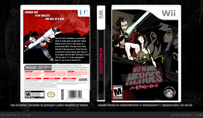
I wanted to try something a little different for a No More Heroes box instead of doing the same red overdose, so I did a mostly grey tone with some punk pink added in. Except the red on the back of course. I ramble, did I ever mention that?
Yes, there ARE SCREENSHOTS ON THE BACK. They are under the red part, trust me on this, it would have look horrible if I lowered the opacity any more, I tried and it was ugly. Just look there and you'll see them, if you don't see them, I don't know what to tell you.
Still rambling and I doubt you are still reading this.
i'm glad so many people like this game. did anyone hear Grasshopper is doing the new Fatal Frame. anyways, you should slide down the front pic so Travis is more the focal point (and it'll cover up the random Travis ear! dunno why that bothers me). right now it kinda looks like Holly is the main character. or maybe put her behind him. overall a good box! 7/10
 No More Heroes Box Cover Comments
"You ever read a book that changed your life? Me neither." ~ Jim Gaffigan
My best box yet, by far I think. I worked really hard on this one so please make a comment if you opened this up. And view it on FULL VIEW PLEASE.
I wanted to try something a little different for a No More Heroes box instead of doing the same red overdose, so I did a mostly grey tone with some punk pink added in. Except the red on the back of course. I ramble, did I ever mention that?
Yes, there ARE SCREENSHOTS ON THE BACK. They are under the red part, trust me on this, it would have look horrible if I lowered the opacity any more, I tried and it was ugly. Just look there and you'll see them, if you don't see them, I don't know what to tell you.
Still rambling and I doubt you are still reading this.
Edited at 1 decade ago
[ Reply ]
no more no more heroes boxes.xD!!
allthough, this is pretty good.
[ Reply ]
The front is classic.
The back is a little plain though.
4/5
[ Reply ]
pretty cool. i like the front a lot back im not too crazy about. still fav
[ Reply ]
Yeah, the back could use some screenshots maybe.
[ Reply ]
5 *sigh*
Read my first post.
[ Reply ]
#6, I know, I saw them, but I just don't think it looks great.
Edited at 1 decade ago
[ Reply ]
Im diggin the front. But the back is a lil to empty. But that collage thing is cool though.
[ Reply ]
i'm glad so many people like this game. did anyone hear Grasshopper is doing the new Fatal Frame. anyways, you should slide down the front pic so Travis is more the focal point (and it'll cover up the random Travis ear! dunno why that bothers me). right now it kinda looks like Holly is the main character. or maybe put her behind him. overall a good box! 7/10
Edited at 1 decade ago
[ Reply ]
Fronts good, but the back is lacking, too much empty space.
[ Reply ]
I really like the front, different, but a nice take nonetheless. good job.
[ Reply ]
I really like this one :(
I think this is my best, and even boxes of mine that I don't like fare better than this.
[ Reply ]
Woah....I love the front, and I'm gonna fave it just for that :D
[ Reply ]