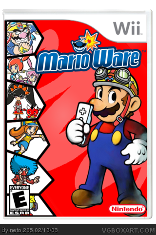
yeah neto! maybe add some mario characters on the side? you left the w on mario's hat, but i still have to fave it. great job, you are really improving.
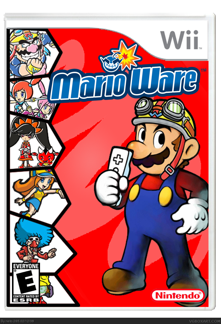
Being someone who likes to work with logos, I moticed this. The 'M' is too boviously a 'W' upside down. Why? The logo's gradient. The dark blue is normally at the bottom, but is on the top on the 'M'. That's a big problem. You have to watch out for these kinds of logos. My suggestion is to mek the 'M' it's own layer and add a gradient overlay. Use the same colors as the rest, but make the gradient match. I know it's not a big deal, but it bugs me. And just watch out for this in the future.
 Mario Ware Box Cover Comments
rofl thats awesome. Only issue is you left the "w" on Marios hat. But thats a nitpick, +fav
[ Reply ]
Well-made, although Wario should be enraged that his game has been stolen. :D
[ Reply ]
Not bad.
[ Reply ]
Nice
[ Reply ]
sweet
[ Reply ]
Clever.
[ Reply ]
Great.
[ Reply ]
lol this should have been on satire, good job :P
[ Reply ]
awsome. looks like a wario ware box. with the 'W' flipped around...... +fav.....
[ Reply ]
you should edit out the little Wario bomb logo thing on the title, maybe change the mustache so it looks more like Mario.
[ Reply ]
yeah neto! maybe add some mario characters on the side? you left the w on mario's hat, but i still have to fave it. great job, you are really improving.
[ Reply ]
I just noticed a BIG problem.
Being someone who likes to work with logos, I moticed this. The 'M' is too boviously a 'W' upside down. Why? The logo's gradient. The dark blue is normally at the bottom, but is on the top on the 'M'. That's a big problem. You have to watch out for these kinds of logos. My suggestion is to mek the 'M' it's own layer and add a gradient overlay. Use the same colors as the rest, but make the gradient match. I know it's not a big deal, but it bugs me. And just watch out for this in the future.
[ Reply ]
#12, lol, "moticed", was that intentional? :P
Edited at 1 decade ago
[ Reply ]
Of course! Everything i do is nitentional! XD
[ Reply ]
turn the "W" on mario's cap.
and the bomb or the mustashe.
[ Reply ]
#12, thanks! I've fixed the logo's gradient.
[ Reply ]
great (except for the w on the hat) +fav
[ Reply ]
awsome faved
[ Reply ]
Now it's really Finished!
[ Reply ]
I dont like this boxart, i LOVE this boxart!
[ Reply ]
nice
[ Reply ]
Why it isn't in the HoF????
I mean... it has 32 favs.
[ Reply ]
#22, depends on the ranks of the people faving it.each rank 1 represents one vote, each rank 2 represents 2, and so on. it need 100 votes to get in.
[ Reply ]
Its-a in-a =D
[ Reply ]
yeah it mayx a da hall =]
[ Reply ]
not bad not bad at all
Edited at 1 decade ago
[ Reply ]
Congratulations. Your second Hall of Fame.
[ Reply ]
YAY!! #23, thaks!!!
Thanks to all of you! :D
[ Reply ]
awesome! Where'dn you get the realistic temp?
4.5/5 and faved
[ Reply ]
Edited at 1 decade ago
[ Reply ]
Gj.
[ Reply ]
+fav +author fav
[ Reply ]
oh wow, i am faving this one! good job! XD
[ Reply ]