Ohhh I've been waiting for someone to make a box for this game, awesomeness, the only thing I dislike is how the screenshots are piled together. Fav+1.
Thank you EG, I agree the method I used to put the screen shots together on the back of the art is a bit different, I wanted to bring in as many screenies as possible without reducing space, oh well I am pleased with how it turned out.
this box looks fantastic, i think that the logo should be centered and the screenshots on the back are..hmmm..awkwardly placed, but the overall box looks trememndous.....ly awesome :D +fav/+fav author
Thanks everyone for the feedback, I might do an update with a new layout for the screenies on the back. And #10, hopefully you see why the logo could not be centered.
i think the screenshots would look neaters with subtle borders, but other than that, this is beauty, i love the colors and all.
good to have you back makin art boyfren! ;)
#15, Yeah, I don't think it's the arrangement of the screens that's detracting from it so much as the lack of some kind of treatment that really integrates them into the box.
At first i agreed with everyone that the box was awesome, and the only problem was the collage, but when I looked closer at the collage and made the box full screen so I could concentrate on it, it looked a lot better and looked lit it fit there, tell me whether or not I'm the only one thinking that.
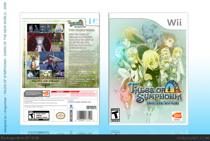
 Tales of Symphonia: Dawn of the New World Box Cover Comments
quickie, after long hiatus ;]
[ Reply ]
Ohhh I've been waiting for someone to make a box for this game, awesomeness, the only thing I dislike is how the screenshots are piled together. Fav+1.
[ Reply ]
Simply beautiful =O
[ Reply ]
Thank you EG, I agree the method I used to put the screen shots together on the back of the art is a bit different, I wanted to bring in as many screenies as possible without reducing space, oh well I am pleased with how it turned out.
EDIT : Thank you ELCrazy ;3
Edited at 1 decade ago
[ Reply ]
#4, I see, I just don't think the barricade of screenshots is as appealing as the rest.
[ Reply ]
dude this is epic. *worships*
[ Reply ]
This is awesomeee! +fav
[ Reply ]
The front is amazing, the back cover is also nice - but the screenshot collage doesnt fit in that well with the soft glowy nature I feel.
Still great to see you back!
[ Reply ]
Woohoo, youre back, you better be making more. This box is awesome, but I agree w/ everyone else on the collage thing.
[ Reply ]
this box looks fantastic, i think that the logo should be centered and the screenshots on the back are..hmmm..awkwardly placed, but the overall box looks trememndous.....ly awesome :D +fav/+fav author
[ Reply ]
Thanks everyone for the feedback, I might do an update with a new layout for the screenies on the back. And #10, hopefully you see why the logo could not be centered.
[ Reply ]
Epicness, this box is blessed by the warm breaths of the triforce goddesses. :D
[ Reply ]
#12, agreed.
Awesomeness....I actually like the screen layout on the back as is, very unique!
[ Reply ]
#8, I agree.
The screen shots look kind of awkward but it's still great.
[ Reply ]
i think the screenshots would look neaters with subtle borders, but other than that, this is beauty, i love the colors and all.
good to have you back makin art boyfren! ;)
[ Reply ]
#15, Yeah, I don't think it's the arrangement of the screens that's detracting from it so much as the lack of some kind of treatment that really integrates them into the box.
[ Reply ]
YOU STOLE THE NAME YOU MOTHERFUCKER 1.5/5
[ Reply ]
#17, What are you talking about?
[ Reply ]
At first i agreed with everyone that the box was awesome, and the only problem was the collage, but when I looked closer at the collage and made the box full screen so I could concentrate on it, it looked a lot better and looked lit it fit there, tell me whether or not I'm the only one thinking that.
[ Reply ]