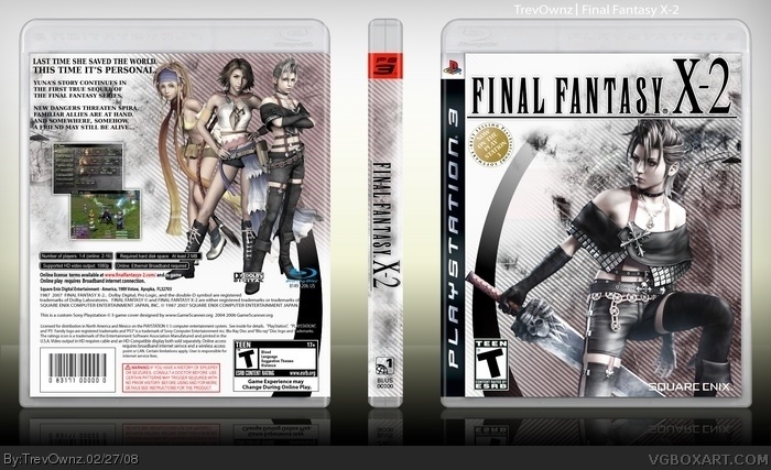
Ok on this box i wanted to point out that it was a son of a ... boxart to get the back characters the same color as the character on the front. I had to place different colors over then and merge and all this stuff lol, took forever. I love how well it came out and i hope you like it to.
I didn't want it like the other FF boxes. I wanted it darkish or i wouldn't have spent all day making the back characters darker and less colorful. I would have cut out the colorful version of the girl and added her to the front which would have been easy and about the back it might be a little empty but i would rather it look like that than have way to much. I'm happy with the way it came out.
Cool box. It's a bit weird that Paine is the focus of the front even though she's not the main character but that's ok, it's your design choice afterall.
#13 Easy on the words my friend we have little kids on the site haha.
Well i tried that #11 but it didn't look like i needed it to. So i had to copy and paste the image in another thing then switch it to black and white then i placed it over the other image and made it like 15% opacity or something. Idk i probably could have done it a easier way but that worked perfect.
#14 that's really creative. and to tell you the truth it's probably what i would have done. you put a lot of effort in your boxes, and for that, i fave you :)
Lol you should see my paint boxes. I only make them to prove annoying little kids that make bad paint boxes that it doesn't matter how long it takes its the amount of effort within that time. I spent 30 solid mins on my paint Bioshock box and it looks really good and has effort.
Fantastic mate, love the colour scheme mix with the grudge/scanlines -- which usually doesn't work with fantasy games, this is great. Neat touch the the little touches like the black arc on front and back, and even the the 'differences' blending in the text on back. ;) Awesome.
I love the style, just not the scanlines. Maybe you should've overlayed or decreased their opacity a bit. Color correction and adjusting lighting always takes time (if done right) and you did a great job.
#19 well, yeah i used to use paint for photo-manipulation and stuff before i got photoshop and that was before last summer. it's a pain in the butt, though, and i wouldn't go back to it ever.
Well with the scan lines i did have them at 50% then i showed ladykiller the WIP and he said turn them down a little bit so i dropped it down to 40% and we both though it looked better so i left it.
OH NOES! It is white and looks so empty due to that >.< Okay, just kidding.
Since you mentioned some blurry stuff on my package: I see some on yours here too and also some of those "bad jpg"-like pixels. Guess we have a little resoultion issue or whatever.
#26 Please don't get mad because i said my opinion on your box. Your box had really bad quality on the character on the back and I couldn't even read the text. Point out where mine has bad quality please so i know what to fix. Thanks.
WOW, i must say this is one of the best boxes ive seen on this site, the ONLY thing i would change to this box is not to have pain on the cover but have yuna, other then that its a sweet box
Well I don't agree at all with you silva about it being one of the best. This is my least favorite box i have. I think it looks cool but its not my favorite. I'm going to add to it whenever i get time to.
 Final Fantasy X-2 Box Cover Comments
Number 16 =]
Ok on this box i wanted to point out that it was a son of a ... boxart to get the back characters the same color as the character on the front. I had to place different colors over then and merge and all this stuff lol, took forever. I love how well it came out and i hope you like it to.
Thanks for looking =]
Edited at 1 decade ago
[ Reply ]
haha, excellent work. I love the scanlines and coloring. very nice. The curved black line on the front adds a nice touch and composition.
+fav
[ Reply ]
one of your best
[ Reply ]
Schwing.
[ Reply ]
Stylishhh
[ Reply ]
It's too gray...from what I have seen of FF games, they are colorful, and that is usually shown in the boxes. Also, the back seems a bit empty.
[ Reply ]
I didn't want it like the other FF boxes. I wanted it darkish or i wouldn't have spent all day making the back characters darker and less colorful. I would have cut out the colorful version of the girl and added her to the front which would have been easy and about the back it might be a little empty but i would rather it look like that than have way to much. I'm happy with the way it came out.
[ Reply ]
Cool box. It's a bit weird that Paine is the focus of the front even though she's not the main character but that's ok, it's your design choice afterall.
[ Reply ]
I like the colors (even though its off the FF style) and i kinda like that paine is the main focus ....fav =]
[ Reply ]
Paine is hardcore looking. I thought she looks BAMF and would own some people so i thought she would be the cooler front character.
[ Reply ]
hey trev dont you just have to press ctrl u and just change the saturation? unless you dont have photoshop. anyway, this is awesome, and i love it.
btw, what is bamf?
[ Reply ]
#11, look it up in urban dictionary. XD
[ Reply ]
#11, *sighs* I had to explain this to Al, too... Naobs. *shakes head*
Um... It means... Bad Bottom Mother Flicker. >___>
Edited at 1 decade ago
[ Reply ]
#13 Easy on the words my friend we have little kids on the site haha.
Well i tried that #11 but it didn't look like i needed it to. So i had to copy and paste the image in another thing then switch it to black and white then i placed it over the other image and made it like 15% opacity or something. Idk i probably could have done it a easier way but that worked perfect.
[ Reply ]
This is awesome. I would only suggest one more screenshot on the back.
[ Reply ]
I might add one more if i get bored one day but as for now its staying like that. Idk whats with people but 2 screen shots aren't enough haha
[ Reply ]
#16, 3's always a good numba' :D
[ Reply ]
#14 that's really creative. and to tell you the truth it's probably what i would have done. you put a lot of effort in your boxes, and for that, i fave you :)
[ Reply ]
Lol you should see my paint boxes. I only make them to prove annoying little kids that make bad paint boxes that it doesn't matter how long it takes its the amount of effort within that time. I spent 30 solid mins on my paint Bioshock box and it looks really good and has effort.
Vid link
Image link
[ Reply ]
Fantastic mate, love the colour scheme mix with the grudge/scanlines -- which usually doesn't work with fantasy games, this is great. Neat touch the the little touches like the black arc on front and back, and even the the 'differences' blending in the text on back. ;) Awesome.
[ Reply ]
I love the style, just not the scanlines. Maybe you should've overlayed or decreased their opacity a bit. Color correction and adjusting lighting always takes time (if done right) and you did a great job.
Very nice and original box.
Edited at 1 decade ago
[ Reply ]
Beautiful but I agree on the scanlines.
[ Reply ]
Nice one :)
[ Reply ]
#19 well, yeah i used to use paint for photo-manipulation and stuff before i got photoshop and that was before last summer. it's a pain in the butt, though, and i wouldn't go back to it ever.
and you're right, it looks very nice.
[ Reply ]
Well with the scan lines i did have them at 50% then i showed ladykiller the WIP and he said turn them down a little bit so i dropped it down to 40% and we both though it looked better so i left it.
[ Reply ]
OH NOES! It is white and looks so empty due to that >.< Okay, just kidding.
Since you mentioned some blurry stuff on my package: I see some on yours here too and also some of those "bad jpg"-like pixels. Guess we have a little resoultion issue or whatever.
But overall the package looks good to me
[ Reply ]
#26 Please don't get mad because i said my opinion on your box. Your box had really bad quality on the character on the back and I couldn't even read the text. Point out where mine has bad quality please so i know what to fix. Thanks.
Edited at 1 decade ago
[ Reply ]
i think what he's seeing is probably compression due to the site
[ Reply ]
WOW, i must say this is one of the best boxes ive seen on this site, the ONLY thing i would change to this box is not to have pain on the cover but have yuna, other then that its a sweet box
5/5
+ fav
[ Reply ]
Thats AWESOME!
[ Reply ]
Holy crap.
[ Reply ]
MYEAH.
[ Reply ]
Well I don't agree at all with you silva about it being one of the best. This is my least favorite box i have. I think it looks cool but its not my favorite. I'm going to add to it whenever i get time to.
[ Reply ]
too gray. X-2 was flashy and GRRLPOWA 4EVA!! This doesn't seem to capture that.
Also. Needs more Rikku.
[ Reply ]
Awesome. This shows another side of X-2 that not alot of people saw due to the hard sidequests. >.< Also...why is Paine in the front?
[ Reply ]
This box is close to HoF. =)
[ Reply ]
Shouldn't it be in the hall now?
[ Reply ]
I justed fav'd it as well. Seriously awesome work Trev, I'm sorry I missed this.
Edited at 1 decade ago
[ Reply ]