And so do a lot of other people. This site has slowed down a lot i think and don't think just because FF22 has 50 comments or something you will to. He and other are big people on the site and everyone wants to see there next box. I don't get much attention as i used to. Its not because of your boxes its just the amount of people on. So please don't ask for comments. Post a box for the love of graphics not for the attention of some kid that lives 10k miles away.
 Okami Box Cover Comments
First of all: PLEASE comment! All of my boxes go ignored. :(
Credit to Techne for the template.
[ Reply ]
all of my boxes get ignored too...
very nice! 4/5
[ Reply ]
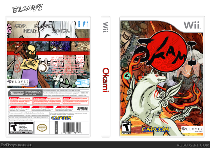
I love the reddish color scheme of the front. :]
But the back should to stick to the front's color scheme..
Still, very artistic and nice. ;)
[ Reply ]
#2, maybe because you are impatient, and don't make the greatest boxes. No offense.
[ Reply ]
And so do a lot of other people. This site has slowed down a lot i think and don't think just because FF22 has 50 comments or something you will to. He and other are big people on the site and everyone wants to see there next box. I don't get much attention as i used to. Its not because of your boxes its just the amount of people on. So please don't ask for comments. Post a box for the love of graphics not for the attention of some kid that lives 10k miles away.
[ Reply ]
#5, Huh? It's not like I bumped asking for comments, I just like comments so that I know what people think.
[ Reply ]
Cool box, I particularly don't like the font for the synopsis because it's not very bold.
[ Reply ]
The Spine needs work aswell.
[ Reply ]
Agreed with E_G and Saint, but still very nice nonetheless :)
[ Reply ]
not to fond of the back ..and the font is iffy 2... but i do like the cover =]
[ Reply ]