Darn yummybrains.xD
well, behold.. my latest submission, and more importantly, my second one after a huge internet loss..[a month..right?]
because of these internet problems, i've dropped from 3rd to 10th place in most fav'd artist rank.[what if? ;)]
Credit is in image.
-edit- i know, but with this art, to make it more dark, and fantasy-like, i needed to do that.
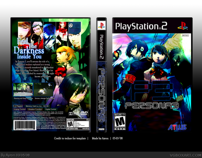
Looks good.. I like how it's so colourful... even like the contrast makes it different. ;) Like the way the characters, slope to one side too. Not too keen on the screenshots/text on back... seems like a bit squeezed into the corner.. or the glow on the specs.. however, job well done.
This is a very impressive boxart ayron - I think there are just some problems but if you fix them then its easily one of the best you've made.
- firstly fix the "P3" part the right way up. Change the yellow outer glow to the light blue as you have on the tagline behind.
- Place the second screenshot slightly away towards the right, and at the same level as the first (not higher or lower). Give it a slight blue outer glow.
- Decrease the amount of text on under the first screenshot.
- Nudge the tagline a bit more towards the left.
- Remove the outer glow from the legal info and dolby/DVD logos - it looks weird. Fix the size of the Dolby logos (when re-sizing remember to click the "paperclip" so both height and width are auto-adjusted and drag from corner) and just make them white without any glow. Even the text. It should look much better.
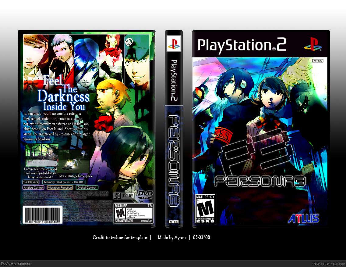
#12, thanks for the criticism dms.
Luckily enough, i already had 4/5 things you've stated updated as i read your comment.
Here it is, the updated version ^^
 Persona 3 Box Cover Comments
I love it!
[ Reply ]
this is really cool. the contrast is too high though. y'know, you don't always have to turn it up... it kinda kills the box in my opinion
[ Reply ]
Darn yummybrains.xD
well, behold.. my latest submission, and more importantly, my second one after a huge internet loss..[a month..right?]
because of these internet problems, i've dropped from 3rd to 10th place in most fav'd artist rank.[what if? ;)]
Credit is in image.
-edit- i know, but with this art, to make it more dark, and fantasy-like, i needed to do that.
Edited at 1 decade ago
[ Reply ]
I like it. I was going to do a box of this game but i changed my mind :)
[ Reply ]
#4, thank you ^^'
[ Reply ]
#3, Indeed
[ Reply ]
Nice it looks a lot better without the high contrast good job :D
[ Reply ]
Looks good.. I like how it's so colourful... even like the contrast makes it different. ;) Like the way the characters, slope to one side too. Not too keen on the screenshots/text on back... seems like a bit squeezed into the corner.. or the glow on the specs.. however, job well done.
[ Reply ]
#8, Thanks a bunch. means alot ;).
Any tips on the back?
[ Reply ]
quite nice.. maybe you should use some more time with the title logo.
[ Reply ]
#10, more ..time?. sorry, but i don't quite get it.
[ Reply ]
This is a very impressive boxart ayron - I think there are just some problems but if you fix them then its easily one of the best you've made.
- firstly fix the "P3" part the right way up. Change the yellow outer glow to the light blue as you have on the tagline behind.
- Place the second screenshot slightly away towards the right, and at the same level as the first (not higher or lower). Give it a slight blue outer glow.
- Decrease the amount of text on under the first screenshot.
- Nudge the tagline a bit more towards the left.
- Remove the outer glow from the legal info and dolby/DVD logos - it looks weird. Fix the size of the Dolby logos (when re-sizing remember to click the "paperclip" so both height and width are auto-adjusted and drag from corner) and just make them white without any glow. Even the text. It should look much better.
Best of luck! :)
Edited at 1 decade ago
[ Reply ]
#12, thanks for the criticism dms.
Luckily enough, i already had 4/5 things you've stated updated as i read your comment.
Here it is, the updated version ^^
[ Reply ]
Nice one Ayron.. I was gonna suggest similar to DMS but looks like you've done it ;)
[ Reply ]
#14, thanks,Marker ^^'
[ Reply ]
Ohh lovely.
[ Reply ]
+FAV. ;)
[ Reply ]
#11, ehm, okay i know my english is bad.. but you have fixed the logo, much better now..
[ Reply ]
impressive.
[ Reply ]
So cool!
Just hoping there won't be a flood of P3 boxes*
Since I'm also planning to make one...finally XD
[ Reply ]
thanks everyone.^^'.
[ Reply ]
Simply amazing. A magnificent piece of work.
However, I feel you should widen your font use.
[ Reply ]
#22, i've never even used it before??.. i'll try and see what i can do though =]
[ Reply ]
#23, Isn't it the font that I said that it was Times New Roman but it turns out it was some Adobe font?
[ Reply ]
#24, Nope, not really. it's a spin-off off a game font,i believe.
[ Reply ]
it might be a different font, but it still looks the same... try something different. even if it's not the same name, it's pretty much the same style.
[ Reply ]
#26, please read #19.
link
[ Reply ]
Well, It isn't so good... sorry... =D
[ Reply ]
'Tis pwnage, but I suggest you make the screenshots bigger or draw more attention to them somehow. Still, fav'd.
[ Reply ]
#29, i know, but it'd be too busy that way[see v2.]
lol @#28 ;)
[ Reply ]
looks great ^_^
[ Reply ]
nicely done faved
[ Reply ]
I'm giving you a thumbs up. Ayron, you rock my soxz. 5/5 +fav
[ Reply ]
Awesome ^^'.
my 10th Hall ;)
[ Reply ]