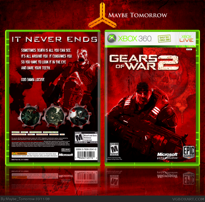
I really kind hate the back. I don't like the description because it's just a quote from Marcus Fenix from the trailer, and I don't like the font choice. I also don't like the placement and it just needs more to it than a Locust and some red.
Nice, but the back is kind of plain. I laugh at noobs that give critique liek they're LK's Mentor. Anyway, nice box. Add some one's body in that blank space, so you can see only their head.
I don't like gears here. They are too clean and too bevel and emboss, you know. I think they should be more dark and rusty or something with texture. They don't suit to the whole style...
Also I think you should add more details to the back. Some characters or text to cover the giant EMPTY (real empty) spaces. I usualy use quotes or awards or something like that - I think they would looks great at this box ;)
What do think? o.O
#11, Looks like they are white or bright gray with some dark gray inner glow inside. they should be dark. Cos those gears are the most brightful part of the box.
If you look around, I'm sure you can find something brighter than my screenshot borders. Ex: The text all over the place. The logo.
There needs to be some contrast. My whole box can't be a deep red color.
 Gears of War 2 Box Cover Comments
About a week of work. Thanks to all that helped me in the forums.
Enjoy.
[ Reply ]
Lovin' it, of course.
[ Reply ]
#2, Thanks.
[ Reply ]
I think the back is a bit plain, but the box is still very, very nice.
[ Reply ]
I was trying to make this one a little more plain than my others.
[ Reply ]
Looks great but i think the left side on the back needs another character or something.
[ Reply ]
I really kind hate the back. I don't like the description because it's just a quote from Marcus Fenix from the trailer, and I don't like the font choice. I also don't like the placement and it just needs more to it than a Locust and some red.
[ Reply ]
Nice, but the back is kind of plain. I laugh at noobs that give critique liek they're LK's Mentor. Anyway, nice box. Add some one's body in that blank space, so you can see only their head.
[ Reply ]
#8, How's this, everybody?
[ Reply ]
I don't like gears here. They are too clean and too bevel and emboss, you know. I think they should be more dark and rusty or something with texture. They don't suit to the whole style...
Also I think you should add more details to the back. Some characters or text to cover the giant EMPTY (real empty) spaces. I usualy use quotes or awards or something like that - I think they would looks great at this box ;)
What do think? o.O
[ Reply ]
#10, You mean the screenshot gears? How could you possibly say those are clean? I made them look scratched up and bloody.
And does nobody understand that I was trying to keep this as a simple box?
[ Reply ]
#11, Looks like they are white or bright gray with some dark gray inner glow inside. they should be dark. Cos those gears are the most brightful part of the box.
[ Reply ]
#12, I'm pretty sure Brightful isn't a word.
If you look around, I'm sure you can find something brighter than my screenshot borders. Ex: The text all over the place. The logo.
There needs to be some contrast. My whole box can't be a deep red color.
[ Reply ]
#13, I am sure that the Brightful is the right word.
Well, I told my opinion. I think gears texture is the weak point of the box.
[ Reply ]
#14, link
Yeah.
[ Reply ]
#15, Ok, I mean bright. Too much Brightness.
[ Reply ]
I think the front is so kick-ass, but I feel the text shouldn't have a Drop Shadow.
[ Reply ]
#16, heh.
#17, I tried it without a drop shadow, and it didn't look right.
[ Reply ]
Damn. I really thought this was good enough for the HoF.
[ Reply ]
Seeing the enormous effort you put in, here's a fave on the house ;)
[ Reply ]
#20, Thanks bro.
[ Reply ]