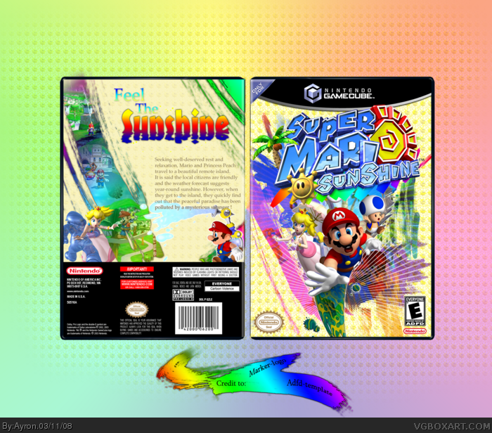
As i was looking through the archives, trying to find a box to make...
i saw that one game in particular hadn't had one 'WOW!'-effect box posted here.
Well, as you know me, i always try to be original.. and this is no exception.
Also, i wanted to know how ADFD felt whilst making the winterfest box
[ which i'm probably losing from ;)... i hope i finish my box soon.xD ].
I almost made everything by myself.. >.<'
Credit to: - MARKER for logo
- ADFD for template [ i left your esrb, i kinda liked it ;).. plus, it's auto-credit...smart =D]
Comments/criticism is highly appreciated.
Please people, don't let this rust away like my two previous boxes. ;)
better than the offisial one, but why is there enemys in delfino plaza?
Edit: And it dont stand how many players and how many blocks it tames...
and I dont like the sleeping mario on the front.
I'll be honest, I love the front, but I find the back isn't so good. The screens ar great, nothing to say about it, but what I find the most distracting is the text. I think it should be bigger. Plus, I don't think that font fit the game. it should be more "cartoonish". And the tagline is kinda randomly placed. I love the front and the screens work though.
I really like it but I have criticisms, I think the huge background behind the box is too much of a distraction. A more upbeat font for the back description could be nice and the tag line suits more of a rhythm game if you ask me. I'll fav it though because I love what you did with the effects.
 Super Mario Sunshine Box Cover Comments
As i was looking through the archives, trying to find a box to make...
i saw that one game in particular hadn't had one 'WOW!'-effect box posted here.
Well, as you know me, i always try to be original.. and this is no exception.
Also, i wanted to know how ADFD felt whilst making the winterfest box
[ which i'm probably losing from ;)... i hope i finish my box soon.xD ].
I almost made everything by myself.. >.<'
Credit to: - MARKER for logo
- ADFD for template [ i left your esrb, i kinda liked it ;).. plus, it's auto-credit...smart =D]
Comments/criticism is highly appreciated.
Please people, don't let this rust away like my two previous boxes. ;)
Thanks in progress,
-Ayron
[ Reply ]
I really like the front. Very original. however the back just seems kind of off to me. I cant really place it though.
[ Reply ]
#2, hmm.. odd..
well, i know something, i'll see if anyone else feels the same, and update later on..ok?
[ Reply ]
The front is amazing, but the back is kinda plain.
[ Reply ]
all i see is an error image
[ Reply ]
i've updated with a subtle pattern on the back. hope that breaks it down for you.
[ Reply ]
#6, is still can see it =[
[ Reply ]
better than the offisial one, but why is there enemys in delfino plaza?
Edit: And it dont stand how many players and how many blocks it tames...
and I dont like the sleeping mario on the front.
Edited at 1 decade ago
[ Reply ]
wow this is grea! 4/5 better than the official!
[ Reply ]
#8, your opinion ;).
Thanks everyone,btw.
[ Reply ]
Yup, Good Mario Sunshine boxes are hard to make. And this is definately a good one.
[ Reply ]
#11, indeed.
But, give 'shining force exa' a shot ;)
-sigh-
[ Reply ]
wow it looks so good but why supper mario sunshine i must ask?
[ Reply ]
it's nice. it's very colorful and bright. you shoulda used the real esrb, but i really like it. 4.5/5
[ Reply ]
#13, i have no clue...
[ Reply ]
Looks great but the background is a little on the big side.
[ Reply ]
Tagline on the back bothers me, but other than the huge background like #16 said, this is fantastic! :)
[ Reply ]
nice, fav
[ Reply ]
it is pretty making. i like it.
[ Reply ]
Yeah, the back is kinda plain. But the front is enough to win me over.
[ Reply ]
I'll be honest, I love the front, but I find the back isn't so good. The screens ar great, nothing to say about it, but what I find the most distracting is the text. I think it should be bigger. Plus, I don't think that font fit the game. it should be more "cartoonish". And the tagline is kinda randomly placed. I love the front and the screens work though.
[ Reply ]
I really like it but I have criticisms, I think the huge background behind the box is too much of a distraction. A more upbeat font for the back description could be nice and the tag line suits more of a rhythm game if you ask me. I'll fav it though because I love what you did with the effects.
[ Reply ]
The front is perty much win, but I don't like how you used that *cough* font on the back.
[ Reply ]
I think like everyone said, the front cover is fantastic. The back mainly needs work in the font department.
Also, I think if you remove the BG behind the box it would really help too, as EG said. Go for a simple BG (gradient)
[ Reply ]
Well done on the HoF. It was my temp that did it huh? XP
Edited at 1 decade ago
[ Reply ]
thanks,everyone.
expect a HOF-update tonight ;)
[ Reply ]
Now you got more HoFs than me :(
LOL congrats on the HoF, mate! Box looks superb!
[ Reply ]
Ayron, you got HoF in 2 DAYS! OMGZORZ YOU ARE THA B0MB! Nice box, faved
[ Reply ]
#28, well, not really. i'm no MARKER, Alldreamsfalldown,dmshaposv, elcrazy or thecodemaster.. just to name a few. But i get along quite nicely.
#27, so unfair. you're way better,dude ;)
[ Reply ]
Wow this is great, congratulations for the HoF.
(+ fav)
[ Reply ]
AWSOME!!!!!!
[ Reply ]
NICE IDEA !!!!!+FAV
[ Reply ]
Great! 5/5 +fav +fav author
[ Reply ]