Credit to Star89er for temp, ninty for screenborders, google and sonic art archive for images, and im pretty sure that's it. Don't have much to say. C+C welcome.
yay sonic, i like it, so i'll fav ^_^, PS what is EB games stand for, but as i live in the uk ive never heard of it, we have game, gamestation and some other crap
Kirby22: If you're using GIMP, PhotoShop or Paint.NET, then go to PlanetRenders.net and SAVE the renders. Open them up, and they'll be cut. This will make your boxes look much better.
#11 thanks i'll remeber that from now on! ok guys, thanks for commenting and sorry about the bad english, i just typed it wrong, i mean i AM from America.
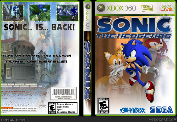
i like the front apart from the characters
and the logos on the front are too big.
i don't like the back because there is only a
little bit of writing and the screenshots are at the top.
2/5
 Sonic the Hedgehog Box Cover Comments
So here's my newest box.
Credit to Star89er for temp, ninty for screenborders, google and sonic art archive for images, and im pretty sure that's it. Don't have much to say. C+C welcome.
[ Reply ]
-bad cutting
-not much text on back
-streched spine logo
-1/5
[ Reply ]
The back is plain, the spine is a little to stretched out. The pictures are pooly cut. Just a few adjustments and this could be a great box =]
Looking foward to version 2.
[ Reply ]
I agree with aggressivetouch, the back is too plain, the side is stretched, but the front is nice
2.5/5
[ Reply ]
#2, i agree. for all those reasons. 1/5
[ Reply ]
I like the front, exept that Tails is standing in the air and they are bad coued.
[ Reply ]
Cutted i mean
Sorry, I am not verry good to spell, but I\m swedish.
[ Reply ]
yay sonic, i like it, so i'll fav ^_^, PS what is EB games stand for, but as i live in the uk ive never heard of it, we have game, gamestation and some other crap
Edited at 1 decade ago
[ Reply ]
woah! #2 -1/5?! Jeez i didnt know i sucked that bad! lol
Ok im definitley making version 2, thanks aggresivetouch!
[ Reply ]
#8 Just checking, you faved it because you like the actual box and not because you like Sonic right? Just checking ^_^
And this box needs improving, basically what everyone said before me above! The back is really poor though!
"Take on robots and eggman, tons of levels"
Very badly written, very bad english!
[ Reply ]
Kirby22: If you're using GIMP, PhotoShop or Paint.NET, then go to PlanetRenders.net and SAVE the renders. Open them up, and they'll be cut. This will make your boxes look much better.
[ Reply ]
hey, you're getting better, look at your first, then this and say wow
this should have more text, and better cuts
otherwise, 3/5
[ Reply ]
#11 thanks i'll remeber that from now on! ok guys, thanks for commenting and sorry about the bad english, i just typed it wrong, i mean i AM from America.
[ Reply ]
ouch. 1/5
[ Reply ]
#14, mind explaining? and surley, it's not that bad of a box? maybe worth 2/5, or 2.5/5, but not 1/5. just tell me whats wrong.
[ Reply ]
Yep your definatley improving ,
2.5/5
if you sort out the spine and cut out the renders properly, and add more text on the bcak itll be pretty good :)
[ Reply ]
#15, where did ya get that pic of sonic?
[ Reply ]
#17, sonic art archive or something
[ Reply ]
you gotta work on your backs. and the spine logo is smushed. its good. better than what you ususallly can do.
[ Reply ]
#19 thanks, yeah i guess im improving.
[ Reply ]
Sonic is in front of Tails's way?? whf?
[ Reply ]
Hate this boxart soooo much 9.1/5. I don't like when people put Tails on the gamebox:(
[ Reply ]
#22 WTF?
[ Reply ]
i like the front apart from the characters
and the logos on the front are too big.
i don't like the back because there is only a
little bit of writing and the screenshots are at the top.
2/5
[ Reply ]