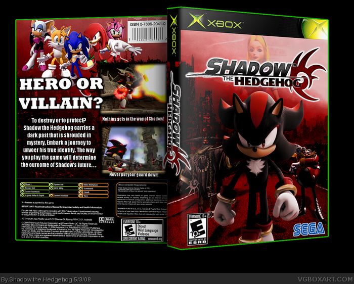
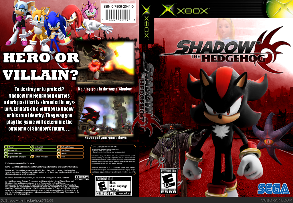
#11, Well I'm not going to make the logo smaller just becuz of the red icon thing. Imagine seeing it on a real spine on a shelf, the words are nice and legible, and IMO it looks cool going off the edge like that. BTW, what do you think of the front's background? I think I should make the road darker, what do you think?
Hey... looks pretty good! Nice choice of background ;)
There are a few things I would change.
1. NEVER have hyphenation turned on when you do text... it makes it look ugly IMO. If you use Photoshop, go to the Paragraph box and UNCHECK hypenate box.
2. Edit the Legal text of the template... I don't know why people don't do this. You have SEGA on the front... so why have Activision address etc. on back.
3. I haven't a clue what those two characters are behind Shadow (not INTO Sonic games), but I personally would have moved them back a bit and darken then to add depth.
-HOWEVER, nice job! I'll FAV too because you actually posted in the WIP and from early stages to finished - it's a good progression to a great box ;)
you should probably move Black Doom somewhere, and make him bigger or something. right now he looks random and small. I know he's behind Shadow, but the perspective looks kinda off. Also since he hovers you should probably have him higher. Maybe get rid of Doom's Eye, since they're actually the same being (Doom's Eye is Black Doom's third eye, which he uses as like a scout-like thing for out in the field) so they're never in the same place. Instead of that, i'd add Sonic, Dr. Eggman or the General. But be sure to add all the right shadow and lighting effects to them, otherwise it looks like they've been slapped on there (like on my box).
UPDATED! Did what Vengeance (#14) said. No offense MARKER, I forgot about what you said >.< :P
Also added shadows to the front
Update #3 addressed some of the stuff MARKER suggested
 Shadow the Hedgehog Box Cover Comments
Alright, people stopped commenting on my WIP thread and I'm pretty happy with this. What do you guys think?
Edited at 1 decade ago
[ Reply ]
It looks nice. Too bad the game sucked though.
[ Reply ]
#2, Thanks! lol very true
[ Reply ]
That's pretty awesome. Love the background!
[ Reply ]
very nice, everything seems good
[ Reply ]
Nice box Aqeel... back text is a bit chunky tho. 4/5 +fav
#2, pfft. This game was good.
[ Reply ]
The logo on the spine goes out on the front and back, otherwise, realy good!
[ Reply ]
hellz yeah! fave+ 100/10
[ Reply ]
#7, yeah, I said that in the forums, but he didn't listen. >.<
[ Reply ]
Wow thanks for the comments and favs everyone :D
BTW I meant for the spine logo to be that way ;)
[ Reply ]
#10, Ok, i Think it just feels verry wrong.
[ Reply ]
#11, Well I'm not going to make the logo smaller just becuz of the red icon thing. Imagine seeing it on a real spine on a shelf, the words are nice and legible, and IMO it looks cool going off the edge like that. BTW, what do you think of the front's background? I think I should make the road darker, what do you think?
[ Reply ]
Hey... looks pretty good! Nice choice of background ;)
There are a few things I would change.
1. NEVER have hyphenation turned on when you do text... it makes it look ugly IMO. If you use Photoshop, go to the Paragraph box and UNCHECK hypenate box.
2. Edit the Legal text of the template... I don't know why people don't do this. You have SEGA on the front... so why have Activision address etc. on back.
3. I haven't a clue what those two characters are behind Shadow (not INTO Sonic games), but I personally would have moved them back a bit and darken then to add depth.
-HOWEVER, nice job! I'll FAV too because you actually posted in the WIP and from early stages to finished - it's a good progression to a great box ;)
Edited at 1 decade ago
[ Reply ]
you should probably move Black Doom somewhere, and make him bigger or something. right now he looks random and small. I know he's behind Shadow, but the perspective looks kinda off. Also since he hovers you should probably have him higher. Maybe get rid of Doom's Eye, since they're actually the same being (Doom's Eye is Black Doom's third eye, which he uses as like a scout-like thing for out in the field) so they're never in the same place. Instead of that, i'd add Sonic, Dr. Eggman or the General. But be sure to add all the right shadow and lighting effects to them, otherwise it looks like they've been slapped on there (like on my box).
[ Reply ]
#13 and #14, I'll have those updates done tonight
And thanks MARKER!
Edited at 1 decade ago
[ Reply ]
UPDATED! Did what Vengeance (#14) said. No offense MARKER, I forgot about what you said >.< :P
Also added shadows to the front
Update #3 addressed some of the stuff MARKER suggested
Edited at 1 decade ago
[ Reply ]
I think Eggman should be bigger.
[ Reply ]
I think it looked better before the update.... just my opinion
[ Reply ]
#18, Why? Do explain :D
[ Reply ]
the logo on the spine is coming out of the...designated spine area.
but its good and stuff.
[ Reply ]
#20, XD
Read #7, and #10-#12
[ Reply ]
What MARKER said. XD
Sweetness, awesome for a first btw. Great job and keep it up. :)
[ Reply ]
#22, Thanks alot :D
BTW its not my first: link
[ Reply ]
this is very good.. 5/5 +fav
[ Reply ]
#24, Thank you very much :)
[ Reply ]
Updated...3D version
[ Reply ]
Awsome
[ Reply ]
I HATE the people in the back backround but everything eles are ok. 2.3/4
[ Reply ]
i love this cover! evil all over it :P
good job brother keep up the good work!
[ Reply ]
#29, Thanks :D
[ Reply ]
why is this not in the Hall?
[ Reply ]
#31 same reason mine isn't lol
[ Reply ]
Very Nice! +fav
[ Reply ]
NICE
[ Reply ]
Update, fixed up a lot of little stuff that was bothering me.
Edited at 1 decade ago
[ Reply ]
Much Better!
[ Reply ]
Thanks to everyone for helping this go HoF!!! :D
[ Reply ]
Congrats, Aqeel.
[ Reply ]
Awesome box!
[ Reply ]
Thanks guys :)
Edited at 1 decade ago
[ Reply ]
Congrats! Getting a first box into the HoF is very rare!
[ Reply ]
i think that was my fav
i faved it and then it's HoF
it makes me happy:D
[ Reply ]
T.T
congrats... ... ...
now if we could just work on mine :P
Edited at 1 decade ago
[ Reply ]
#41, took awhile tho :p
#42, yours or Muggles o.o
[ Reply ]
Pure awsomness, FAVED!
[ Reply ]