[ Box updated on June 14th, 2008 ] [ original ]
 Sonic Adventure 10th Aniversary Edition Box Cover Comments
Comment on EggBoy13's Sonic Adventure 10th Aniversary Edition Box Art / Cover.
[ Box updated on June 14th, 2008 ] [ original ]
Comment on EggBoy13's Sonic Adventure 10th Aniversary Edition Box Art / Cover.
i'm very sorry 4 the bad quality idk y it did that
but anyway this is a sequal to my other one: link
thnx --eggboy
Edited at 1 decade ago
[ Reply ]
What is that on te front and why is the logos red?
[ Reply ]
#2 youv'e never played it have you?
and the logos are red cuz it fits better that way
[ Reply ]
please rate
[ Reply ]
Its not too great, I like the front. The back isn't as great though; The ESRB doesnt have a discription, the SEGA shouldnt be blue, but red instead. All the text looks bad, and its plain with no background. Also, you should use a different template because you don't have a side and the front looks messed up because its not 3d on a 3d temp.
4.5/5 for the front
1.5/5 for the back
0/5 for the side
Edited at 1 decade ago
[ Reply ]
Why is Sonic not even on the front cover?! This is an outrage!!
[ Reply ]
#5 what r u smokin?
[ Reply ]
#7, wtf...
[ Reply ]
I like your idea. Using the bad guys for the cover for the tenth aniversary.
[ Reply ]
#9, Same. But for the back, its pretty plain. Here's a picture that could be worked into filling up more on the back: link
[ Reply ]
yeah but i think i like mine better
[ Reply ]
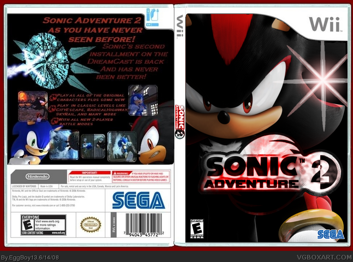
that thing on the front is scary lookibg.
[ Reply ]
How do you have 4 boxes for a ranking?
[ Reply ]
i like your boxes more milkyoreo more than eggboys.
[ Reply ]
both are okay, but not great.
[ Reply ]
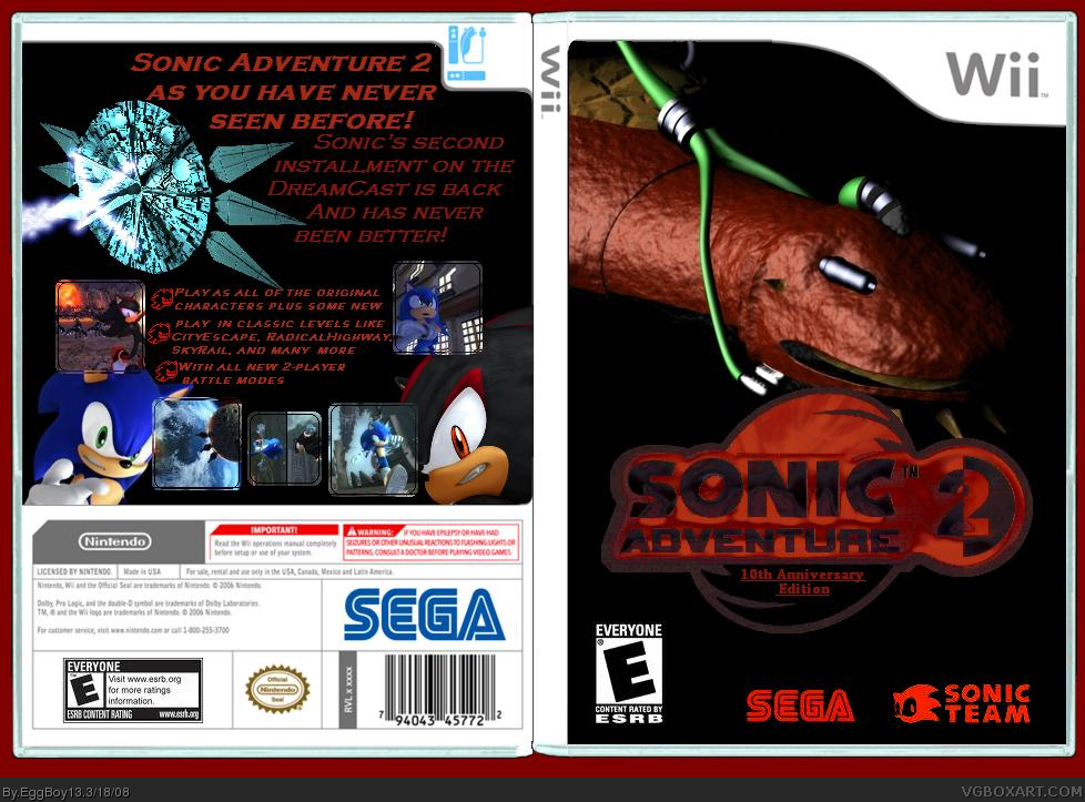
You should put the falling ARK in the back of the Bio Lizard
[ Reply ]
The thing on the front looks like a penis. wtf???
[ Reply ]
This is so sucks! Too much dark and gives me a 9.1/5
[ Reply ]
#18, why the hell are you rating my boxes 9.1 /5
and saying that they all sucks so much?????
[ Reply ]
#18, you have to be the wierdest banned member ever, are you nuts or something? #19, mebe she thinks that 9.1 is 1.9 lol.
Edited at 1 decade ago
[ Reply ]
#18 I think he meant to rate it 0.1/5
It was just a type he typed '9' instead of '0'
[ Reply ]
#17, yes that's not innopropriate at all.
[ Reply ]
#21, he does that so often though.
[ Reply ]
#17, you perverted little....
-_-
[ Reply ]
#24, LOL!
[ Reply ]
this is pretty bad, because
1. you shouldn't use a pic of the final boss on the cover, because i) it's a spoiler and ii) it's only a small part in the game
2. Why would it be 10th anniversary edition on Wii? the ORIGINAL version was 10th anniversary. Pay more attention in math.
3. the red logos are unnatractive and blurry.
4. no background (i know, minimalist design and all, but it doesnt even look good)
5. badly designed back
and a lot more... it'd take me ages to explain. sorry man. but this gets a 2/5 from me. don't worry you will get better.
[ Reply ]
#26, you've really thought this through havent you.
[ Reply ]
The Bio Lizard / Final Hazard creeps me out!
[ Reply ]
#28, when i was younger it was gerald that creep't me out
lol
[ Reply ]
updated (finally)
[ Reply ]
COOL!!!
5/5
[ Reply ]
sweet
[ Reply ]
the only thing i don't like about it is the back
[ Reply ]
i like it
[ Reply ]