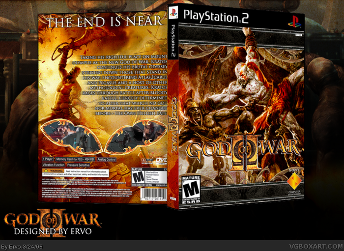
Nice box. Good choice of artwork.
Not a fan of the black borders top and bottom on front and Kratos hanging off them however. Also think the descriptive text is spread across too much. Not keen on the screenshot borders either... they are too much of an effect than practical IMO.
 God of War II Box Cover Comments
My latest and probably one of my best boxes ever. Special Thanks to my friend Daniel for help ;)
[ Reply ]
Nice job. I like everything about it except for the black bars on the cover. They just seem out of place for some reason. Again, really nice job.
[ Reply ]
#2, I agree, I'm also not so keen on those screenshot borders.
[ Reply ]
Hof,much?
[ Reply ]
It's so cool. I'm not a fan of the screenshots border though.
And change your font, it getting repetitive...
j/k =p
[ Reply ]
#5, now i have to say. WHAT THA DUCK, I HAVE NEVER EVEN USED THAT FONT BEFORE?!HOW IN THE HECK CAN IT GET REPETITIVE?
Edited at 1 decade ago
[ Reply ]
what's with the screen borders? they look like lips...
[ Reply ]
#6, I was just joking, didn't you read the entire post ? Don't be angry... or were you joking ?!
[ Reply ]
Aww, you didn't change the placement of Kratos' hand. sad face
Anyways, w00t, this is sweet.
[ Reply ]
#8, i was joking too :D I'm glad you noticed it ;)
[ Reply ]
Nice box. Good choice of artwork.
Not a fan of the black borders top and bottom on front and Kratos hanging off them however. Also think the descriptive text is spread across too much. Not keen on the screenshot borders either... they are too much of an effect than practical IMO.
[ Reply ]
Really good Joni :D
[ Reply ]