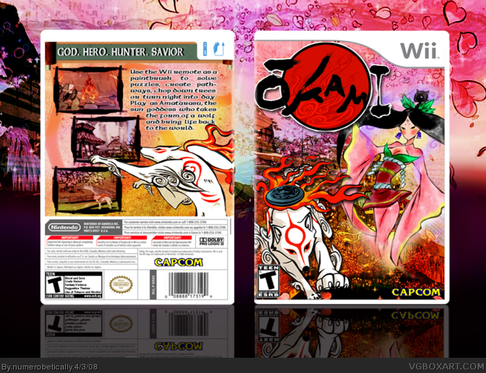
#5, although you wouldn't think so, a lot of games have logos cut off a little bit :D but yeah, this is both really nice... and pink! The logo IS kinda in a weird place, but it doesn't matter, it's very nice and a good addition to your ever-growing colection. :)
Beautiful.
I love the contrasty colors, they fit the style of Okami very well.
The only thing I have to nitpick about is there's no real focal point on the front. You can't really tell what you're supposed to look at: Amaterasu or the lady?
But that doesn't stop you from getting my fav. ;)
Nice job, Numero.
well, for me, my eyes start at amaterasu and then move to the fire and the lady. they way it's set up (i think) forces you to take in everything, one way or another.
Well if you've taken advertising or a class along those lines...you might know that one of the eye patterns is "C" (the other 2 are "Z" and "S") That being said, the front has a reversed "C" pattern where the eyes start at the logo...then the lady (forgot her name XD) and then Amaterasu.
Personally, I'd make Amaterasu the main focus point my increasing his size while decreasing the size of the lady. Might wanna decrease the size of the logo a bit and also move it farther from the template. The back text choice is nice, but align the text so that there aren't big gaps between the text here and there. Just a few things to improve upon in an already splendid box. :)
i just thought of something, LK... if my box has a reverse "C" presentation and it starts at the logo, it ends with amaterasu...so theoretically, it's effective, since the last thing your eyes see is the main character. right?
As a friend of mine might say... Lol, Asian. :P
>_>
<_<
*steals secrets*
Ahem, This is really cool but I think that you should make the lady smaller, and I think "Savior" should have a period after it...
the front is nice, but i agree with LK..
Allthough i'm not an advertising expert, nor a professional graphic designer.. i'd decrease the lady's size..alot.
This box is over-rated for me :( The screens placement doesn't looks right and the font you used is awful and choppy... The front is pretty good though...
 Okami Box Cover Comments
It's absolutely beautiful. Gets a fav from me.
[ Reply ]
A little too pink for my liking :-\
[ Reply ]
you're too pink for my liking =P
jk.
[worst comeback EVER]
anyway, i felt like making it girly.
[ Reply ]
#3, Yes it really was....
:P
[ Reply ]
Truly beautiful, the only thing I'd criticize is that the main logo is being cut off.
[ Reply ]
ahhh i wondered who would be the one to say that :)
[ Reply ]
#5, I agree. I love it, though.
VGM, I wish you would comment once in a while.
Edited at 1 decade ago
[ Reply ]
D'oh, you just had to post this right after my box. O_o
Fiery anger aside, this box is beautiful. :P
[ Reply ]
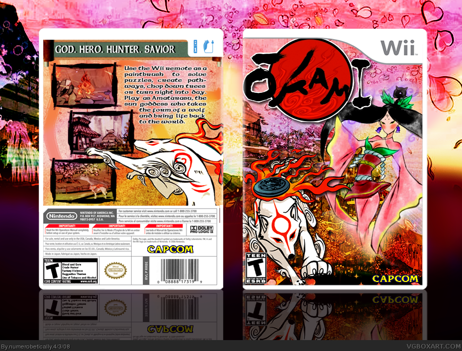
#5, although you wouldn't think so, a lot of games have logos cut off a little bit :D but yeah, this is both really nice... and pink! The logo IS kinda in a weird place, but it doesn't matter, it's very nice and a good addition to your ever-growing colection. :)
[ Reply ]
#5 & 7 i fixed it for you guys :)
thanks everyoene
[ Reply ]
Beautiful.
I love the contrasty colors, they fit the style of Okami very well.
The only thing I have to nitpick about is there's no real focal point on the front. You can't really tell what you're supposed to look at: Amaterasu or the lady?
But that doesn't stop you from getting my fav. ;)
Nice job, Numero.
[ Reply ]
well, for me, my eyes start at amaterasu and then move to the fire and the lady. they way it's set up (i think) forces you to take in everything, one way or another.
[ Reply ]
Well if you've taken advertising or a class along those lines...you might know that one of the eye patterns is "C" (the other 2 are "Z" and "S") That being said, the front has a reversed "C" pattern where the eyes start at the logo...then the lady (forgot her name XD) and then Amaterasu.
Personally, I'd make Amaterasu the main focus point my increasing his size while decreasing the size of the lady. Might wanna decrease the size of the logo a bit and also move it farther from the template. The back text choice is nice, but align the text so that there aren't big gaps between the text here and there. Just a few things to improve upon in an already splendid box. :)
+ author fav for now. ;)
[ Reply ]
well.. uh...
obviously i haven't taken an advertising class... but i feel like a have now lol
thanks :)
[ Reply ]
*sighs loudly*
[ Reply ]
Amozing!
[ Reply ]
#13, Weird, my eyes just look at the front in a circle over and over again O_o
[ Reply ]
#15 im really starting to piss you off huh? haha
[ Reply ]
Mayyybeee. >_>
Thing is, I was just about to submit summat of my own...
[ Reply ]
do it :) dont let me miss it ;)
btw thanks for the faves
Edited at 1 decade ago
[ Reply ]
Well it's not done yet. ;___;
[ Reply ]
#21, Is it that uber secret U...
oh wait. :p
[ Reply ]
#22, That one? Oh no, that's nowhere NEARS done. :p
No, this is one I've just started on recently but been conceptualizing on for a long time.
I'm pretty proud of it so far.
[ Reply ]
<the official conversation box> lol
[ Reply ]
>__>
<__<
[ Reply ]
#25 check your pm's :)
NOT pms. lol sorry
Edited at 1 decade ago
[ Reply ]
But... But I'm a BOY.
[ Reply ]
i just thought of something, LK... if my box has a reverse "C" presentation and it starts at the logo, it ends with amaterasu...so theoretically, it's effective, since the last thing your eyes see is the main character. right?
[ Reply ]
Theoretically...or aesthetically, yes. The reverse "C" pattern is definitely effective.
However, that doesn't mean that you can't have a main focus point and not making the eye flow smoother. ;)
[ Reply ]
As a friend of mine might say... Lol, Asian. :P
>_>
<_<
*steals secrets*
Ahem, This is really cool but I think that you should make the lady smaller, and I think "Savior" should have a period after it...
Edited at 1 decade ago
[ Reply ]
Nice... :)
+ Fav
[ Reply ]
the front is nice, but i agree with LK..
Allthough i'm not an advertising expert, nor a professional graphic designer.. i'd decrease the lady's size..alot.
+fav---awesome job :D
[ Reply ]
This box is over-rated for me :( The screens placement doesn't looks right and the font you used is awful and choppy... The front is pretty good though...
[ Reply ]
#30 i didn't realize there wasnt one :/ i'll get around to fixing it
[ Reply ]
Yay! Congratulations on your 3rd Hall of Famer! :D
[ Reply ]
Your becoming one of our best around here, numero. Well done.
[ Reply ]
numero... your
just...
tooo...
goood...
whyy...
u...
has...
Hof....
so...
much...
not...
fair... ;) Gratz
Edited at 1 decade ago
[ Reply ]
haha thank you :)
[ Reply ]
#38, gratz,lovely.[both box and you-LOL]
2 more for hof #5 benchmark!
[ Reply ]