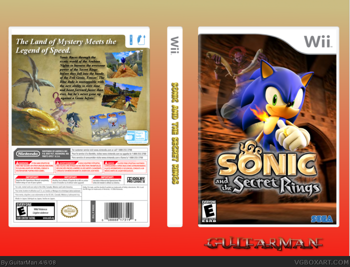
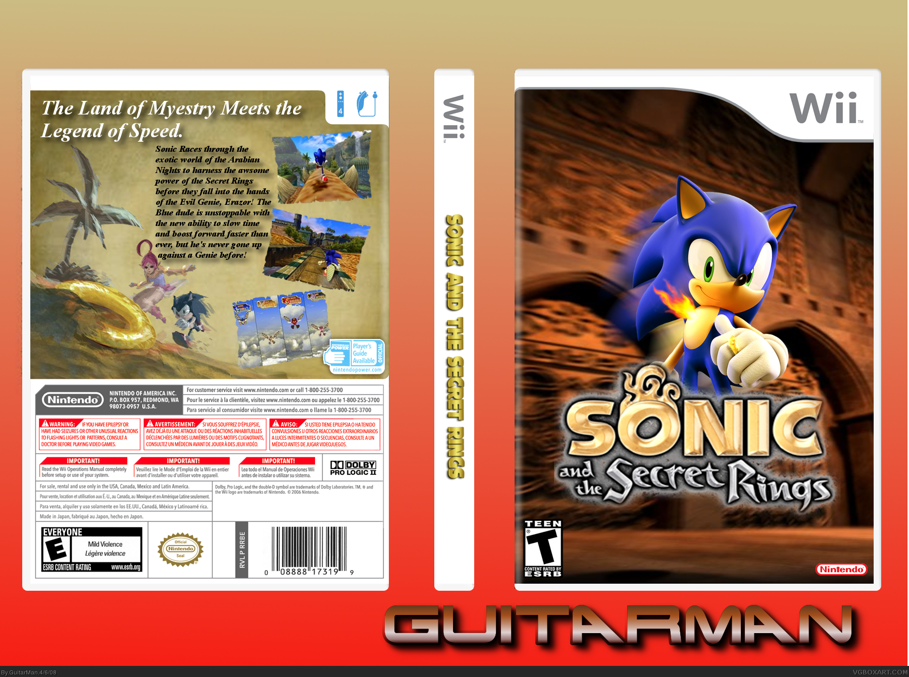
[ Buy Sonic and th... at Amazon ] By GuitarMan 28 on April 6th, 2008 No Printable Available [ Box updated on April 7th, 2008 ] [ original ] Sonic and the Secret Rings Box Cover Comments Comment on GuitarMan's Sonic and the Secret Rings Box Art / Cover. Cancel Reply GuitarMan 28 [ 1 decade ago ] Ok guys here's my SATSR Box. i really like how this one came out. Credit: Temp: Techne [ Reply ] kirby22 14 [ 1 decade ago ] woah, you havent made a box in a while. Nintendo logos to small, front esrb is t and back is e, and you cant copy the font of Marker's signature, you just cant! 4/5 [ Reply ] Veronica 41 [ 1 decade ago ] Looks great, +fav [ Reply ] GuitarMan 28 [ 1 decade ago ] #2, oh whoops my bad i forgot about the ratings and dev logo. and that's terminator font not MARKER's lol. i'll fix those mistakes when i can. [ Reply ] Cerium 43 [ 1 decade ago ] Wow! You forgot the most simple mistake you can make with a Sonic box.. No Sega logo? ^_^ [ Reply ] GuitarMan 28 [ 1 decade ago ] #5, i already said that. read the post about "and dev logo" [ Reply ] Ladykiller 42 [ 1 decade ago ] I really like this, great job. Not too sure about the back paragraph text placement, but overall still sweet. Keep up the good work. :) [ Reply ] Dersnap 41 [ 1 decade ago ] The Nintendo logo is too small and there's WAY too much space on the front and it's not rated Teen, there's also different ESRBs on the front and back, but it's good. Edited at 1 decade ago [ Reply ] GuitarMan 28 [ 1 decade ago ] #7, i had the paragraph in a different spot before but it looked horrid so that about the best spot. #8, im aware of the rating thing. read post 4. Edited at 1 decade ago [ Reply ] TwistedTinkerToy 43 [ 1 decade ago ] That's awesome. What an improvement. I would suggest faiding some characters into the front. (For style) [ Reply ] GuitarMan 28 [ 1 decade ago ] #10, yeah i was thinking about that but i found no good 3-d erazor renders. [ Reply ] Redhedd 13 [ 1 decade ago ] The back says "Myestry". [ Reply ] Cerium 43 [ 1 decade ago ] #12 It also says "awsome" [ Reply ] GuitarMan 28 [ 1 decade ago ] ok two spelling mistakes i have to fix. thanks for alerting me fellas Edited at 1 decade ago [ Reply ] TwistedTinkerToy 43 [ 1 decade ago ] #11, how about this? link [ Reply ] Shadow the Hedgehog 29 [ 1 decade ago ] I actually really like this. Just fade the ^above^ guy somewhere into the front [ Reply ] E_G 39 [ 1 decade ago ] Really good. I like the use of the blur, really brings attention to Sonic but you should've made him bigger. [ Reply ] GuitarMan 28 [ 1 decade ago ] Ok i fixed the spelling Mistakes, Faded Erazor, and took E_G's advice and made Sonic larger [ Reply ] Skppy 1 [ 1 decade ago ] definately my favorite box from you. definately faved! [ Reply ] GuitarMan 28 [ 1 decade ago ] Thanks skippy and all that i see fav'd without commenting *coughMM111cough* lol [ Reply ]
 Sonic and the Secret Rings Box Cover Comments
Ok guys here's my SATSR Box.
i really like how this one came out.
Credit:
Temp: Techne
[ Reply ]
woah, you havent made a box in a while.
Nintendo logos to small, front esrb is t and back is e, and you cant copy the font of Marker's signature, you just cant! 4/5
[ Reply ]
Looks great,
+fav
[ Reply ]
#2, oh whoops my bad i forgot about the ratings and dev logo. and that's terminator font not MARKER's lol. i'll fix those mistakes when i can.
[ Reply ]
Wow! You forgot the most simple mistake you can make with a Sonic box..
No Sega logo? ^_^
[ Reply ]
#5, i already said that. read the post about "and dev logo"
[ Reply ]
I really like this, great job. Not too sure about the back paragraph text placement, but overall still sweet. Keep up the good work. :)
[ Reply ]
The Nintendo logo is too small and there's WAY too much space on the front and it's not rated Teen, there's also different ESRBs on the front and back, but it's good.
Edited at 1 decade ago
[ Reply ]
#7, i had the paragraph in a different spot before but it looked horrid so that about the best spot.
#8, im aware of the rating thing. read post 4.
Edited at 1 decade ago
[ Reply ]
That's awesome. What an improvement. I would suggest faiding some characters into the front. (For style)
[ Reply ]
#10, yeah i was thinking about that but i found no good 3-d erazor renders.
[ Reply ]
The back says "Myestry".
[ Reply ]
#12 It also says "awsome"
[ Reply ]
ok two spelling mistakes i have to fix. thanks for alerting me fellas
Edited at 1 decade ago
[ Reply ]
#11, how about this? link
[ Reply ]
I actually really like this. Just fade the ^above^ guy somewhere into the front
[ Reply ]
Really good. I like the use of the blur, really brings attention to Sonic but you should've made him bigger.
[ Reply ]
Ok i fixed the spelling Mistakes, Faded Erazor, and took E_G's advice and made Sonic larger
[ Reply ]
definately my favorite box from you. definately faved!
[ Reply ]
Thanks skippy and all that i see fav'd without commenting *coughMM111cough* lol
[ Reply ]