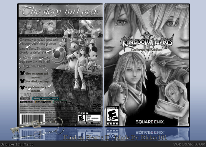
I think I would love this more if it was in color. It's hard to see the words on the back. Change it to color, and I"ll give it a 4.5/5, but for now, it's a 3.5/5. Color matters.
this is very nice, my only gripes would be that empty black space on the front and not being able to read the text on the back. also i've never seen that roxas image before :D
I think it's very good. The overall silver effect would look better if complimented by another color though, but I really like the front. The back is a little hard to read though. Overall very nice box, 4.8/5. And I agree with White Dove, did you render all those or get them from the internet? And the Roxas image is really neat!
 Kingdom Hearts II: Collector's Edition Box Cover Comments
Here is my Kingdom Hearts II Collectors Edition!
I worked really hard on this, I hope you like it!
[ Reply ]
this is really good i like it +Fav
[ Reply ]
Cool. IMO, the grayscale doesn't look that nice, but the presentation is sick.
[ Reply ]
I think I would love this more if it was in color. It's hard to see the words on the back. Change it to color, and I"ll give it a 4.5/5, but for now, it's a 3.5/5. Color matters.
[ Reply ]
Did you draw the picture on the front? If yes, then this is a very great box, if no then I think you should credit the artist. Good job nonetheless
Edited at 1 decade ago
[ Reply ]
this is very nice, my only gripes would be that empty black space on the front and not being able to read the text on the back. also i've never seen that roxas image before :D
[ Reply ]
Good one Blakeman.
[ Reply ]
I think it's very good. The overall silver effect would look better if complimented by another color though, but I really like the front. The back is a little hard to read though. Overall very nice box, 4.8/5. And I agree with White Dove, did you render all those or get them from the internet? And the Roxas image is really neat!
[ Reply ]
MUST FAV BOX!!!
[ Reply ]