Wow, that's cool! I thought I was fast at making boxart, but you are sure churning them out (especially with those other projects you have in the wings)! LOL -- superb!
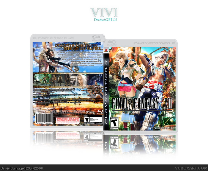
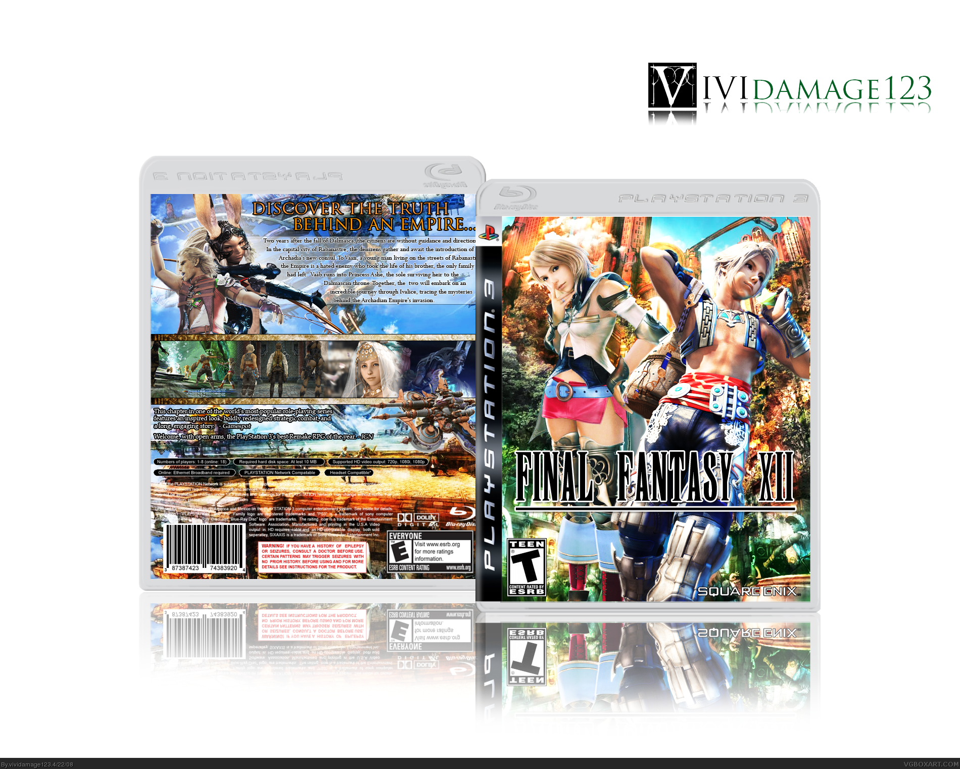
I appreciate the effort, but there is way too much going on the background of the front cover which detracts my attention from the main characters.
The back cover should've complimented the front more with some green tones.
A good rule of thumb is keep a minimal image behind the legal info stuff. I also feel just a white colored tagline would look better than orange stroked with black.
Also when putting a last gen game on a next gen template needs to be explained, maybe have a "remastered" or something to explain why a game meant for PS2 is on the PS3.
I'm sorry if my crit felt a bit harsh, but this will help you more than airy-fairy comments. You do seem to have a lot of potential so I look forward to your next box. :)
 Final Fantasy XII Box Cover Comments
Holy Kwap! Nice work. Mismatched ESRB logos though :) Fix that and i'll fave it.
Edited at 1 decade ago
[ Reply ]
im gonna kill you... if you didnt make this box.
[ Reply ]
Despite the ESRB this ownsezeserzems.
[ Reply ]
ESRB FIXED :) Oh and temp credit to Techne
Edited at 1 decade ago
[ Reply ]
I think you should cut down on the white space, the box design is high quality.
[ Reply ]
Awesome.
[ Reply ]
Awesome!
[ Reply ]
Used the same wallpapers as i did on my FF box, looks cool. Great job.
[ Reply ]
very nice work, i love it +fav
[ Reply ]
nice box vivi, wierd how i would stumble upon this funny FFXII video today, when you also made a box :D
link
[ Reply ]
#10, Lol!
"Oh Vaan, everyone hates you....
The way it should be." XDD
Nice box btw, viv. ;)
[ Reply ]
a lot of effort... nice 5/5
[ Reply ]
Wow, that's cool! I thought I was fast at making boxart, but you are sure churning them out (especially with those other projects you have in the wings)! LOL -- superb!
[ Reply ]
do you know... i think you're one of my top favorites. you've replaced MARKER!! no jk but you're top 5 ;)
[ Reply ]
#10, That video was hilarious! :D
#13, lol thanks, yeah you put boxes out fast too, yeah cant wait for that other project to be done, thanks!
#14, Wow that means alot! ONE DAY Ill beat Marker lol!!! just kidding...
[ Reply ]
I really like this one. Both the front and the back show how much effort you probably put into making this box.
[ Reply ]
*faints*
[ Reply ]
I appreciate the effort, but there is way too much going on the background of the front cover which detracts my attention from the main characters.
The back cover should've complimented the front more with some green tones.
A good rule of thumb is keep a minimal image behind the legal info stuff. I also feel just a white colored tagline would look better than orange stroked with black.
Also when putting a last gen game on a next gen template needs to be explained, maybe have a "remastered" or something to explain why a game meant for PS2 is on the PS3.
I'm sorry if my crit felt a bit harsh, but this will help you more than airy-fairy comments. You do seem to have a lot of potential so I look forward to your next box. :)
Edited at 1 decade ago
[ Reply ]
#18, Hey hey hey your not harsh at all this makes better box artists :)
As for the remake I did mention it in the quote but I didnt exactly make it apparent which I should have.
Your right about the Legal Info, you really cant read it, but I do feel that this is one of my better backs, it has a bunch of details
[ Reply ]
WOW
[ Reply ]
#20, lol thanks, I like your icon btw
Edited at 1 decade ago
[ Reply ]
#16, What's your icon of? sorry for double post
Edited at 1 decade ago
[ Reply ]