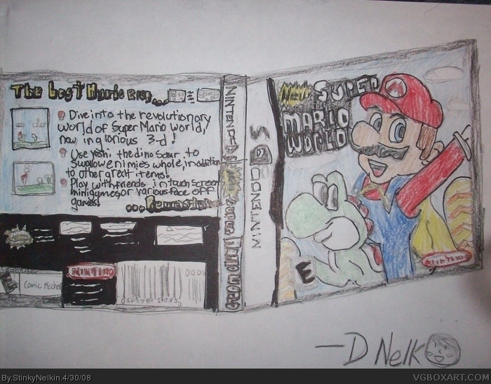
If this weren't for the drawing comp I'd be flipping out, but since it is, I quite like it. The drawings could be better; for example, the back description is hard to read because the text is all crammed together. The front image of Yoshi looks kinda weird, too. Still, it's a decent box. 3/5
 New Super Mario world Box Cover Comments
My entry for the drawing comp...
Also my first box
Edited at 1 decade ago
[ Reply ]
OH MY GOD. YOU MADE A BOX.
[ Reply ]
Yes I did.... :D
[ Reply ]
Well, it's not great, but nice first.
[ Reply ]
I respect you for making it 3D. :D
[ Reply ]
Very good attempt.
[ Reply ]
I'm just saying it again, this is FOR THE DRAWING COMPETITION
[ Reply ]
If this weren't for the drawing comp I'd be flipping out, but since it is, I quite like it. The drawings could be better; for example, the back description is hard to read because the text is all crammed together. The front image of Yoshi looks kinda weird, too. Still, it's a decent box. 3/5
[ Reply ]
You...made...a...box...
[ Reply ]
You couldn't have made it look nice by using a ruler and writing like your not 3?
[ Reply ]
I used a ruler.....
And I'm not 3....
I'm 4 1/2....
[ Reply ]
XD
[ Reply ]
#11, There isn't one freaking straight line. Dude come on his is spam.
[ Reply ]
How is it spam?
[ Reply ]
Pretty cool one man.
[ Reply ]
#13, How the hell is this spam? I think it's a very nice box, and it will recieve a fave from me. Because it's a drawing.
[ Reply ]