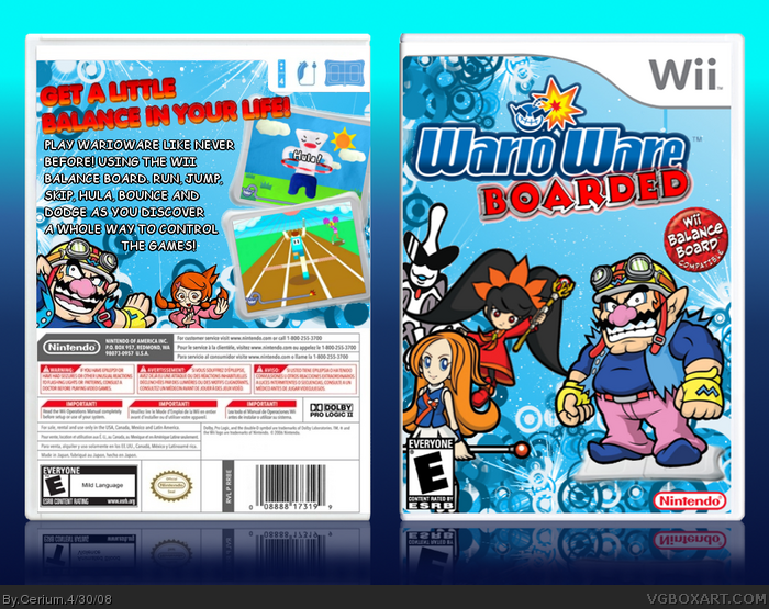
Been a while since I made a non-satire box so I hope you all like =]
I think it would be cool if Nintendo made more games that use the Wii Balance Board so then I had the brilliant idea of making a WarioWare game that uses the Board to play the minigames with. Credit to KoopaDasher for the template.
Also special thanks go to Ayron for his positive feedback and also MARKER for giving me inspiration to do this and basically helping me along the way! Thank alot you guys, couldn't of done this without you two =]
#18, Also, if they did make this game. I could guarantee you wouldnt just be Balancing on the board.
It'd probly include stepping on and off, jogging on it and other stuff.
Btw this is an awsome idea and if Nintendo is looking at this, Pay Cerium £50,000,000 then use the idea... >.<
#20 Yeah, as anyone who has played WIi Fit will know, you can do alot more than just balance on the Wii Board. And im pretty sure Nintendo have thought of this idea way before I did ha ha. Unless I try to copyright the idea before they do XD
Nice one Cerium! You already know my views on it since I saw it several times from start to almost finish! lol
I still prefer the original tagline with the Bored/Board take, and preferred tad smaller text to keep it above Wario's head on the back... but nice job mate!
Hey I just wanna say a HUGE thank you to everyone who gave me advice, faved or simply just commented this box! I have been aiming for another HoF for a while now and im so happy about how this turned out!
I know I have made good boxes in the past but I think this box truely shows just how far I have improved as an artist! I mean compare this box to my second box link *hides*
Cerium, I've noticed a few flaws. A few of them I mentioned above and a few of them I didn't.
I think it's too blurry. Mainly the renders. I also think that it would look better if the Board was a cartoon as well. I also find the screenshot borders to choppy, and the text looks bad. The subtitle on the front looks poorly cut out, too.
#29 Ah yes, thank you for pointing them out.
A few renders do look a bit blurry in full view so I suggest try not to click on it :P
The subtitle is meant to have that glow around it and also the Wii Fit box had a cartoon image on a real Wii Board so I thought it would be alright. Its not really a major flaw though.
Still, thanks for your feedback TTT ^_^
#32, your font choice is fine, (Comic Sans fits the game quite nicely) it's the black behind it that makes it look bad. It just looks messed up. I would suggest you just add a simple stroke to the text.
 WarioWare: Boarded Box Cover Comments
That's actually really cool, but the red doesn't seem to fit with the overpowering blue theme.
But, a fave.
[ Reply ]
Been a while since I made a non-satire box so I hope you all like =]
I think it would be cool if Nintendo made more games that use the Wii Balance Board so then I had the brilliant idea of making a WarioWare game that uses the Board to play the minigames with. Credit to KoopaDasher for the template.
Also special thanks go to Ayron for his positive feedback and also MARKER for giving me inspiration to do this and basically helping me along the way! Thank alot you guys, couldn't of done this without you two =]
[ Reply ]
[/game should be real]
[ Reply ]
I like it a lot, bold and colorful. Your best design yet.
[ Reply ]
Great idea. I love the box too ;)
[ Reply ]
The quality and blurriness kills it for me. :\
Edited at 1 decade ago
[ Reply ]
I like it, but a few problems are:
The Wii Balance Board should be a cartoon, as well.
The text on the back looks messy.
It's pretty blurry.
Edited at 1 decade ago
[ Reply ]
I hope this'll be your second HoF,mate.. here's my fav ^.^!
[ Reply ]
awshum!
[ Reply ]
This box is awesome!
Edited at 1 decade ago
[ Reply ]
I love this, man. Mos def' your best yet. ;)
+fav
[ Reply ]
Awesome, I love the colors.
[ Reply ]
Brilliant! Get a medal! 5/5!
PS. Sorry I can't give you useful critism but it's just too good!
[ Reply ]
Gratz Cerium !
[ Reply ]
Gratz Cerium !
[ Reply ]
I told you mate.. great job!
gratz on HoF!
[ Reply ]
WHOAH! another HoF for cerium, well done man. +fav
[ Reply ]
Cool, but I think it would be better as " Wario Ware: Balanced "
[ Reply ]
#18 I did think of that name but it sounded too obvious and unoriginal.
I like thinking outside the box xD
[ Reply ]
#18, Also, if they did make this game. I could guarantee you wouldnt just be Balancing on the board.
It'd probly include stepping on and off, jogging on it and other stuff.
Btw this is an awsome idea and if Nintendo is looking at this, Pay Cerium £50,000,000 then use the idea... >.<
[ Reply ]
#20 Yeah, as anyone who has played WIi Fit will know, you can do alot more than just balance on the Wii Board. And im pretty sure Nintendo have thought of this idea way before I did ha ha. Unless I try to copyright the idea before they do XD
[ Reply ]
Nice one Cerium! You already know my views on it since I saw it several times from start to almost finish! lol
I still prefer the original tagline with the Bored/Board take, and preferred tad smaller text to keep it above Wario's head on the back... but nice job mate!
[ Reply ]
Well, I didn't love it...buuuuuuuut...grats on HoF, Cerium. *claps*
[ Reply ]
this is actually really awsome...
[ Reply ]
#19 and #20, I see what you guys mean. Oh, and #20, I'm from the USA, so I would pay $ 6,250,000 :P
[ Reply ]
i agree red don't go with blue
[ Reply ]
but it is very good.
[ Reply ]
Hey I just wanna say a HUGE thank you to everyone who gave me advice, faved or simply just commented this box! I have been aiming for another HoF for a while now and im so happy about how this turned out!
I know I have made good boxes in the past but I think this box truely shows just how far I have improved as an artist! I mean compare this box to my second box link *hides*
Edited at 1 decade ago
[ Reply ]
Cerium, I've noticed a few flaws. A few of them I mentioned above and a few of them I didn't.
I think it's too blurry. Mainly the renders. I also think that it would look better if the Board was a cartoon as well. I also find the screenshot borders to choppy, and the text looks bad. The subtitle on the front looks poorly cut out, too.
[ Reply ]
#29 Ah yes, thank you for pointing them out.
A few renders do look a bit blurry in full view so I suggest try not to click on it :P
The subtitle is meant to have that glow around it and also the Wii Fit box had a cartoon image on a real Wii Board so I thought it would be alright. Its not really a major flaw though.
Still, thanks for your feedback TTT ^_^
[ Reply ]
#30, I'd still suggest you fix the text, though. ^_^
Você pouco verme!
:p
[ Reply ]
#31 Do you have any suggestions on how to fix the text? Fonts have never been my strong point :P
[ Reply ]
#32, your font choice is fine, (Comic Sans fits the game quite nicely) it's the black behind it that makes it look bad. It just looks messed up. I would suggest you just add a simple stroke to the text.
[ Reply ]
#33 Ok thanks. I'll try playing around with the text a lil bit and see if I can get it looking better =]
[ Reply ]
great box Cerium. and congratz on the second HoF.
[ Reply ]
Did anyone notice that the reflection has a Teen ESRB and The Box has a E ESRB. Besides that, great box!
[ Reply ]
#36 Haha yep that was a little hidden mistake I threw in there on purpose. I wanted to see who would spot it first You win!! :)
10 points to Sentry!!
[ Reply ]
Quality! My favourite!
[ Reply ]
What is Wario stand on? *wonder* 3.5/5
[ Reply ]
#39 UM is that sarcasm? lol
Or do you seriously not know? O_o
[ Reply ]
Good idea!
I would like a similar game onto the Wii.
Edited at 1 decade ago
[ Reply ]