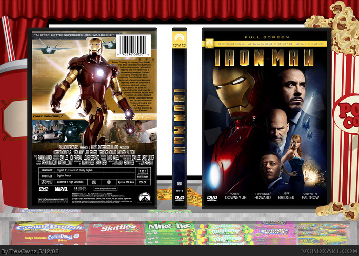
My greatest box so far. This has like 10+ hours into it. The background was done by me. That case and candy took forever to do. This is a counter at the movies with candy, popcorn, and a drink. The white in the back is the movie screen. I thought it would be better a white screen before the movie started than a screen shot of the movie which would take your eyes off the box more. The front isn't just a wallpaper, its not even the same Iron Man. I did so much work on the back. I had to type and look up all the producers, director, music, screen story, and makers of Iron Man comics. The screen shots i though came out nicely and i liked the very light Armour info and lines. Not much else i can explain about this box.
I changed his head on purpose because i hate the image you sent me... His head looks like it went threw a washing machine.. and that makes in not just a wallpaper BTW. I did have to do other things to it. I thought the back of your latest box was very empty but i try to be nice... and how is it empty when i added to the whole image, i try not to over fill and make the box a clutter and i like the simple look sense that is how most DVD's look..The summary on the paper is because he is in another country and his work isn't to bee seen so to me it shows the sketches on paper style and stuff if that makes sense. I didn't show you my box because your the only person that never has anything nice to say about my boxes.
The only thing I suggest for the background is make it little more darker. Add some shadows, cos it looks a bit cartoony. And maybe even make the movie screen black or dark gray.
But details of the background is awsome. Box looks amazing too.
+ Fav
good. i like it. but it could do with getting right of that paper square thing on the back... it kinda grabs my attention. but other than that its awesome. damn you, i was gonna use that pic >_>
oh, and best box on the site? please. you've all said that for like 1/3 of all the boxes you've ever commented on. this is brill, but certainly not best or anything. Oh, and Trev, I thought you absolutely hated non-game boxes? You used to say things like all the CD covers are spam etc.
Anyone got some ideas for the movie description then i would be more than happy to hear. I would prefer help than it looks bad, ya know?
I'm glad you guys liked it but i don't really like the future, simple and non colorful look #13 that you would prefer, I'm the opposite. I like "cartoony" look sense I'm a comic book, superhero, Star Wars kind of kid. I love artistic looking stuff. This is my style. I like color, not dull downed colors but I understand your advice and everyone else's. Sorry you felt i was being mean shady but it felt your like a insult with a good job at the end. Mad Spike got his point across in a more helpful way. You said its empty thats it, he gave advice.
and about the non game stuff I stopped when he made DVD, CD title things. I felt like the misc was being used wrong and the 5 CDs in one day made me think this was going to be a everyday thing and i was like Wtf is going on? I don't mind know that he clearly made a section for CD and DVD's. I agree with E_G about there needing to be a area for CD and DVD boxes to show up on the main page.
I didn't want you to rewrite what i said but i wanted someone to give me advice on how to apply it to the back, sense no one likes the paper. What you put wouldn't make sense and that is why i didn't right something like that. Why would i put the release date of when it came out in the movies on the DVD?
Sorry I forgot to comment, this is ace Trev. Are you planning to get into the graphic industry? you could actually make a professional freelance portfolio with this sort of stuff.
Just one gripe: I agree with Spike about the lack of shadowing in the display objects. Just small black circles, blurred, and lower their opacity and put them beneath the popcorns and the other items. Trust me, lighting and shadowing have a major impact on an image. The sweets and stuff look like very good vectors but they seem to lack depth, which would be fixed with some shadows.
That is how you give your opinion in a very nice way. Thanks Dmshaposv, i understand about the shadowing but i was playing with the shadows and it felt to crowned with all the shadow and stuff. I will fix it before i use this template background on my next movie boxart. Thanks everyone for the comments and favs =]
Awesomely wicked job, TrevOwnz! This has got to be your best box yet! I love the background. It's really creative! I would've faved the box for the background alone, but theres much more to it. Keep up the great work, TrevOwnz! You're starting to become one of the site's better artist of your time.
Wow thanks guys, I'm glad you like this box so much. I made some updates to it but I'm not at home right now and my internet is down so it might be away until i update, but i added to the front a couple things. Thanks for the comments and favs. Hope you guys like the update when i do it.
I like the changes on the back. The new summary fits way better than the old sheet of paper. The box is pretty much perfect now, and the small changes to the front are nice, however small they may be.
Man, I really want those skittles right now.
Thanks for the comment and I really liked the update so I had to post. I think it makes it look a lot better about the back definitely looks better. Cred to Marker for the textures and if I add to it i will update again. Thanks for commenting and faving guys.
Screw freaking all of you. I didn't use just a freaking poster. I added to the bottom, I fixed up the colors on his chest, his head is different, I added the circle chest thing in the background, I faded out the image more and extended it to be a taller image. If you have a problem with my damn box then do better and shut the hell up.
Delete these comments before I flip out because these crap isn't criticism this is crap comments.
#46, Yes I used a movie poster and I did add a different head #46. I disliked how it looked like i said before, but there is other things I did to the front that I think went over looked like how I added a different shot at the bottom, changed the brightness in areas, added a image of his chest piece, extended the image so it was taller and I had to fade it in a lot of areas so it didn't look like it cut off. I put work into the front even if at first glance it doesn't appear to be so. Thanks to all for the comments and favs, I hope you enjoy my other Iron Man boxart if your a fan like me.
omg,omg,omg! soooo great! i was gunna make it 5/5 except..... the last screenie (to the right of screenies) looks like his hand was done really wierdly.... it might just be me but i think that. sorry if you found that offensive..... so i would give it 4.9999999999999999999999999999999999999999999/5
#53, Sorry its not perfect? I tried to cut his hand out of an image where his head was the focus point not his hand so his hand was blurry and hard to see the edge, but whatever.
#54,..... i was wierd on that comment,
i cant believe i didn't fave it.......
dammit im faving nao!
did you know you introduced me to the site....
from youtube :)
thank you!
 Iron Man Box Cover Comments
My greatest box so far. This has like 10+ hours into it. The background was done by me. That case and candy took forever to do. This is a counter at the movies with candy, popcorn, and a drink. The white in the back is the movie screen. I thought it would be better a white screen before the movie started than a screen shot of the movie which would take your eyes off the box more. The front isn't just a wallpaper, its not even the same Iron Man. I did so much work on the back. I had to type and look up all the producers, director, music, screen story, and makers of Iron Man comics. The screen shots i though came out nicely and i liked the very light Armour info and lines. Not much else i can explain about this box.
I love it so much and i hope you do to =]
[ Reply ]
WOW!
[ Reply ]
Oh my God dude, this is even more epic than it was when you showed me on AIM.
[ Reply ]
Class. The box is awesome enough but I love the background with the sweeties. :D So much attention to detail.
[ Reply ]
Wow
......
Wow
[ Reply ]
#5, Wow
[ Reply ]
#3, yea, it's like epic+30
[ Reply ]
deleted because trev hates my critiquing :\
Edited at 1 decade ago
[ Reply ]
I changed his head on purpose because i hate the image you sent me... His head looks like it went threw a washing machine.. and that makes in not just a wallpaper BTW. I did have to do other things to it. I thought the back of your latest box was very empty but i try to be nice... and how is it empty when i added to the whole image, i try not to over fill and make the box a clutter and i like the simple look sense that is how most DVD's look..The summary on the paper is because he is in another country and his work isn't to bee seen so to me it shows the sketches on paper style and stuff if that makes sense. I didn't show you my box because your the only person that never has anything nice to say about my boxes.
[ Reply ]
#9, comments are all about voicing your opinion and critiquing trev......but i guess im the "bad guy"...>_>
[ Reply ]
I think you're being pretty unfair, Trev. Shady's just voicing his opinion.
[ Reply ]
very stylish ineed! gets my fav
[ Reply ]
The only thing I suggest for the background is make it little more darker. Add some shadows, cos it looks a bit cartoony. And maybe even make the movie screen black or dark gray.
But details of the background is awsome. Box looks amazing too.
+ Fav
[ Reply ]
I seriously think this might be the best box on the site.
*gets devoured*
[ Reply ]
I can't wait for this movie, and If the case does not look similar, I will shoot myself.
[ Reply ]
#15, I hope I will see it tomorrow :D
[ Reply ]
I usually wait to rent it, but it really looks cool.
fav
[ Reply ]
imdb.com rating is 8.3
looks like its something more then just another Marvel's movie.
Sorry 4 offtop.
[ Reply ]
oh my god, this is awsome i am sooooo faving
[ Reply ]
Congratulations, Trev.
[ Reply ]
good. i like it. but it could do with getting right of that paper square thing on the back... it kinda grabs my attention. but other than that its awesome. damn you, i was gonna use that pic >_>
oh, and best box on the site? please. you've all said that for like 1/3 of all the boxes you've ever commented on. this is brill, but certainly not best or anything. Oh, and Trev, I thought you absolutely hated non-game boxes? You used to say things like all the CD covers are spam etc.
[ Reply ]
Awesome job.
[ Reply ]
#21, I really haven't though.
[ Reply ]
Full screen? FULL SCREEN?!?!? BLASPHEMY!
On subject, really awesome looking. The description part looks a little off but everything else is so great.
[ Reply ]
Amazing 5/5. And im gonna be seeing this movie today. But i dont like how that paper square is covering iron man's left arm but i still faved^^
[ Reply ]
Holy shizz.
Self explanatory.
[ Reply ]
+fav +author fav
[ Reply ]
Anyone got some ideas for the movie description then i would be more than happy to hear. I would prefer help than it looks bad, ya know?
I'm glad you guys liked it but i don't really like the future, simple and non colorful look #13 that you would prefer, I'm the opposite. I like "cartoony" look sense I'm a comic book, superhero, Star Wars kind of kid. I love artistic looking stuff. This is my style. I like color, not dull downed colors but I understand your advice and everyone else's. Sorry you felt i was being mean shady but it felt your like a insult with a good job at the end. Mad Spike got his point across in a more helpful way. You said its empty thats it, he gave advice.
and about the non game stuff I stopped when he made DVD, CD title things. I felt like the misc was being used wrong and the 5 CDs in one day made me think this was going to be a everyday thing and i was like Wtf is going on? I don't mind know that he clearly made a section for CD and DVD's. I agree with E_G about there needing to be a area for CD and DVD boxes to show up on the main page.
Edited at 1 decade ago
[ Reply ]
#28, Why not just use Koopa's description that he gave out in the forums?
Edited at 1 decade ago
[ Reply ]
I didn't want you to rewrite what i said but i wanted someone to give me advice on how to apply it to the back, sense no one likes the paper. What you put wouldn't make sense and that is why i didn't right something like that. Why would i put the release date of when it came out in the movies on the DVD?
[ Reply ]
Sorry I forgot to comment, this is ace Trev. Are you planning to get into the graphic industry? you could actually make a professional freelance portfolio with this sort of stuff.
Just one gripe: I agree with Spike about the lack of shadowing in the display objects. Just small black circles, blurred, and lower their opacity and put them beneath the popcorns and the other items. Trust me, lighting and shadowing have a major impact on an image. The sweets and stuff look like very good vectors but they seem to lack depth, which would be fixed with some shadows.
[ Reply ]
That is how you give your opinion in a very nice way. Thanks Dmshaposv, i understand about the shadowing but i was playing with the shadows and it felt to crowned with all the shadow and stuff. I will fix it before i use this template background on my next movie boxart. Thanks everyone for the comments and favs =]
[ Reply ]
Epic. :D
[ Reply ]
I'm usually against having non-videogame boxarts on the site but THIS IS SO AN EXCEPTION!!! AMAZING!
[ Reply ]
Thanks LK and Rathus =] #34, can you check your messages. I sent you something.
Edited at 1 decade ago
[ Reply ]
Awesomely wicked job, TrevOwnz! This has got to be your best box yet! I love the background. It's really creative! I would've faved the box for the background alone, but theres much more to it. Keep up the great work, TrevOwnz! You're starting to become one of the site's better artist of your time.
[ Reply ]
O....M....G! Excuse me as I now faint at the awsomeness of this.
*faints at the awsomeness of this*
[ Reply ]
Wow thanks guys, I'm glad you like this box so much. I made some updates to it but I'm not at home right now and my internet is down so it might be away until i update, but i added to the front a couple things. Thanks for the comments and favs. Hope you guys like the update when i do it.
[ Reply ]
Damn, this is so sick.
[ Reply ]
Added some stuff to the front. I think its more original than the first upload. I might work on it some more later =]
Edited at 1 decade ago
[ Reply ]
I like the changes on the back. The new summary fits way better than the old sheet of paper. The box is pretty much perfect now, and the small changes to the front are nice, however small they may be.
Man, I really want those skittles right now.
Edited at 1 decade ago
[ Reply ]
Thanks for the comment and I really liked the update so I had to post. I think it makes it look a lot better about the back definitely looks better. Cred to Marker for the textures and if I add to it i will update again. Thanks for commenting and faving guys.
[ Reply ]
Amazing movie, amazing box!
[ Reply ]
Dam... when did I miss this one!? Typical, I see the preview, and miss the posted one! Superb! ;)
[ Reply ]
link
But +fav for the back.
[ Reply ]
#45, You don't have a point, we know he used a poster.
[ Reply ]
#46, oh... my bad.
[ Reply ]
#45, He used the head from the other poster though.
[ Reply ]
Screw freaking all of you. I didn't use just a freaking poster. I added to the bottom, I fixed up the colors on his chest, his head is different, I added the circle chest thing in the background, I faded out the image more and extended it to be a taller image. If you have a problem with my damn box then do better and shut the hell up.
Delete these comments before I flip out because these crap isn't criticism this is crap comments.
Edited at 1 decade ago
[ Reply ]
#46, Yes I used a movie poster and I did add a different head #46. I disliked how it looked like i said before, but there is other things I did to the front that I think went over looked like how I added a different shot at the bottom, changed the brightness in areas, added a image of his chest piece, extended the image so it was taller and I had to fade it in a lot of areas so it didn't look like it cut off. I put work into the front even if at first glance it doesn't appear to be so. Thanks to all for the comments and favs, I hope you enjoy my other Iron Man boxart if your a fan like me.
[ Reply ]
what software did you use to create this?
[ Reply ]
#51, Photoshop.
[ Reply ]
omg,omg,omg! soooo great! i was gunna make it 5/5 except..... the last screenie (to the right of screenies) looks like his hand was done really wierdly.... it might just be me but i think that. sorry if you found that offensive..... so i would give it 4.9999999999999999999999999999999999999999999/5
sincerely A_Masta
[ Reply ]
#53, Sorry its not perfect? I tried to cut his hand out of an image where his head was the focus point not his hand so his hand was blurry and hard to see the edge, but whatever.
[ Reply ]
...
I never faved this.
[ Reply ]
#54,..... i was wierd on that comment,
i cant believe i didn't fave it.......
dammit im faving nao!
did you know you introduced me to the site....
from youtube :)
thank you!
[ Reply ]
You're awesome
FAVE AUTHOR FAVE
[ Reply ]