Great job, Numero. I like that you tryed something different. Something that I don't like is the way the text is setup. It just looks kinda messy. Maybe you could try something else?
Well, it's nice I suppose, and it's refreshing to see you try something out of your element, but I gotta be honest - you're better than this box.
The logo's the main problem for me. I know you said it looked ugly any other color, but you're smart - I'm sure you can figure something out. ;) Tinker around with placement and glows/strokes - you'll come up with something. Also, the back layout is essentially the same as your other boxes, and it's starting to look a tad stale. Annddd finally, the color scheme clashes - it would look a lot better if you had the same shade of blue present at all places.
I hope I'm not being too harsh - It's just that this had a lot of potential and I have very high expectations for you. ;)
Okay. #5 What do you mean it looks messy? Like the font or the backdrop/stroke? It's a perfect line down the right side, so I don't quite understand.
#6 I'm gonna shoot you in your dang eye. In your dad gum eye.
lol jk..You're not being too harsh, I just don't really get what you're saying. But I have a few things to say in response anyway.
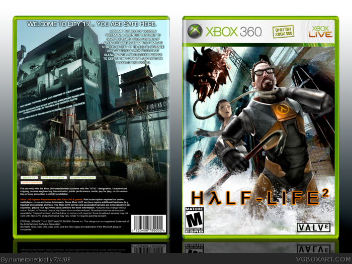
1) There were simply no logos that were big enough, so I had to make my own using the font.
2) It's different from my other backs because the screenborders and positions are entirely different. My design for backs usually goes as such:
Tagline with a border (no border on this one)
Text next to a render (text is above render)
Screenshots are either 3 on the side or 3 on the bottom.
And I don't get what you meant about the blue.
With that said, credit to Crayon Man for the front template, and myself for the back, which was a real pain in the butt, what with typing the information correctly. Very tedious.
I understand what Ryan is saying, actually. By this time, having made 67 boxes and getting several HoF's, I expect that you got your technique almost mastered by now. That doesn't mean I'm disappointed, because I'm not...As a matter of fact, this is one of your better boxes IMO.
The front concept is great, but as Ryan said- you should consider experimenting on different styles when it comes to your backs. My main gripe for your previous boxes was mainly the typography and I see that you've improved on the font choice etc, but definitely not text wrapping. The text wrapping gets really weird towards the end. Might wanna put some emphasis on the logo too by virtue of some kind of stroke or outerglow.
In the end, it's a great box...but minor errors in typography and technique (such as the small back/front esrb logos) keep it from reaching its true potential. :)
It's basically how the text "wraps" or "hugs" around an image. Notice how you didn't extend the back paragraph text to the hexes and kinda made them "wrap" around them instead. That's text wrapping and if done well it creates a really smooth eye flow for the viewer. In this box's case- it feels kinda awkward towards the end of the back paragraph text with the sudden breaks and is highly noticeable in the last line.
Check out the bullet info in qwerty's god of war box and how smoothly they wrap around Kratos' leg. I also have a good example of text wrapping in my Jade Empire box where the text wraps smoothly with the red curtain to create a good flow- which is essential in achieving mastery of typography. ;)
Looks cool and i agree that your a good artist but i had a feeling when i saw Half Life 2 idea from Mad Spike that it wouldn't be your best. I have nothing against Half Life but i feel the art work is hard to work with. In my opinion Nintendo boxes are the best. They give you every character usually on a easy wallpaper to cut out with plenty on backgrounds to play with and sense its not so real looking its easy to free hand. I think the back could use less screen shots and you could blend another image onto it. Keep up the good work.
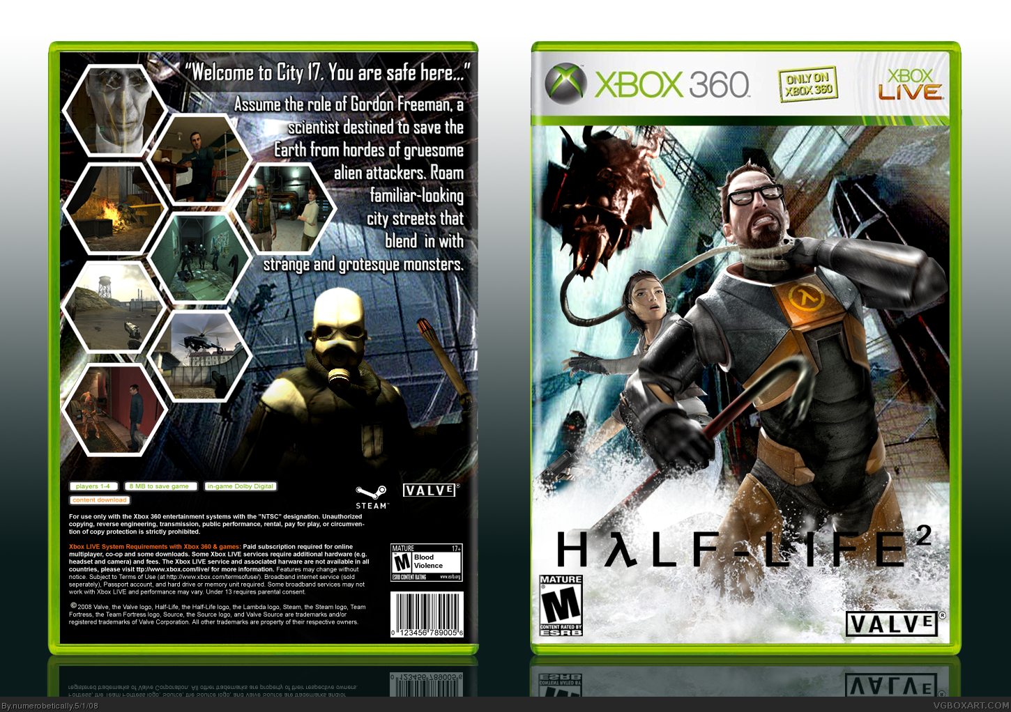
Well, I'm modefying it all so I'll include those things. BTW Ryan I changed that back image because it ended up looking truly awful..
#14 I agree, that's why I usually stick to cartoon-like boxes. I think it's pretty weird when people ask me to change my style.. hmm.. But it's all good practice.
@#14, Then why not do Half-life 2? That would be a good challenge for an aspiring artist like her.
It sounds like you are discouraging her from doing anything but a nintendo box since they are easier to make. Looking at the site demographic, a lot of people over here like nintendo stuff. So even if you make a so-so nintendo box, people would eat it up. HL2, on the other hand doesn't seem to be very popular and also has artwork which is more difficult to manipulate.
I love the way she got the Alex render to work in the BG, and how she rendered gordon and the water. I agree though, the back cover seems quite rushed, but with a little help (which she is already getting from hunter and LK) it can be much better.
#16, Dude I'm not saying that at all. If she has a style she is good at then i would like to see that style. Mad Spike gave her the idea to do Half Life 2 when that is Mad Spikes style, she said herself "its weird when people ask me to change my style.." I think Nintendo boxes are so much fun and have some much personality in them where other boxes are more likely to look like another box. I'm not saying this looks like another box of course.
Love the front... saw what you did in your WIP thread, and thought it came out cool. The Logo colour change is an improvement.
Back is also improvement over V1.0, although I'm not a fan of the thick hexagon borders of the screenies. Personally I would have gone with smaller text for the description, and then add some feature text to compliment it, since anyone picking up the box would want to know why they should buy this as oppose to the other 100 1st person shooters on the 360. However, great job.
Do I like the back...do Canadians like their beer? Do rednecks like shooting possums? Did the Native Americans get cheated out of the fur trade by the French?
To answer the above questions, YES! Super original, I love it.
 Half Life 2 Box Cover Comments
i love you.
[ Reply ]
#1 I love her more ^_^
[ Reply ]
That new render of Alex is perfect.
But I agree with TTT.
Edited at 1 decade ago
[ Reply ]
No I do...:p
[ Reply ]
Great job, Numero. I like that you tryed something different. Something that I don't like is the way the text is setup. It just looks kinda messy. Maybe you could try something else?
[ Reply ]
Hmm.
It, ah - Hmm.
Well, it's nice I suppose, and it's refreshing to see you try something out of your element, but I gotta be honest - you're better than this box.
The logo's the main problem for me. I know you said it looked ugly any other color, but you're smart - I'm sure you can figure something out. ;) Tinker around with placement and glows/strokes - you'll come up with something. Also, the back layout is essentially the same as your other boxes, and it's starting to look a tad stale. Annddd finally, the color scheme clashes - it would look a lot better if you had the same shade of blue present at all places.
I hope I'm not being too harsh - It's just that this had a lot of potential and I have very high expectations for you. ;)
[ Reply ]
Okay. #5 What do you mean it looks messy? Like the font or the backdrop/stroke? It's a perfect line down the right side, so I don't quite understand.
#6 I'm gonna shoot you in your dang eye. In your dad gum eye.
lol jk..You're not being too harsh, I just don't really get what you're saying. But I have a few things to say in response anyway.
1) There were simply no logos that were big enough, so I had to make my own using the font.
2) It's different from my other backs because the screenborders and positions are entirely different. My design for backs usually goes as such:
Tagline with a border (no border on this one)
Text next to a render (text is above render)
Screenshots are either 3 on the side or 3 on the bottom.
And I don't get what you meant about the blue.
With that said, credit to Crayon Man for the front template, and myself for the back, which was a real pain in the butt, what with typing the information correctly. Very tedious.
[ Reply ]
#7, well, it's placement. I don't really know how else to explain it.
The setup is kinda weird.
Edited at 1 decade ago
[ Reply ]
Teh blue on the front (mainly on the left) isn't the same shade of blue as on the back. Here, lemme show you:
link
See the difference?
(Although actually, it still doesn't look as good as it could... I think it's cause the front is kinda cyan/white and the back is kinda cyan/gray.)
[ Reply ]
I understand what Ryan is saying, actually. By this time, having made 67 boxes and getting several HoF's, I expect that you got your technique almost mastered by now. That doesn't mean I'm disappointed, because I'm not...As a matter of fact, this is one of your better boxes IMO.
The front concept is great, but as Ryan said- you should consider experimenting on different styles when it comes to your backs. My main gripe for your previous boxes was mainly the typography and I see that you've improved on the font choice etc, but definitely not text wrapping. The text wrapping gets really weird towards the end. Might wanna put some emphasis on the logo too by virtue of some kind of stroke or outerglow.
In the end, it's a great box...but minor errors in typography and technique (such as the small back/front esrb logos) keep it from reaching its true potential. :)
[ Reply ]
Text wrapping?
[ Reply ]
It's basically how the text "wraps" or "hugs" around an image. Notice how you didn't extend the back paragraph text to the hexes and kinda made them "wrap" around them instead. That's text wrapping and if done well it creates a really smooth eye flow for the viewer. In this box's case- it feels kinda awkward towards the end of the back paragraph text with the sudden breaks and is highly noticeable in the last line.
Check out the bullet info in qwerty's god of war box and how smoothly they wrap around Kratos' leg. I also have a good example of text wrapping in my Jade Empire box where the text wraps smoothly with the red curtain to create a good flow- which is essential in achieving mastery of typography. ;)
[ Reply ]
#12, What part of "get on AIM" do you not understand? :P
[ Reply ]
Looks cool and i agree that your a good artist but i had a feeling when i saw Half Life 2 idea from Mad Spike that it wouldn't be your best. I have nothing against Half Life but i feel the art work is hard to work with. In my opinion Nintendo boxes are the best. They give you every character usually on a easy wallpaper to cut out with plenty on backgrounds to play with and sense its not so real looking its easy to free hand. I think the back could use less screen shots and you could blend another image onto it. Keep up the good work.
[ Reply ]
Oh okay. I get it :).
Well, I'm modefying it all so I'll include those things. BTW Ryan I changed that back image because it ended up looking truly awful..
#14 I agree, that's why I usually stick to cartoon-like boxes. I think it's pretty weird when people ask me to change my style.. hmm.. But it's all good practice.
[ Reply ]
@#14, Then why not do Half-life 2? That would be a good challenge for an aspiring artist like her.
It sounds like you are discouraging her from doing anything but a nintendo box since they are easier to make. Looking at the site demographic, a lot of people over here like nintendo stuff. So even if you make a so-so nintendo box, people would eat it up. HL2, on the other hand doesn't seem to be very popular and also has artwork which is more difficult to manipulate.
I love the way she got the Alex render to work in the BG, and how she rendered gordon and the water. I agree though, the back cover seems quite rushed, but with a little help (which she is already getting from hunter and LK) it can be much better.
Edited at 1 decade ago
[ Reply ]
Okay, updated.
:D I'm happier with this version.
[ Reply ]
#16, Dude I'm not saying that at all. If she has a style she is good at then i would like to see that style. Mad Spike gave her the idea to do Half Life 2 when that is Mad Spikes style, she said herself "its weird when people ask me to change my style.." I think Nintendo boxes are so much fun and have some much personality in them where other boxes are more likely to look like another box. I'm not saying this looks like another box of course.
[ Reply ]
Love the front... saw what you did in your WIP thread, and thought it came out cool. The Logo colour change is an improvement.
Back is also improvement over V1.0, although I'm not a fan of the thick hexagon borders of the screenies. Personally I would have gone with smaller text for the description, and then add some feature text to compliment it, since anyone picking up the box would want to know why they should buy this as oppose to the other 100 1st person shooters on the 360. However, great job.
[ Reply ]
Okay, updated again. Smaller text, bullet points and all. There was nothing I could do about the hexagon borders, sorry MARKER.
[ Reply ]
I decided to change the back on this, as I had time. Let me know what you think, and if you like it better than the version before it.
[ Reply ]
Do I like the back...do Canadians like their beer? Do rednecks like shooting possums? Did the Native Americans get cheated out of the fur trade by the French?
To answer the above questions, YES! Super original, I love it.
Edited at 1 decade ago
[ Reply ]
The first one I was like... I don't know, I assume everyone likes their beer. But then I got it :D. Thanks.
[ Reply ]