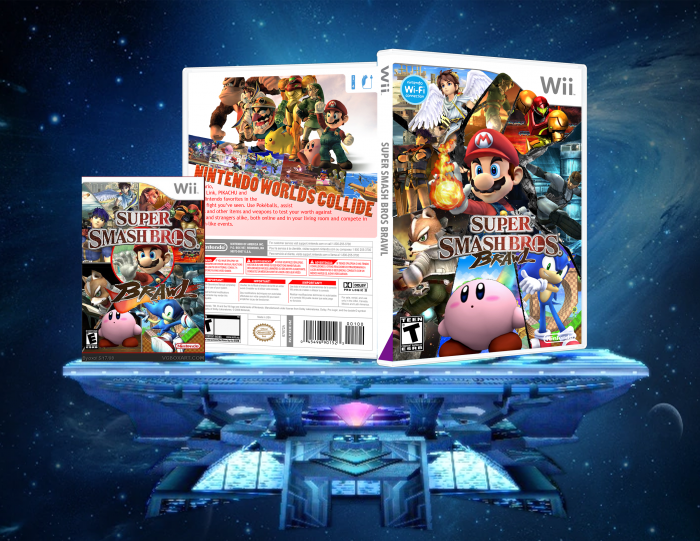
woah, one of your better boxes! But mario? Mario should be in the middle of the box, where pit is, well first... you have yo put HIM ON THE BOX! The esrb is wierd, and nintendo logo is blurry. other than that 3.3/5
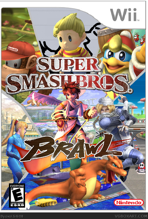
I like the idea but the execution has a lot to be desired for. Making sure things aren't choppy and using more important characters would help. You can add a more intersting texture to those divider lines. If you're an MS Paint user then I think you should use link
I was working on an update and should just add the logos and a background for one of the pics, but I had to go to the store, so I saved it quickly, and when I came home I saw thet I had saved it in totally wrong format, so now I got to start over totally...
It'll take a while til I uploads an update...
So, but the logo screwed up...
I had totally gorgotten it, so I haddn't made place for it...
Sorry for so many posts in so short time, I'll think about it later, and post as fev and good posts as possible.
#12, whats the problem whit the ESRB?
I think the slits connecting the characters needs to be a diffrent color as well as the circle...center brawl a bit ...better esrb which is simple to find...and the try diffrent backgrounds with some of the characters such as sonic and diddy kong and maybe make a back.... not bad and good idea
A totally new box, the same style though.
Damn, I forgot to shange the colour of the circle around Mario, but I'll do thet tomorow, I'm off to bed soon.
 Super Smash Bros Brawl Box Cover Comments
I deleted it by mistake, but here's the comments written:
Oxol:
My best box in my option, credit to KD and Ninty for the renders (Ninty for ZSS) and Sens for the logo.
#2. EggBoy13
i dont see any important chacters
#3. oxol
#2, I added those which I found nice material and som other minor reasons.
[ Reply ]
woah, one of your better boxes! But mario? Mario should be in the middle of the box, where pit is, well first... you have yo put HIM ON THE BOX! The esrb is wierd, and nintendo logo is blurry. other than that 3.3/5
[ Reply ]
No Mario? No Link? No Pikachu? NOT EVEN KIRBY!?
Disgraceful!
[ Reply ]
I simply felt for using these renders, but later I'll probuably shange it the those.
[ Reply ]
I like the idea but the execution has a lot to be desired for. Making sure things aren't choppy and using more important characters would help. You can add a more intersting texture to those divider lines. If you're an MS Paint user then I think you should use link
[ Reply ]
I'm using a bit Paint and a bit Photoshop.
[ Reply ]
I was working on an update and should just add the logos and a background for one of the pics, but I had to go to the store, so I saved it quickly, and when I came home I saw thet I had saved it in totally wrong format, so now I got to start over totally...
It'll take a while til I uploads an update...
[ Reply ]
So, updated whit better characters , it went out better than the last V.2 that I saved in wrong format.
[ Reply ]
#8, you do know there is no logo... other tha n that great job
[ Reply ]
oh, I'll add that soon.
[ Reply ]
So, but the logo screwed up...
I had totally gorgotten it, so I haddn't made place for it...
Sorry for so many posts in so short time, I'll think about it later, and post as fev and good posts as possible.
#12, whats the problem whit the ESRB?
Edited at 1 decade ago
[ Reply ]
I think the slits connecting the characters needs to be a diffrent color as well as the circle...center brawl a bit ...better esrb which is simple to find...and the try diffrent backgrounds with some of the characters such as sonic and diddy kong and maybe make a back.... not bad and good idea
[ Reply ]
A totally new box, the same style though.
Damn, I forgot to shange the colour of the circle around Mario, but I'll do thet tomorow, I'm off to bed soon.
[ Reply ]