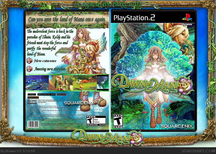
Here is my Dawn of Mana 2 box!
I hope you enjoy it :D
Credit to Nikki for the temp, Shady for the logo,and
LK for the screen border.
I worked really hard on this.
I don't like it, really. It's all very low quality, and the back layout is lame and unoriginal. There's not enough text, and the text that IS there is way too big. The logo on the front is also choppy, and it's too small. I also don't find anything about the front appealing. It's just not that original. 2/5
 Dawn of Mana 2 Box Cover Comments
Here is my Dawn of Mana 2 box!
I hope you enjoy it :D
Credit to Nikki for the temp, Shady for the logo,and
LK for the screen border.
I worked really hard on this.
[ Reply ]
I don't like it, really. It's all very low quality, and the back layout is lame and unoriginal. There's not enough text, and the text that IS there is way too big. The logo on the front is also choppy, and it's too small. I also don't find anything about the front appealing. It's just not that original. 2/5
[ Reply ]
Logo is a little choppy but still really good.
[ Reply ]
Wow!
[ Reply ]
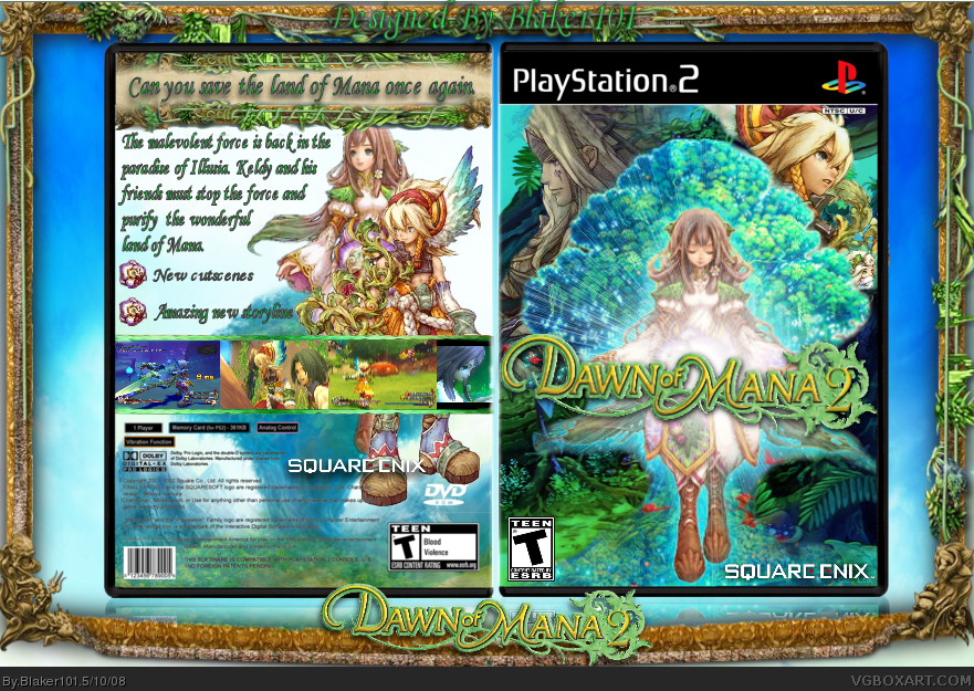
I updated it, I made it bigger and less blurry
Edited at 1 decade ago
[ Reply ]
Excellent.
I'd add another feature, because two is awkward. Just one more bullet point will do. I like it though.
[ Reply ]
Updated once again, I added something to the logo. :D
[ Reply ]
damn. that front sells it.
[ Reply ]
Teh update ez niceee.
[ Reply ]
Really nice
[ Reply ]
wow this looks really cool, nice job
[ Reply ]